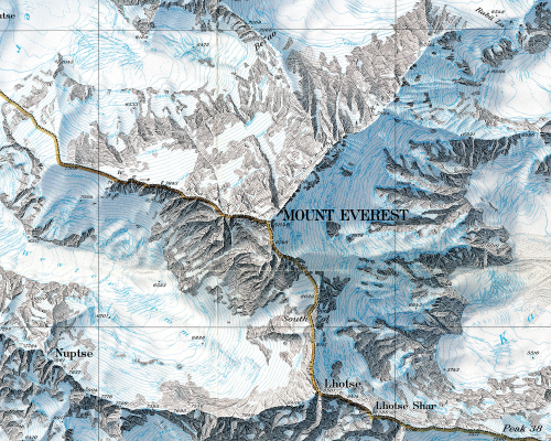
Mount Everest has been mapped extensively using a plethora of relief representations. Possibly the most frequently cited example of excellence in design is by Eduard Imhof in the 1960s for his impressive use of colour. Here, though, Bradford Washburn used Swissair Survey aerial photos and Space Shuttle infrared photos to plot Mount Everest at 1:50,000 before applying his beautifully drawn representation.
Possibly the last example of hand drawn Swiss relief representation makes clear the most detailed and accurate map ever made of Mount Everest. The digital age has yet to provide ways of matching such exquisite artistry. The peaks, glaciers, rocks and hydrography are particularly clear with scree slopes depicted in astonishing detail. Blue contours sit well in the overall design and take on the appearance of layers of ice. The typography is beautifully set and the map has a soft, photo-realistic feel that adds visual impact. The border separating China and India is so subtle it looks like it is actually painted on the ridgelines. A masterpiece of accurate planimetric terrain representation showing natural beauty and scientific information in the most vivid possible way.


