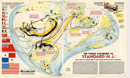
 Artists and illustrators owe as much to cartography as cartography does to them. Here, Richard Edes Harrison’s double page spread in the May 1940 issue of Fortune Magazine shows the world as it exists for Standard Oil. The map owes much to earlier flow maps such as Charles Minard’s such as Export of British Coal map but as a magazine illustration the map-maker can apply a little more artistic license.
Known for his innovative cartographic solutions, Harrison developed a projection that suited the map’s needs. The maps are based on a warped azimuthal equidistant projection centred on the Poles which allows the northern hemisphere to appear at the visual centre. This approach places North America and the main flow lines of oil distribution central in the map layout. The projection gives space for Standard’s key production areas in Texas and Venezuela which supports the pictorial elements.
The map takes on the appearance of a drop of liquid and the overall layout is well supported by flags, drawn proportional to the dead-weight gross tonnage of the tanker fleet, and a well constructed legend in the top right. Text curves according to the projection which supports the overall design aesthetic.

