MapCarte 211/365: Bauhaus building by Hinnerk Scheper, 1926

MapCarte211_Scheper

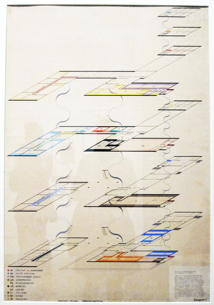
Mapping in the third-dimension is nothing new in cartography. The very earliest maps on clay tablets illustrated mountainscapes by using rudimentary aspect depictions. Perhaps we nowadays think of 3D as detailed cityscapes with photorealistic textures yet this isn’t always the best way to approach a solution for which 3D might be appropriate. One of the key tenets of cartography is, of course, generalization and so reducing complexity to the bare essentials sits at the heart of much of what we do. Detailed satellite base imagery and realistic building renderings are becoming a map-makers preferred approach and it’s inevitable people add stuff to a map if it’s available. Elimination is one of the most important skills a cartographer can master. This map, created by Bauhaus teacher Hinnerk Scheper illustrates the principle at work.

His map is a large scale representation of the orientation and outline plan of the various floors of the Bauhaus building in Dessau, Germany. Floors are shown one on top of another and colour signifies function. The linework is absolutely minimal. Colour is applied internally to each room but not as a complete fill. This gives the work space to breath and reduces the blocks of colour which may overpower the image due to the differently sized rooms. An almost whimsical set of linework connects the floors simply indicating staircases and the front and back of the building is represented with a slightly thicker line.

There’s no photorealistic textures. There are no transparent walls. There’s no need for any other landscape detail. It communicates the structure of the building and the function. that’s it. That’s all.

Of course, the Bauhaus style has had a profound influence on many aspects of design including architecture, interior design, typography and graphic design. We can learn much from such design approaches to inform our cartography.

MapCarte 178/365: Voting Patterns in the Eurovision Song Contest by Thomas Molen, 2009

MapCarte178_eurovision

Some of the simplest maps can be used to great effect to explore long held assumptions about some phenomena. For many years, when votes are cast from European nations in the Eurovision song contest it’s been generally agreed that certain countries are more likely to vote for others. This map proves it.

Molen’s map for a Swedish newspaper simply shows more eastern countries in blue and more western in orange. The chord diagram is a graphic representation..a highly generalised map. It clearly shows the links between the different nations based on voting patterns. The main picture could not be clearer as orange occupies one side of the diagram and blue the other. The use of colour as a differentiating visual variable does its job perfectly and there’s little need to add any complexity.

MapCarte178_eurovision_web

Click the image above to view online web map

Molen does, however, provide an online version that allows people to interact with the diagram to isolate particular countries and explore the data further. This illustrates how, if the approach is simple enough it can be as effective as a print graphic as well as an online graphic. The online version simply makes use of interaction to give people a way of mining the detail.

Schematic maps and diagrams are a highly graphic representation but extremely effective at isolating very specific detail. Molen shows us how to make use of such an approach.

MapCarte 145/365: Hora Mundial by Eduardo Asta & Vincenzo Scarpellini, 2004

MapCarte145_astaIs it possible, or even desirable to constantly strive for originality in cartographic work? It’s suggested that there are only about 7 major story lines that one might fit any film to (boy meets girl…you know the rest). Much the same might be said about maps. Truly original, innovative mapping is very rare indeed and the passage of time makes the search for originality even harder. But why do we place so much value on originality? Many great maps borrow heavily from what has gone before and time and again we can spot lineage to other maps or other map-makers. Sometimes there’s a direct hat-tip and sometimes it’s merely clever ‘theft’ but if it makes a great end product does it matter?

Take this really great graphic which shows nothing more than the world time zones. they’ve been mapped countless times before yet this example is elegant and eye-catching. It uses the most striking colour combination of black and yellow as its main theme and has a neat motif of the aeroplane travelling east and west along the equator while a similarly styled perpendicular line focuses on the Brazilian time zone. Is this design new? Well no. It’s based strongly on the much earlier design by Erik Nitsche for General Dynamics (a postcard from 1955) shown below.

MapCarte145_nitsche

Asta and Scarpellini are entirely open about their inspiration and it works. Their work has a strong aesthetic and clean lines. It’s modern in appearance and works well at different sizes. It uses a Goode Homosoline projection..generally under-used but visually different with it’s large interruptions and which exhibits a strong form in its own right.

A simple layout, minimalist linework and strong, bold typographic elements give this work a clean, vibrant structure and appearance. What it teaches us as map-makers is that borrowing great design ideas from other classic design can translate well and create new, beautiful work in its own right.