MapCarte 34/365: The Peters World Map by Arno Peters, 1973

MapCarte34_peters

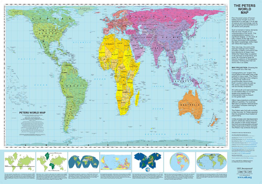
Not so much a map as a projection and a statement that caused considerable cartographic debate in the years following its publication. Here, the world map version shows the projection that Peters created (or reincarnated given the Gall orthographic from the late 19th century) which Arthur Robinson claimed resembled “wet, ragged long winter underwear hung out to dry in the Arctic Circle”. Perhaps not aesthetically pleasing, the map is well designed in other ways.

The map is included here more for what it represents in the sense that its unique re-shaping of the world and the value in challenging the bias of other projections which gave mapping an alternative. It raised public consciousness of cartography and was used by many development agencies due to the way it presented Africa and promoted the equal-area projection for thematic maps in particular.

The projection is now rarely used and the rise of Web Mercator has meant that many good projections are marginalised in favour of ease of use. Peters, then, represents the single-minded approach to cartography when all around are following the herd. Mapping can be more than conforming, it can be a place to explore, innovate, resurrect and challenge. Designing good quality map-based information graphics requires good cartographic knowledge. Peters attempts to highlight inequalities inherent in other projections were a jarring information graphic of the time.

MapCarte 22/365: Hurricanes since 1851 by John Nelson, 2012

MapCarte22_Nelson

 A stunning poster format print map of all known Hurricanes and tropical storms since 1851 from the NOAA archive.  As the availability of archived geolocated datasets continue to grow, many are experimenting with different ways to map the detail. John Nelson’s maps are visually strong as he creates high contrast between the map elements. Here, he uses a basemap that is almost faded completely into a black background. The familiar image of Antarctica acts as a good visual anchor that allows people to orientate themselves to the unfamiliar polar stereographic projection. Mapped onto this projection, the storm paths produce a fantastic swirling ring around the map – a pattern that wouldn’t be nearly as dramatic if he’d used an alternative projection.

Nelson uses almost neon colours for the hurricanes tracks and differentiates by intensity using size and colour. He also applies a fair bit of Gaussian blur to create a soft focus on many of the map elements to great effect which creates a unique style. On a dark background, Nelson’s map shows how the normal connotation of dark = more is reversed as light = more and sits higher in visual perception. Useful graphs and other peripheral information is illustrated succinctly around the well balanced map.

This is one of a number of similarly styled maps which can be seen and also printed on Nelson’s website.

MapCarte 21/365: View and Map of New York City by Herman Bollmann, 1962

MapCarte21_Bollmann

Published for the 1964 New York World’s Fair, Bollman’s map maintains scale equally throughout by an axonometric projection, a technique developed as early as the 15th Century.  Bollmann, a woodcarver and engraver, drew this spectacularly detailed map by hand from 50,000 ground and 17,000 aerial photographs to allow readers to view all parts of the map at the same scale.

The map exaggerates widths of streets to create a perfect amount of white space in which buildings sit.  The dense fabric of the city is represented at the same time as giving clarity to individual buildings.  Vertical exaggeration is used to give a sense of the skyscrapers soaring.  The street numbering is consistently placed and beautifully letter-spaced.

The rich detail invites closer inspection and the colouring, predominantly in pastel shades (to identify building function) with deep grey roof-tops mimics the grey skyline of Manhattan. Other versions exist such as Constantine Anderson’s 1985 map and Tadashi Ishihara’s version from 2000.