 Personal geographies are becoming big business. In cartographic terms we’ve seen massive increases in maps derived from social media, personal monitoring, geotagged photographs and just about anything else our various devices capture and record. Many of the maps we see, though, are not much more than data dumps…points placed on a map with very little cartographic work undertaken to extract, ascribe and communicate some salient, useful information. In short, we rarely see any thought put into maps made of personal data.
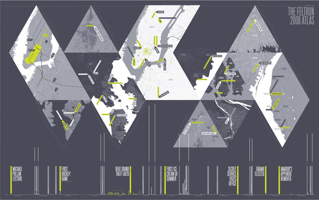
This atlas is an altogether different piece of personal mapping. Since 2005 Nicholas Felton has kept track of his life in every conceivable way. He publishes an annual report that paints a rich picture of all of this which has become both intriguing but also a model for information design and presentation with carefully crafted maps and graphs. His annual works contain numerous expertly produced maps and each year showcases a different design ethos but the 2008 edition stands out cartographically.
The poster for his 2008 edition is reminiscent of Buckminster Fuller’s Dymaxion world map. The graphic shows a collage of his travels from the year in greyscale with only lime green as a contrasting colour to pick out key aspects. The 13 maps in equilateral triangles provides a unique portrait and a convenient use of the projection metaphor. You can cut the map out and fold it into a polyhedra with each face showing a different destination and story. The timeline provides additional details along with annotated highlights. The pages inside the atlas include even more maps and graphics.
Felton’s reports (including 2008) can be viewed on his web site here.