MapCarte 289/365: The Molucca Islands by Petrus Plancius, 1594

MapCarte289_plancius

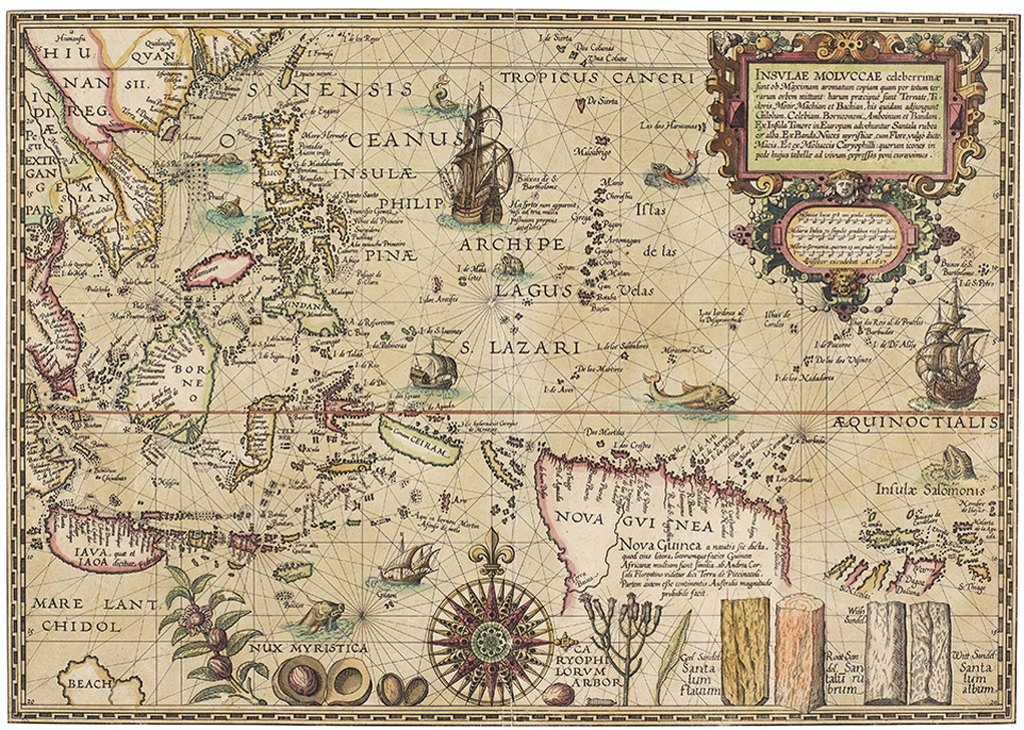
Maps have always served a multitude of purposes and supported the great period of trade in the 16th century, particularly for the Portuguese who dominated the Southeast Asian spice trade. When the Dutch wanted to enter the region to support their own trading aspirations they required maps and this map by Petrus Plancius, astronomer and cartographer, became key not only for their trade but also for cartography.

Plancius used maps acquired from the Portuguese and created his map using Mercator’s projection which had to this point found little favour with navigators due to its complex mathematics. By adorning his map with the riches that lay in wait for bold navigators he was able to persuade his map to be used. In many senses it is a persuasive map with the imagery and style evoking a rich bounty of nutmeg, sandalwood and cloves for those who dared.

The map is both a navigational chart and includes rhumb lines and the depiction of shoals and rocky areas but it is also an early example of the use of maps for corporate purposes as it underpinned the development and later success of the Dutch East India Company. Amusingly, despite its scientific basis the map is still embellished with sea monsters to fill in the gaps and for decoration.

A beautiful example of late 16th century copperplate engraved cartography that supports dual purposes and is perhaps one of the most early forms of persuasive cartography.

MapCarte 288/365: Atlas of Canada International Polar Year Map by NRCan, 2008

MapCarte288_circumpolarFitting a map to a piece of paper or a screen is not necessarily the optimum approach to creating a suitable layout. While creating maps of different shapes on a screen is technologically a step too far, when the map is designed for print there remains the opportunity to play with projections and shapes. Here, the Atlas of Canada Program and NRCam illustrate how to handle the shape of a map perfectly. Mapping the North CIrcumpolar region, the region north of 55 degrees latitude, demands an azimuthal projection. Consequently, the map is round rather than the more usual equirectangular maps we tend to see.

The map illustrates national boundaries, Canada’s 200 mile exclusive economic zone as well as the usual toporaphic and reference detail one would associate with a small scale map. The scale of 1:10,400,000 results in a map 1.6 metres in diameter and the impact of such a large map is impressive. Visually, the circular shape immediately invites exploration. Upon closer inspection the drawbacks of a circular shape have been mastered. Typographic placement is a particular difficulty. Horizontal text dowsn’t work on a circular map but ensuring curved text follows an appropriate line is imperative to create harmony. Sometimes type is placed across a curve relating o the landscape but often it follows either lines of longitude as they radiate or lines of latitude when the meridians become too steep up and down the page.

MapCarte288_circumpolar_detail

Colour is well handled, further detail of minimum permanent sea ice extent, the tree line and historical surveyed locations of the Magnetic North Pole from 1831 to 2007 are included to make the map a combination of topographic reference and thematic map. It’s a successful hybrid.

The unconventional format makes perfect sense for the map but brings with it an interesting added dimension that creates interest and reinforces the information portrayed.

The original map (square format) can be downloaded from Natural Resources Canada with additional information here.

MapCarte 287/365: City of Pop by Designliga, 2014

MapCarte287_pop

Fictional maps continue to occupy a growing genre in cartography through the increase in the use of fictional worlds in film and gaming. It’s not entirely new in the sense that literary works have long used fictional maps as part of the setting of their story (for instance Treasure Island in MapCarte 36, 100 Aker Wood in MapCarte 14 and The worlds of J. R. R. Tolkein in MapCarte 247). Music, also has seen imaginary worlds devised to tell something of the culture and circumstances such as the Manchester Music Map featured in MapCarte 205. Here, a German radio station, working with design firm Designliga, has created a fictional music map as a celebration of their station and the music it has championed since it hit the airwaves.

An earlier version of the City of Pop map was created in 2009 to celebrate the station’s 30th anniversary. This 2014 version is in celebration of their 35th anniversary and as a cartographic product in print and on the web provides listeners with something additional. As a print map it works well as a promotional device for the station more than anything. There is also a zoomable online version that allows deeper exploration of the map’s detail

MapCarte287_pop_detail2

The map is hand drawn in detail and showcases the history of pop culture. The design goal was to illustrate the history of music in a form other than the written word or a magazine article. The imaginary city metaphor allows interconnections to be brought to life. For instance ‘Depeche Mode Midway’ separates the pop district from the new wave quarter and the Bryan Ferry sails down the Mainstream River. The map is not devoid of satire either as Michael Jackson has been erected as a monument in the heart of the pop district but with his face obscured by scaffolding.

MapCarte287_pop_detail1

The map contains over 1300 streets and 500 places with a timeline printed verso. The main design motif is an electric guitar whose strings appear as railway lines entering a station. This isn’t a normal city though great care has been taken to combine musical imagery and references into a believable landscape.

It’s a fascinating and engaging way to present information that would otherwise be seen in a less visual form. It illustrates the versatility of the map to act as a canvas on which people can create fantastic illustrations of even the most non-spatial phenomena.

You can view the online version here and more on the map’s concept by Designliga here.

MapCarte 286/365: Kii – Kinki 360° panorama map by Masaki Oda, 2009

MapCarte286_kinki

Japanese cartography is renowned for the quality and craftsmanship of their panoramas. The detail is exquisite and the scenes are so well framed with not only landscape but, often, a narrative of and contained within the vista itself. This beautiful example from the studio gTonbi-eye by Masadi Oda is in a full 360 degree perspective and depicts the landscape of the Kii peninsula near the centre of the Japanese islands.

As an area that receives large annual rainfall measures there is a lot of dense natural forest so the image is predominantly green though there are diverse landscapes revealed with plains, mountains and basins on view.

MapCarte286_kinki_detail1

To the north is the city of Kyoto but the impressive design characteristic of this work is the combination of such a macro-level image but which also allows the reader to view the micro detail of different urban or rural regions. Creating a map that supports these tow very different scales and views is impressive. The maps are made by hand which makes their design all the richer since every stroke has been thought through and carefully applied. There’s no analytical work involved to apply equal treatments across similar data types which has the result of making each component just that bit different.

MapCarte286_kinki_detail2

The mountainscapes are shown predominantly as aspect molehills but with a carefully applied hillshade to give added depth. The outlining of each mountain ridge in a darker colour wouldn’t be seen naturally but gives each mountain a presence and clarifies the image. At over 3 metres in length if you wrapped the map around you and stood in the centre you would genuinely see the landscape.

MapCarte286_kinki_detail3Finally, the author has added some realistic haze effects so that distant features seem subdued in comparison to the foreground. Our eyes are naturally accustomed to this in the real world and the map mimics it and makes the reader feel at ease. Even Mt Fuji makes a distant appearance in the distant haze.

Rich in detail, colour and thinking.


MapCarte 285/365: Lake Wakatipu by Simon Bardsley, 2014

MapCarte285_bardsley

Terrain representation is vital to good topographic cartography. It goes a long way to defining the look and feel of a map and has become a subset of cartographic expertise and practice that has defined many cartographers and their research interests and products. Classic terrain representation has long been associated with artists who were able to marry a keen eye for terrain with a well honed artistic ability. We might look at the work of Eduard Imhof as perhaps the finest exponent of hill shading for instance (See MapCarte 58). Many of the very best techniques began their life as manual techniques for which others have experimented with analytical versions. It’s debatable whether analytical techniques retain the elegance and beauty of manual techniques but they are sufficiently developed for map-makers to now be taking their experiments further.

In this example, Simon Bardsley has gone beyond default hillshade techniques to use a multidirectional model which captures the terrain in a stylized way. The shading almost represents contouring and might be seen as terracing if shown using traditional colours (or merely darker on the non-illuminated South-East slopes). Yet he’s used a range of pink and orange hues to subtley shade the hillshade and create a different aesthatic altogether. Bardsley describes the effect he was attempting to convey as a sunrise over the mountains. Certainly, the rich colours give that impression but it perhaps goes further.

MapCarte285_bardsley_detailWhether these are the actual colours one might see is perhaps questionable but it’s the impression evoked. It’s how we relate the palette we see in the real world and mentally merge it with the detailed hillshade. The map is abstract in real terms yet we are able to imagine the mountains at sunrise through the lens Bardsley paints. There’s even some hydrographic detail picked out using the technique which, of course, wouldn’t necessarily look that way in reality but leads us to imagine shimmering, reflecting light as it casts across the surface.

Terrain experimentation often leads to unexpected results. Bardsley illustrates that you can do interesting things with hillshading and analytical terrain representation and we get a beautiful map as a result.


MapCarte 284/365: Pizza Geography by Nathan Yau, 2013

MapCarte284_yau1

Thematic maps that display data over a surface normally map counts or rates (think census data…dot density, choropleths etc). Nathan Yau isn’t interested in how many pizza restaurants and take-aways there are near to him. He’s interested in how far away the nearest one is so that any order will get to him in the quickest time (road network and traffic allowing of course). Instead, he calculates which pizza chain has the nearest outlet for a grid, calculated as the nearest place within a 10 mile radius across the U.S.

The map creates a fascinating picture not of totality, because having the ‘most’ number of outlets isn’t necessarily optimum for someone wanting to get their dinner in good time, but of relative accessibility. It’s a simple idea but simple ideas often generate interesting work and he brings a good sense of design and a clean graphical approach to the map too.

He’s used a similar approach to create a tesselated map of burger joints.

MapCarte284_yau2

And has also played with small multiples in looking at the spatial preferences of supermarkets.

MapCarte284_yau3

Exploring datasets using simple thematics is a great way of disentangling the data to eveal particular patterns but these examples show that clear thinking about the specific question you want to answer leads to a clarity in the output too.

There’s more discussion and examples of these maps on Nathan’s FlowingData blog here.

MapCarte 283/365: NYC Noise complaints by Karl Sluis, 2013

MapCarte283_sluis

Abstract looking maps are very often some of those that have the most immediate impact because they look less like maps than, well…maps. They intrigue and reel us in because of their design; their approach; and their graphic aesthetic. These aspects may very well be difficult to define or even describe for a particular map but nevertheless they exist and they go a long way to helping us frame why a map is engaging.

This map (or set of maps within the overall layout) by Karl Sluis depicts the collection and concentration of 311 calls in New York City in 2012. On one hand it’s a graphic art project with minimal but impactful colour, strong shapes that relay the noise concentrations and small multiples that reveal smaller stories within the overall picture.

Yet it remains a map that deconstructs the data in a meaningful way to show us an overall picture using graphics that conotate echoes or pulsing noise waves and then unravels it further to tell micro-stories.

MapCarte283_sluis_detail1

Sluis takes a series of interesting subsets of the data and shows us how they play out across space using individual maps. Here, loud party noise shows concentrations in the Upper East Side as well as parts of lower Manhattan. Other maps reveal interesting pictures of noise associated with construction, buses and noisy dogs. They have a purpose in that they show the complex interplay of noise in an urban setting.
MapCarte283_sluis_detail

Graphically, the maps are clean, sparse and strong in a visual sense. They naturally attract attention and without recourse to any other urban form (roads etc) they clearly show us the gridded structure of the city. The data give us a sense of the city without needing any other forms. They show us how the character of the city changes across time representing residential, commercial and industrial foci at different times. There’s a rhythm that the maps depict, well represented using the visual metaphor of sound waves

You can see more of the map at Sluis web page here and it’s also one of the maps included in the NACIS Atlas of Design II.

MapCarte 282/365: The Heart of Canyonlands by Tom Patterson, 2014

MapCarte282_canyonlands

Beautiful maps are not the preserve of a bygone era when people spent years surveying, then designing and producing their map. While that has often led to some spectacular and often unparalleled cartography, modern techniques are no less capable of producing similarly impressive work.

Here, Tom Patterson, inspired by the map of the Heart of the Grand Canyon by Bradford Washburn (MapCarte 100) sets out to create an equally impressive representation using modern data, software and processing. He achieves it with ease in the sense that the finished product provides an exquisite depiction of the terrain morphology and colours of the landscape. Patterson uses a range of techniques to build a realistic rendering of the terrain that captures not only the vertical component but also something of the horizontal structure and bedding that the hillshading techniques yield. In particular, the techniques used give an impression of rock texturing synonymous of historic, manually drawn relief and rock shading typical of the Swiss school of cartography. Patterson successfully and impressively gives us a realistic and engaging three-dimensional landscape.

MapCarte282_canyonlands_detailRather than leave the map as a function of processed digital elevation models, Patterson goes further in attempting to give a realistic rendering. Thee colours are derived from a process that combines aerial photography with the relief renderings. This allows natural colours to play a part in colouring the map though there is some additional exaggeration of colours such as blue for water features to make them sit comfortably and boldly in the landscape.

Overall, a combination of advanced digital terrain model processing, some clever compositing with aerial photography and a keen eye to manually adjust what’s required give the map the finished look. It’s a beautiful depiction and harks not only to a bygone era of care in terrain representation but also to a future when we should strive to achieve such a wonderful result in our mapping.

You can download a high resolution version of the map here and it’s featured in the NACIS Atlas of Design Volume II.


MapCarte 281/365: Columbia River watershed by Jake Coolidge, 2014

MapCarte281_columbia


Maps are usually bounded by arbitrary administrative constructs because we readily identify with them…countries, states, counties. They may otherwise use a graphical boundary defined by, say, chosen lines on a graticule. There are many other ways to define the boundary and, therefore, the focus of the content for a map which can resonate and serve your map better. Here, Jake Coolidge focuses on the Columbia River watershed but instead of making a map of the 7 states and parts of Canada its water originates from as a framework for the map, he’s used the watershed itself.

Once seen this may seem an obvious approach but it’s all too easy to rely on digital data which comes pre-packaged and organised. Simple selection queries perhaps don’t go as far as might be needed. Coolidge’s map is hand drawn though and the benefit of starting with a blank canvas means less reliance on other data. Choices can be more sensibly made.

The map focuses on the rich and varied terrain that makes up the watershed. The curved perspective view from space gives us a sense of the size and reach that a planimetric approach wouldn’t similarly achieve. Indeed, the simple act of adding exaggerated curvature and an horizon makes an impressive statement.

MapCarte281_columbia_detailThe depiction of features is carefully applied with each getting equal and detailed attention. The text sits comfortably in the landscape and the two components work well together. The lack of colour serves the map well too. There’s no distractions from the raw landscape and the sense of scale and scope is perhaps enhanced by taking the approach of making the map in monochrome with pencil and ink.

There is a benefit of taking a hand-drawn approach to map-making that Coolidge’s map also demonstrates. It takes time to make such a map and that time is demonstrated across the entire map in the detail of each decision to make a mark. While analytical techniques bring us speed, uniformity and allow those with less artistic abilities to make great maps, the time it takes to craft something by hand teaches the map-maker valuable skills as they wrestle with the various decision-making processes of map design. The product is a rich and beautiful map.

You can view a larger version of the map at Coolidge’s web site here or in the NACIS Atlas of Design Volume II in which the map is featured.


MapCarte 280/365: GB Minecraft 2.0 by Ordnance Survey, 2014

MapCarte280_minecraft

Minecraft is a computer game that allows players to create and build places in which they can then play. The landscapes are built of 3D textured blocks and since its creation in 2009 many different worlds and environments have been built. Gameplay is supported by the procedurally generated 3D blocks. Britain’s national mapping agency Ordnance Survey has built an entire version of Great Britain as a downloadable world that players can then use in minecraft.

The map consists of 83 billion building blocks that represent the 220,000 sq km of mainland Britain and its surrounding islands, all built from Ordnance Survey data. Each building block represents a ground area of 25 sq metres and has been vertically exaggerated to reflect topography in a way that gives interest to low-lying landscapes.

MapCarte280_minecraft2

The original map was built by intern Joseph Braybrook who has now improved the detail in GB Minecraft 2 by adding trees in forested areas as well as more detailed hydrology and the rail network. Roads are also classified using Ordnance Survey’s familiar scheme. What better way to play in a computerised world than by using the real world, mapped by Ordnance Survey!

GB Minecraft 2 not only provides gameplayers with a beautiful world in which to play, it acts as an educational tool to explore geography.

You can read more about GB Minecraft and download it here and, inspired by Ordnance Survey, the British Geological Survey has build a geology world that you can also download here.