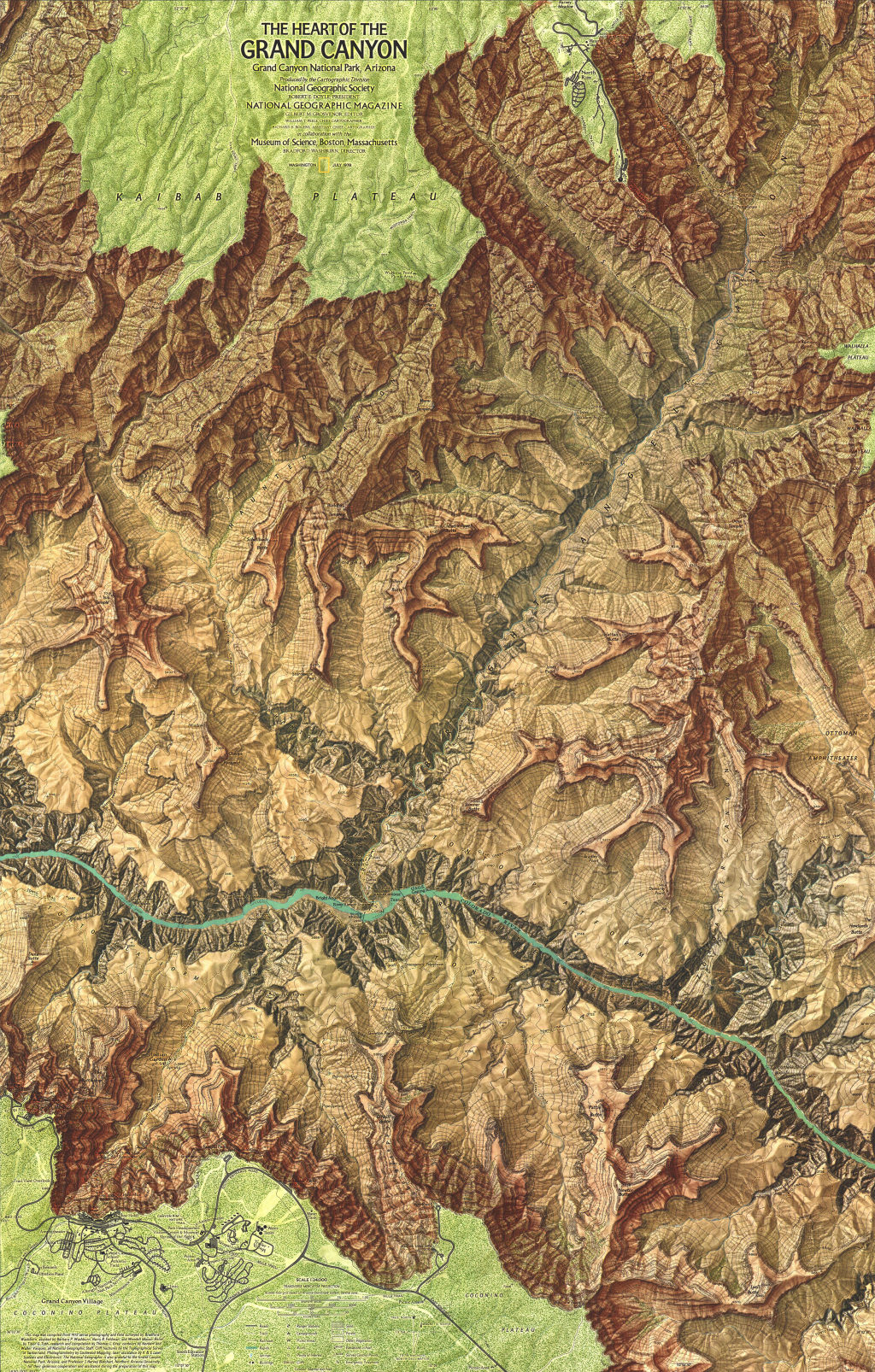
Terrain representation is vital to good topographic cartography. It goes a long way to defining the look and feel of a map and has become a subset of cartographic expertise and practice that has defined many cartographers and their research interests and products. Classic terrain representation has long been associated with artists who were able to marry a keen eye for terrain with a well honed artistic ability. We might look at the work of Eduard Imhof as perhaps the finest exponent of hill shading for instance (See MapCarte 58). Many of the very best techniques began their life as manual techniques for which others have experimented with analytical versions. It’s debatable whether analytical techniques retain the elegance and beauty of manual techniques but they are sufficiently developed for map-makers to now be taking their experiments further.
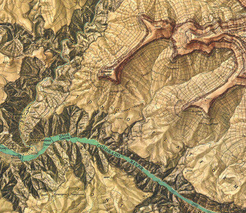
In this example, Simon Bardsley has gone beyond default hillshade techniques to use a multidirectional model which captures the terrain in a stylized way. The shading almost represents contouring and might be seen as terracing if shown using traditional colours (or merely darker on the non-illuminated South-East slopes). Yet he’s used a range of pink and orange hues to subtley shade the hillshade and create a different aesthatic altogether. Bardsley describes the effect he was attempting to convey as a sunrise over the mountains. Certainly, the rich colours give that impression but it perhaps goes further.
 Whether these are the actual colours one might see is perhaps questionable but it’s the impression evoked. It’s how we relate the palette we see in the real world and mentally merge it with the detailed hillshade. The map is abstract in real terms yet we are able to imagine the mountains at sunrise through the lens Bardsley paints. There’s even some hydrographic detail picked out using the technique which, of course, wouldn’t necessarily look that way in reality but leads us to imagine shimmering, reflecting light as it casts across the surface.
Terrain experimentation often leads to unexpected results. Bardsley illustrates that you can do interesting things with hillshading and analytical terrain representation and we get a beautiful map as a result.