MapCarte 287/365: City of Pop by Designliga, 2014

MapCarte287_pop

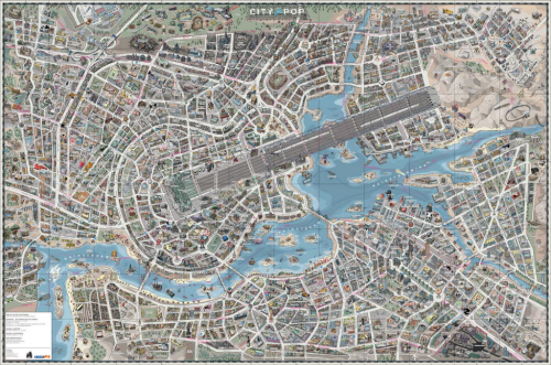
Fictional maps continue to occupy a growing genre in cartography through the increase in the use of fictional worlds in film and gaming. It’s not entirely new in the sense that literary works have long used fictional maps as part of the setting of their story (for instance Treasure Island in MapCarte 36, 100 Aker Wood in MapCarte 14 and The worlds of J. R. R. Tolkein in MapCarte 247). Music, also has seen imaginary worlds devised to tell something of the culture and circumstances such as the Manchester Music Map featured in MapCarte 205. Here, a German radio station, working with design firm Designliga, has created a fictional music map as a celebration of their station and the music it has championed since it hit the airwaves.

An earlier version of the City of Pop map was created in 2009 to celebrate the station’s 30th anniversary. This 2014 version is in celebration of their 35th anniversary and as a cartographic product in print and on the web provides listeners with something additional. As a print map it works well as a promotional device for the station more than anything. There is also a zoomable online version that allows deeper exploration of the map’s detail

MapCarte287_pop_detail2

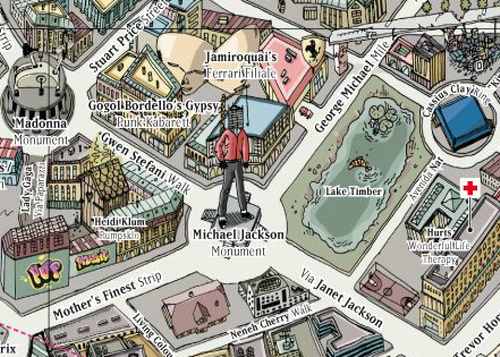
The map is hand drawn in detail and showcases the history of pop culture. The design goal was to illustrate the history of music in a form other than the written word or a magazine article. The imaginary city metaphor allows interconnections to be brought to life. For instance ‘Depeche Mode Midway’ separates the pop district from the new wave quarter and the Bryan Ferry sails down the Mainstream River. The map is not devoid of satire either as Michael Jackson has been erected as a monument in the heart of the pop district but with his face obscured by scaffolding.

MapCarte287_pop_detail1

The map contains over 1300 streets and 500 places with a timeline printed verso. The main design motif is an electric guitar whose strings appear as railway lines entering a station. This isn’t a normal city though great care has been taken to combine musical imagery and references into a believable landscape.

It’s a fascinating and engaging way to present information that would otherwise be seen in a less visual form. It illustrates the versatility of the map to act as a canvas on which people can create fantastic illustrations of even the most non-spatial phenomena.

You can view the online version here and more on the map’s concept by Designliga here.

MapCarte 36/365: Treasure Island by Robert Louis Stevenson, 1883

MapCarte36_stevenson

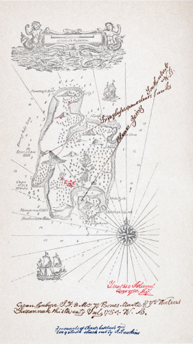
Maps have the ability to transport us to far off places without ever having been there. They also take us to completely fictitious places. Robert Louis Stevenson’s tale of action and adventure in Treasure Island contained a detailed map on the inside cover that showed the location of a career’s worth of looting by the notorious pirate Captain Flint. The map was integral to the story. X marked the spot of the buried treasure and so the hunt began.

The map is well drawn which makes it believable. It contains all elements of topographic detail you’d expect; depths and rhumb lines finish the nautical chart and the title cartouche and pictorial flourishes add to the intrigue and resonate with the reader of the book and the characters in the book. It contains annotations which, of course, many maps do as personalised geographies are added over time. It’s a vital part of the story and making the map believable and tangible made the story that much more believable. The map and the story have become patterns for pirate stories ever since but above everything the parable here is that maps lie. X didn’t actually mark the spot so no matter how well designed, aesthetically pleasing and believable a map may appear to be…they may be telling completely fictitious stories.

MapCarte 33/365: Twin Peaks by David Lynch, 1988

MapCarte33_lynch

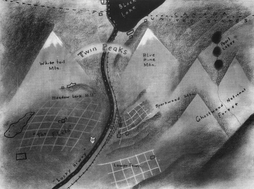
Fictional cartography expertly created by director David Lynch who presented this map to potential television producers as a way of giving a sense of place to his fictional place (and programme) Twin Peaks. rather than present scripts, lynch drew the map to give an idea of where the action was to take place with White Tail and Blue Pine mountains clearly shown as a key feature in the landscape.

The town becomes more believable as a map. The monochrome presentation gives a sense of quirkiness, darkness and intrigue as well as creating something more interesting than a simple planimetric, abstract version. This reflects the stories to be told and creates a ‘mood’ and an emotional reaction in the map reader. The map sacrifices accuracy for detail which enhances the elements of the landscape that are relevant to the story. The sense of the all_american small town that harbours bone-chilling evil are well captured in Lynch’s treatment.