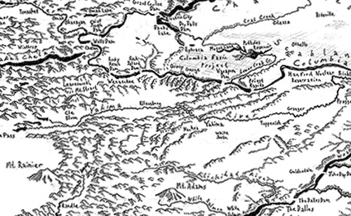
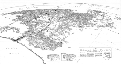
Maps are usually bounded by arbitrary administrative constructs because we readily identify with them…countries, states, counties. They may otherwise use a graphical boundary defined by, say, chosen lines on a graticule. There are many other ways to define the boundary and, therefore, the focus of the content for a map which can resonate and serve your map better. Here, Jake Coolidge focuses on the Columbia River watershed but instead of making a map of the 7 states and parts of Canada its water originates from as a framework for the map, he’s used the watershed itself.
Once seen this may seem an obvious approach but it’s all too easy to rely on digital data which comes pre-packaged and organised. Simple selection queries perhaps don’t go as far as might be needed. Coolidge’s map is hand drawn though and the benefit of starting with a blank canvas means less reliance on other data. Choices can be more sensibly made.
The map focuses on the rich and varied terrain that makes up the watershed. The curved perspective view from space gives us a sense of the size and reach that a planimetric approach wouldn’t similarly achieve. Indeed, the simple act of adding exaggerated curvature and an horizon makes an impressive statement.
 The depiction of features is carefully applied with each getting equal and detailed attention. The text sits comfortably in the landscape and the two components work well together. The lack of colour serves the map well too. There’s no distractions from the raw landscape and the sense of scale and scope is perhaps enhanced by taking the approach of making the map in monochrome with pencil and ink.
There is a benefit of taking a hand-drawn approach to map-making that Coolidge’s map also demonstrates. It takes time to make such a map and that time is demonstrated across the entire map in the detail of each decision to make a mark. While analytical techniques bring us speed, uniformity and allow those with less artistic abilities to make great maps, the time it takes to craft something by hand teaches the map-maker valuable skills as they wrestle with the various decision-making processes of map design. The product is a rich and beautiful map.
You can view a larger version of the map at Coolidge’s web site here or in the NACIS Atlas of Design Volume II in which the map is featured.

