Abstract looking maps are very often some of those that have the most immediate impact because they look less like maps than, well…maps. They intrigue and reel us in because of their design; their approach; and their graphic aesthetic. These aspects may very well be difficult to define or even describe for a particular map but nevertheless they exist and they go a long way to helping us frame why a map is engaging.
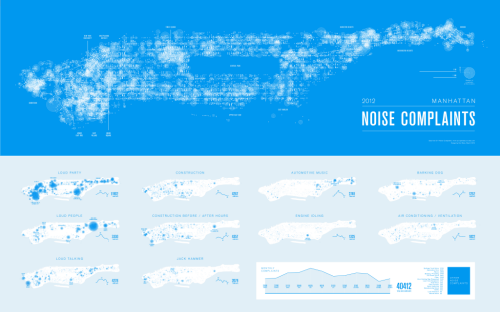
This map (or set of maps within the overall layout) by Karl Sluis depicts the collection and concentration of 311 calls in New York City in 2012. On one hand it’s a graphic art project with minimal but impactful colour, strong shapes that relay the noise concentrations and small multiples that reveal smaller stories within the overall picture.
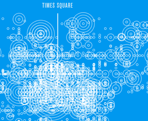
Yet it remains a map that deconstructs the data in a meaningful way to show us an overall picture using graphics that conotate echoes or pulsing noise waves and then unravels it further to tell micro-stories.
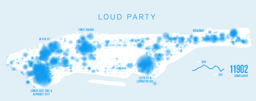
Sluis takes a series of interesting subsets of the data and shows us how they play out across space using individual maps. Here, loud party noise shows concentrations in the Upper East Side as well as parts of lower Manhattan. Other maps reveal interesting pictures of noise associated with construction, buses and noisy dogs. They have a purpose in that they show the complex interplay of noise in an urban setting.

Graphically, the maps are clean, sparse and strong in a visual sense. They naturally attract attention and without recourse to any other urban form (roads etc) they clearly show us the gridded structure of the city. The data give us a sense of the city without needing any other forms. They show us how the character of the city changes across time representing residential, commercial and industrial foci at different times. There’s a rhythm that the maps depict, well represented using the visual metaphor of sound waves
You can see more of the map at Sluis web page here and it’s also one of the maps included in the NACIS Atlas of Design II.


