MapCarte 350/365: World islands by Nakheel Properties, 2003

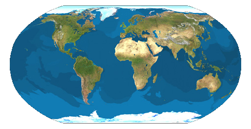
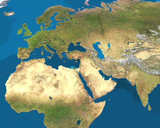
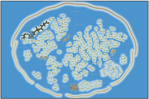
MapCarte350_worldmap1In possibly the greatest example of cartographic simulacrum, the World Islands project is both befuddling and impressive at the same time. The idea to create a completely artificial archipelago of small islands in the shape of a world map might seem extravagant but then why not? In the search for cartographic curiosities it’s relatively easy to find maps that hold certain titles (oldest, largest etc) but constructing something on an altogether grander scale was always going to take a special place. That place, of course, is Dubai and a project originally conceived by Sheikh Mohammed bin Rashid Al Maktoum, the ruler of Dubai.

In design terms it’s the scale and imagination of the project that impresses. The project to create some 300 or more islands by dredging sand began in 2003. It has yet to be completed though most of the islands have been sold to private contractors ahead of development. Only two of the islands have been developed thus far but the world’s richest people and organisations always need frivolous reasons to spend money and what better than a ‘country’ all of their own in World Islands.
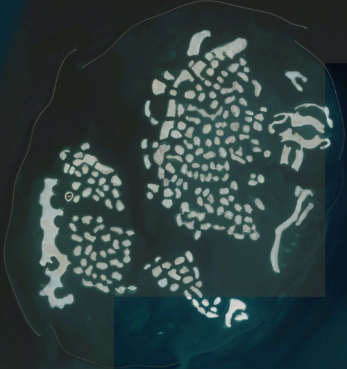
MapCarte350_worldmap2The archipalago measures some 9km by 6km and the islands range from 14,000 to 42,000 sq metres. Distances between the islands averages 100m and the shorelines total approximately 232km in length. Dredging for the islands was completed in 2008 and in early 2012 the ‘Lebanon’ island opened as a commercial island for private corporate events and public parties with the Royal Island Beach Club. The project is really quite astonishing and shows how vital the shape of the countries on our planet really are for all manner of artistic projects. They inspire so much beyond making maps.

What could be better than partying on a map of the world on the world?

MapCarte 349/365: Density equalizing cartogram by Michael Gastner and Mark Newman, 2004

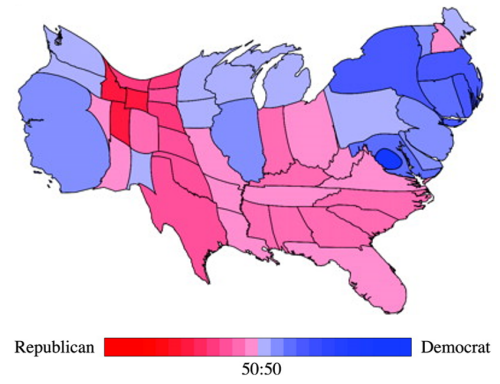
MapCarte349_cartogramThe so-called Holy Grail of cartograms was solved by Michael Gastner and Mark Newman and published in 2004. To this point, cartograms had largely been abstract maps; they took various geometric shapes such as circles and then re-sized and re-positioned them. The result was a map without a map…there was very little of the underlying geography depicted and in some respects they were simply spatial graphs, or the thematic part of a thematic map without any sense of the geography that they more normally sit atop of.

At the heart of a cartogram is the use of symbols to represent geographic regions in proportion to the variable being mapped. To do this, one normally has to severely distort shapes or revert to geometric symbols. These can make such maps difficult to read because they no longer look like the very places they are supposed to represent. Gastner and Newman brought a new approach to the calculation of their cartogram by making use of elementary physics. This in itself was innovative since they borrowed logic and algorithms from the science of physics and applied it to cartography. They demonstrated their work using data from the 2000 U.S. Presidential election which illustrates how the U.S.A. map is modified by the share of the vote, thus giving equal visual weight to the key data being mapped as well as retaining the general impression of a map of the U.S.

The technique is referred to as density equalising because it uses a variable to normalize the map shape. It’s almost the inverse of a choropleth whereby one would normalize the data values to take account of the size of area; instead the actual values are mapped but the size of the areas are modified so they are visually equivalent in prominence. The result was an elegant solution to the search for a cartogram that allowed the user to show different magnitudes by area and at the same time preserve shape sufficient enough to make it recognisable. In effect, the map is warped yet shared boundaries are retained in their correct topological state. The map retains the essential elements of the original shapes and leaves readers with the ability to recognise the shapes.

Cartograms are visually arresting as images. Gastner and Newman’s work produced a new technique that enables them to be just that bit more understandable.

You can read their original paper here.

MapCarte 348/365: Abekawa-dōri sanchū ichien ezu by Ichiryūtei Shoraku Dōjin, 1862

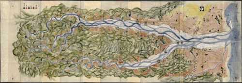
MapCarte348_aberiverInstead of creating general purpose reference maps that depict the topographic detail of a specified area, an alternative approach is to let a specific feature define the area itself. In this sense, the feature becomes the central player in the map and all other content becomes its supporting cast. It also determines the shape, format and, possibly, the size of the finished product. This superb example shows the Abe River region in Japan from the mid 19th century. The river itself defines the shape and scope of the map with the flow from north-west to south-east being depicted from left to right across the map, with straightening being used in places. In this case, north is towards the upper left rather than directly upwards.

The map is predominantly pictorial with relief in particular shown pictorially. Relief is drawn in aspect while the map in general is planimetric; a fairly typical approach of the time in Japanese cartography. It’s also worth noting that the mountains are not uniformly drawn with their base at the bottom and peak at the top across the map – they change orientation so, for instance, toward the left of the map it’s noticeable that the mountains are rotated left by 90 degrees to show them as the origin of the river and make the flow of the river make more sense visually.

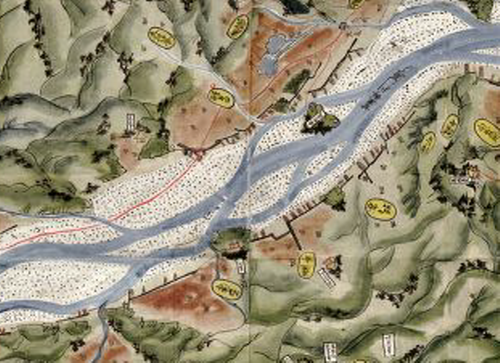
MapCarte348_aberiver_detailThere is very little text on the map itself, the reverse side being used for notes on the geography of the region. This allows the map to remain clutter free and for the topography to be drawn in detail. The finish is in watercolour and ink with major land uses benefiting from different hues to demarcate the landscape.

The braided river flowing through alluvial deposits and floodplains is particularly well represented and stands out amongst other rich colours of the surrounding mountains. The stippled pattern for the plains adds to the texture of the map and creates a sense of realism that a relatively solid fill doesn’t. There’s no frame as such and the river washes out into the sea to the right.

A beautiful map and an example of allowing your subject or theme dictate many of the other cartographic choices to be made.

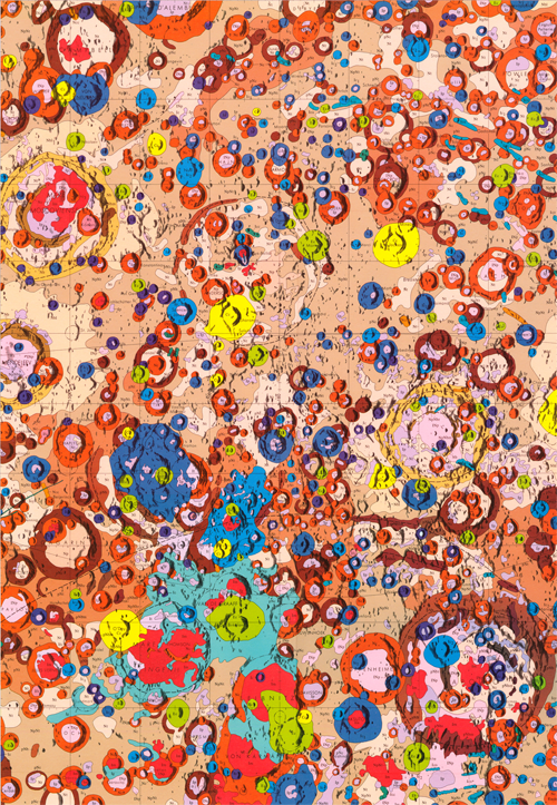
MapCarte 347/365: Geologic map of the central far side of the Moon by Desiree E. Stuart-Alexander, 1978

MapCarte347_moonCartography isn’t restricted to the planet that we inhabit. Imagery and maps have long been made for other planets, moons, stars and (recently) comets in our solar system and, indeed, of the solar system itself. They are a key mechanism by which we record information about the surface composition, geology or topography whether that be by remotely sensed imagery or through the capture and analysis of samples from human exploration or robotic means. Being the closest major celestial body to Earth, the Moon is perhaps unsurprisingly the earliest and most detailed to have been mapped to date.

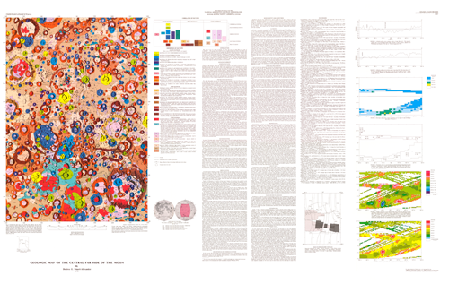
Prepared for the National Aeronautics and Space Administration by U.S. Department of the Interior and U.S. Geological Survey as part of the Geologic Atlas of the Moon, 1:5,000,000, this map was the first of its kind.  It was compiled from NASA Lunar Orbiter and Apollo photographs and Soviet Zond photographs as well as geochemical and geophysical data obtained from orbiting spacecraft to show the detailed geological character of the Moon in glorious detail.

MapCarte347_moon_detail1The map illustrates the topography as a technicolour mosaic that is almost Jackson Pollock-esque in design.  The engaging palette of colours immediately attracts interest in the map which accentuates the strange form of the Lunar landscape.  What might appear to be a small design element, the thin black line outlining each feature helps to accentuate the image and delineate one feature from another as distinct forms in contrast to the monotonous appearance of the real landscape.  The colours themselves allow the reader to quickly differentiate between neighbouring detail and also to identify where similar information exists elsewhere. It’s also possible to pick out craters and other morphological detail.

MapCarte347_moon_detail2The map is in two versions, one that includes geological notation and grids and a version without. It’s a magnificent scientific tool of record and discovery but it’s also a piece of cartographic art and one which has inspired many subsequent maps of the moon and other bodies that generally comprise an interest in planetary cartography.

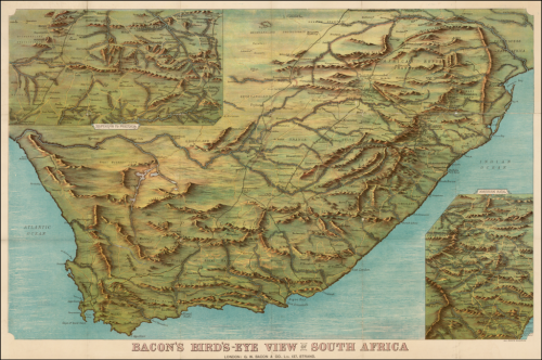
MapCarte 346/365: Bird’s eye view of South Africa by G. W. Bacon, ca 1890

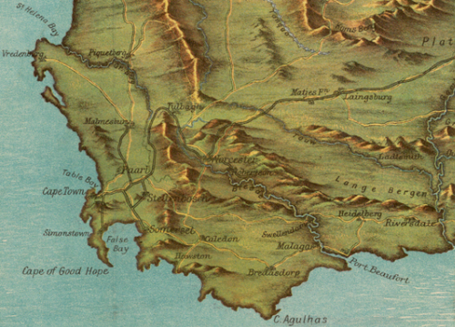
MapCarte346_southafricaBird’s eye views fascinate us because they give us a panoramic, perspective view of a landscape as if we were seeing it with our own eyes. Typically, such views are of cityscapes or relatively small areas but with some cartographic license we can turn our skills to the depiction of much larger areas. This chromolithographic print, published by G. W. Bacon captures an entire country using the technique. It’s neither perfectly planimetric nor uses a progressive projection but there are subtle changes in the perspective from south to north, accentuated by the depiction of landforms throughout.

The content is fairly routine in terms of topography with roads, rivers, towns and cities as well as major mountains, rivers and some political and administrative features. Insets are used to show the Transvaal in the upper left and northern Natal in the lower right giving the layout balance as well as space for more detail in these areas.

MapCarte346_southafrica_detailOf course, timing is everything in cartography and the map was was published just after the First Boer War (1880-1) and in the period leading to the Second Boer War (1899-1902). The British were particularly keen to understand the landscape and names which were becoming part of daily life in newspapers. Maps such as this helped contextualize the far off land and better appreciate the places which had, by now, been discovered to hold large gold and diamond reserves.

More than all of this, the map is well coloured and pleasing as a form of cartographic art. The mountains, in particular, are depicted using a plan oblique technique and sit well amongst the otherwise flat plains. The use of light across the image hints at the way sunlight might hit a picture with the south being slightly darker than the north, particularly around the inset. The same is true for the rendering of the water and around the lower right inset. This gives the work added depth.

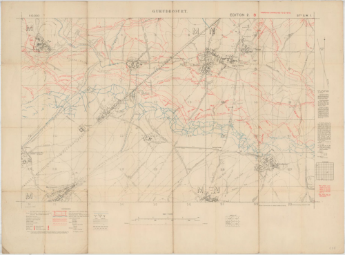
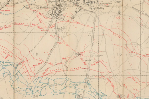
MapCarte 345/365: British Trench Map 57C.SW.1 (Gueudecourt) (1:10,000) from World War I by the War Office, 1916

MapCarte345_trenchMaps fight a good war. Geographic intelligence has always been a pre-requisite for battle, whether in the form of Ezekiel’s clay model of Jerusalem or a digital terrain model from a reconnaissance drone.

The year 2014 marks one hundred years since the outbreak of World War I, a global conflict which began on 28th July 1914 and ended on 11th November 1918 with a cost of 16 million lives and the downfall of four Empires in continental Europe. After the German army had invaded neutral Belgium and Luxembourg, their march on Paris was halted and what became the Western Front fell into a battle of attrition with a line of trenches that changed little until 1917.

When the British Expeditionary Force (BEF) crossed the English Channel in August 1914, it relied upon on existing maps at 1:40,000 (Belgium) or 1:80,000 (France) and some at smaller scales, which were useful for planning troop movements, but not for the largely static war of attrition that required a more detailed knowledge of enemy defensive positions. From early 1915 the Geographical Section of the General Staff (GSGS) at the War Office began to produce new, larger-scale maps for the fighting units at the Front. At a scale of 1:10,000, the new maps could reveal details of the enemy Front Line, machine gun posts, bunkers, communication trenches to the rear and any defensive positions. Small teams of Royal Engineers and Ordnance Survey surveyors gradually grew into larger field survey companies who could correct, print and distribute maps from the British lines.

MapCarte345_trench_detailThe Battle of the Somme, fought by the British and French forces against Germany from 1st July to 18th November 1916, was one of the largest battles of the war and claimed over one million casualties. The 1:10,000 sheet shown here, Gueudecourt, depicts the trenches as on 2nd December 1916, with German positions in red and British/French in blue (as was the standard until these colours were reversed in early 1918). Gueudecourt was one of the most distant objectives of the British during the Battle of the Somme. The village saw decisive action from the Royal Newfoundland Regiment, who played a key role in capturing and successfully defending a German strong point. A memorial near the village, comprising a bronze caribou standing atop a cairn of Newfoundland granite, commemorates their achievement and sacrifice.

Images by permission of the National Library of Scotland

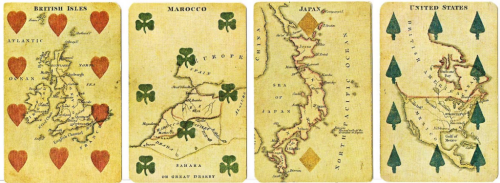
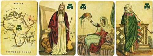
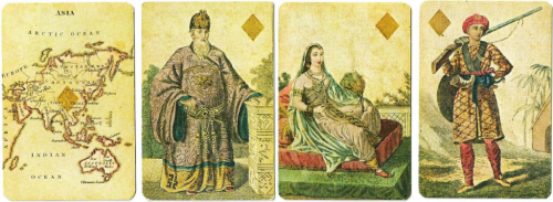
MapCarte 344/365: Geographical Cards by Charles Hodges, 1827

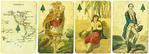
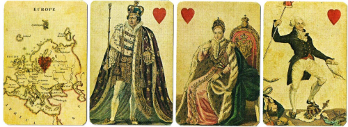
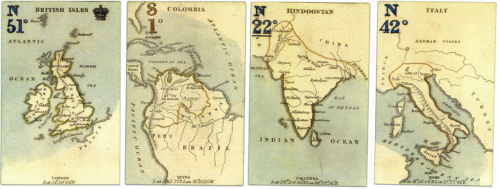
MapCarte344_hodges5English bookseller and stationer Charles Hodges original Geographical Cards were published in 1827 and subsequently in 6 different versions until c.1830 when he ceased trading. They have become highly collectible and prove the versatility of maps in their ability to suit a wide variety of purposes. Here, as a backdrop to the most simple of games – the humble pack of playing cards. To this point, there had been a tradition of creating playing cards with engraved representations of educational and scientific subjects. Hodges carried on this tradition by using maps as the focus of his own cards. The cards were made and manufactured by Stopworth & Son in London.

The Aces show maps of the four main continents of Europe, Asia, Africa and America. The court cards depict historical persons representing the continent and the other numerical cards show maps of the respective countries. George Washington is the King of Spades and King George IV is the King of Hearts.

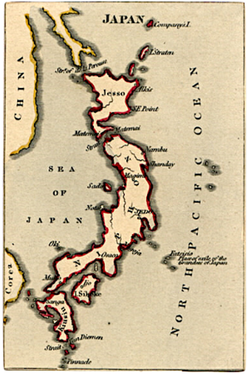
MapCarte344_hodges4 MapCarte344_hodges3 MapCarte344_hodges2 MapCarte344_hodges1The maps themselves are small format (obviously) but in this case small is beautiful and each map is exquisitely engraved and coloured. Coastlines benefit from a waterlining vignette and for such small maps, the typography is of a suitable level of detail and shows excellent positioning. In every sense, these are excellent maps albeit their primary purpose is illustrative in support of the deck of cards.

Hodges later made use of the same printing plates and produced a game using cards that had no suit information but, instead, had the longitude and latitude of capital cities printed as well as more elaborate colouring, particularly in the colour applied to the seas and oceans.

MapCarte344_hodges6He also produced a set of forty cards without suit marks or the court cards simply as a miniature atlas. These appeared in a small slip-case and had gilt-edges.

MapCarte344_hodges7Maps can be used in myriad ways and as a mechanism to provide not only an attractive illustration but also additional interest. A beautiful way of using cartography.

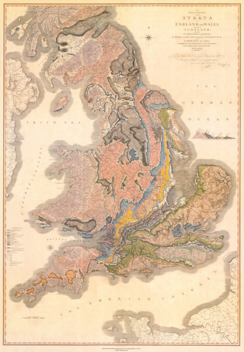
MapCarte 343/365: A deliniation of the strata of England and Wales by William Smith, 1815

MapCarte343_smithIn a world where many seem rather quick to suggest their map is ‘the first to show…’ it’s refreshing to be able to show actual firsts from the world of cartography that exhibit good design. English geologist William Smith is credited as the first to have created a nationwide geological map. Smith’s legacy is in the first ever map to collate a full geological record of a whole country into a single map.

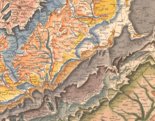
Smith’s map is perhaps also an early marker for that most current trend in digital map-making – the mashup of third-party basemaps and some sort of overlay. He uses conventional symbols to show urban and rural areas, roads, tramways and collieries and mines. The geology itself is applied over the top and all hand-drawn using a range of colours to denote the different rock types. One of Smith’s approaches was to use the fossil record as a way of establishing the strata as opposed to simply rock composition. His map was more accurate as a result. Indeed, the map Smith created is not far off the modern geological map of England and Wales at this scale illustrating just how accurate he had managed to make his map.

MapCarte343_smith_detailThe map was made in a range of formats: on sheets, or canvas or mounted on rollers. In total the map measures approximately 8 feet tall by 6 feet wide. He oversaw the hand-colouring of each of ~400 maps and each is numbered and signed.

MapCarte343_smith_detail2It’s possible Smith could also claim to have made a map with one of the longest titles. The full title is: A delineation of the strata of England and Wales with part of Scotland: exhibiting the collieries and mines, the marshes and fen lands originally overflowed by the sea, and the varieties of soil according to the variations in the substrata, illustrated by the most descriptive names.

A fantastic cartographic first in both the quality of the surveying and the accuracy of the resulting work, but also for the beauty and richness of the cartographic depiction. In all ways, this map underpins much of what has subsequently been made regarding geological cartography.


MapCarte 342/365: Satellite Map of Earth by Tom Van Sant, 1990

MapCarte342_vansantWhat better to represent the culmination of cartographic knowledge and achievement at the close of the twentieth century than a portrait of the Earth from space?

The first cloud-free, high-resolution composite image of the Earth was completed on 15th April 1990. It featured on the title page of the National Geographic World Atlas that year and was produced by artist Tom Van Sant with technical assistance from Lloyd Van Warren, Leo Blume and James Knighton. Using multiple whole-Earth mosaics collected by Advanced Very High Resolution Radiometer (AVHRR) sensors on board TIROS-N (Television and InfraRed Observation Satellite Next generation) satellites, the composite was derived from over 2,000 images with a ground resolution of 4.6 km. The project required ten months of software development and both interactive and non-interactive methods of creating the mosaics using a Stardent GS1000 Graphics Supercomputer – then amongst the most powerful machines of its type.

MapCarte342_vansant_detailBut is it a map? ‘First-of-a-kind portrait from space’ was its title in the November 1990 issue of National Geographic, strengthening the cartographic pedigree of this latest mapping achievement. A portrait is usually intended to flatter its subject; while appearances need to be accurate to form a resemblance, complete faithfulness – even allowing for Oliver Cromwell’s desire for ‘warts and all’ – is beyond the objective of the artist. Hence, as a map, Van Sant’s Earth portrait aptly represents the blend of art and science that characterises cartography and its drive for an aesthetic perfection that reflects impossibility more than reality. Not only do we see a cloud-free and perfectly and evenly illuminated Earth, but one in perpetual bloom with maximum vegetation cover wherever you look. Drainage and relief were enhanced using high-resolution hydrology and elevation databases and the images themselves were filtered, corrected and manipulated to produce the best view possible.

In The Power of Maps (1992), Denis Wood deconstructs Van Sant’s Satellite Map of Earth, unveiling the very human forces behind each decision in its production. Yet, aptly completed on the birthday of Leonardo da Vinci, the image is also a reminder of cartography’s unique fusion of art, science and technology – and the cartographer’s desire to portray a pleasing world.

MapCarte 341/365: Mapping analogy for explaining to people the mingling and evolution of influences in the World Wide Web technology by Tim Berners-Lee, 2007

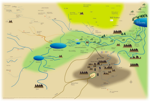
MapCarte341_leeIf I say that this map by Sir Tim Berners-Lee will never win any design awards then you’d be perfectly within your rights to question why it warrants a spot in MapCarte. That would be to ignore the map’s function which is to explain how the world wide web works to mere mortals…and the use of a map is a perfect metaphor. The complex world of wires that Berners-Lee is credited with inventing during his time at CERN. Of course, the world has grown way beyond those early beginnings and is far more complex with a range of complementary technologies which interlink in weird and wonderful ways.

The map, then, portrays these relationships and shows how various components connect together and what each is used for. Even if you have no idea what TCP is or how Google fits into the scheme of things this map gives you a sense that you can at least position them within. There are some wonderful touches and the map isn’t devoid of graphical treats. Google isn’t directly mentioned but the colour coding of the word ‘Giants’ is unmistakable and riffs off the logo. There’s also some vague areas thrown in that refer to accountability or logic or efficiency and understanding. There’s even a ‘here be dragons’ reference.

So what of the map’s overall appearance? Well it’s reflective of an early computer game aesthetic. It’s simple and clearly generated using simple paint tools. In many ways it works in this form where a more accomplished map or diagram might not. It reflects complexity through simple graphics. There’s no place to hide in this realm as depicted and the seas and mountains add to the sense of some sort of fantasy map, perhaps almost Tolkien-esque. Even the fonts used perhaps add to the impression that this is a role-playing game map. It’s a look and feel that works well.