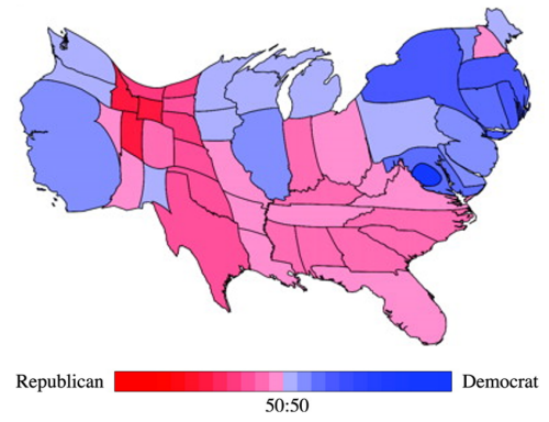
 The so-called Holy Grail of cartograms was solved by Michael Gastner and Mark Newman and published in 2004. To this point, cartograms had largely been abstract maps; they took various geometric shapes such as circles and then re-sized and re-positioned them. The result was a map without a map…there was very little of the underlying geography depicted and in some respects they were simply spatial graphs, or the thematic part of a thematic map without any sense of the geography that they more normally sit atop of.
At the heart of a cartogram is the use of symbols to represent geographic regions in proportion to the variable being mapped. To do this, one normally has to severely distort shapes or revert to geometric symbols. These can make such maps difficult to read because they no longer look like the very places they are supposed to represent. Gastner and Newman brought a new approach to the calculation of their cartogram by making use of elementary physics. This in itself was innovative since they borrowed logic and algorithms from the science of physics and applied it to cartography. They demonstrated their work using data from the 2000 U.S. Presidential election which illustrates how the U.S.A. map is modified by the share of the vote, thus giving equal visual weight to the key data being mapped as well as retaining the general impression of a map of the U.S.
The technique is referred to as density equalising because it uses a variable to normalize the map shape. It’s almost the inverse of a choropleth whereby one would normalize the data values to take account of the size of area; instead the actual values are mapped but the size of the areas are modified so they are visually equivalent in prominence. The result was an elegant solution to the search for a cartogram that allowed the user to show different magnitudes by area and at the same time preserve shape sufficient enough to make it recognisable. In effect, the map is warped yet shared boundaries are retained in their correct topological state. The map retains the essential elements of the original shapes and leaves readers with the ability to recognise the shapes.
Cartograms are visually arresting as images. Gastner and Newman’s work produced a new technique that enables them to be just that bit more understandable.
You can read their original paper here.


Pingback: Cartogram: Various Examples | MAPresso