 Cartography isn’t restricted to the planet that we inhabit. Imagery and maps have long been made for other planets, moons, stars and (recently) comets in our solar system and, indeed, of the solar system itself. They are a key mechanism by which we record information about the surface composition, geology or topography whether that be by remotely sensed imagery or through the capture and analysis of samples from human exploration or robotic means. Being the closest major celestial body to Earth, the Moon is perhaps unsurprisingly the earliest and most detailed to have been mapped to date.
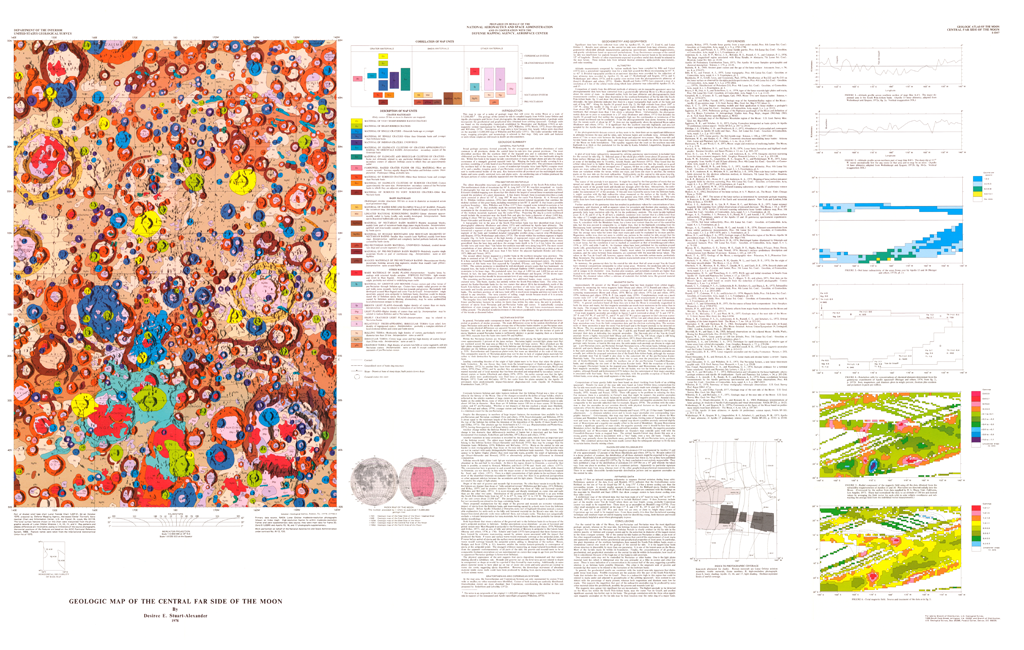
Prepared for the National Aeronautics and Space Administration by U.S. Department of the Interior and U.S. Geological Survey as part of the Geologic Atlas of the Moon, 1:5,000,000, this map was the first of its kind. It was compiled from NASA Lunar Orbiter and Apollo photographs and Soviet Zond photographs as well as geochemical and geophysical data obtained from orbiting spacecraft to show the detailed geological character of the Moon in glorious detail.
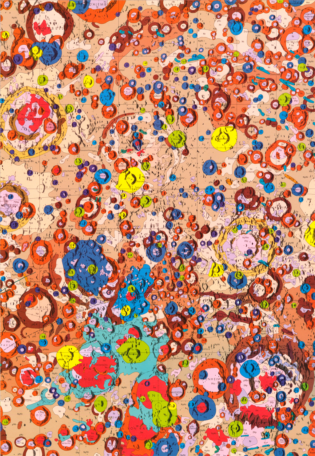 The map illustrates the topography as a technicolour mosaic that is almost Jackson Pollock-esque in design. The engaging palette of colours immediately attracts interest in the map which accentuates the strange form of the Lunar landscape. What might appear to be a small design element, the thin black line outlining each feature helps to accentuate the image and delineate one feature from another as distinct forms in contrast to the monotonous appearance of the real landscape. The colours themselves allow the reader to quickly differentiate between neighbouring detail and also to identify where similar information exists elsewhere. It’s also possible to pick out craters and other morphological detail.
 The map is in two versions, one that includes geological notation and grids and a version without. It’s a magnificent scientific tool of record and discovery but it’s also a piece of cartographic art and one which has inspired many subsequent maps of the moon and other bodies that generally comprise an interest in planetary cartography.