There’s something uniquely compelling about the shapes that maps make. The outlines of countries, in particular, are one-off. They are instantly recognisable and allow artists and illustrators, as well as cartographers, a rich seam to exploit. There’s arguably no better way of representing something than combining a theme with a map shape.
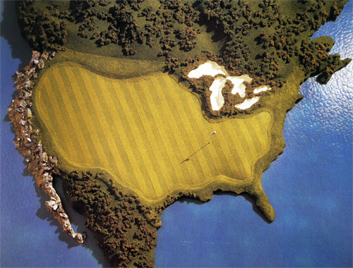
Take this fantastic example from Sports Illustrated in 1990. The illustration is a wonderful use of the shape of the United States used as a golf green. The surrounding water hazards are depicted in a rich blue, the greens are lush and the ‘rough’ in Canada and Mexico frames the green perfectly. Even the Great Lakes are turned into a series of bunkers.
The illustration was commissioned to accompany an article about the massive growth in interest in golf at the time. The use of the map emphasises the point, making us see the spread of golf as nationwide. Whether the intent was to provide a strong message or not, the illustration shows us the extent to which map shapes can be used artistically.


