MapCarte 117/365: Atlas of Global Geography by Erwin Raisz, 1944

MapCarte117_raiszOne of the twentieth centuries foremost cartographers, Erwin Raisz was born in Hungary but emigrated to the US in 1923 and spent much of his professional career teaching cartography and curating the map collection at Harvard University. He was a prolific map-maker who produced thousands of maps comprising mainly of landform drawings. His style supported the easy interpretation of landform features “combining a scientist’s fascination with geomorphology with an artist’s drawing ability”

MapCarte117_raisz2

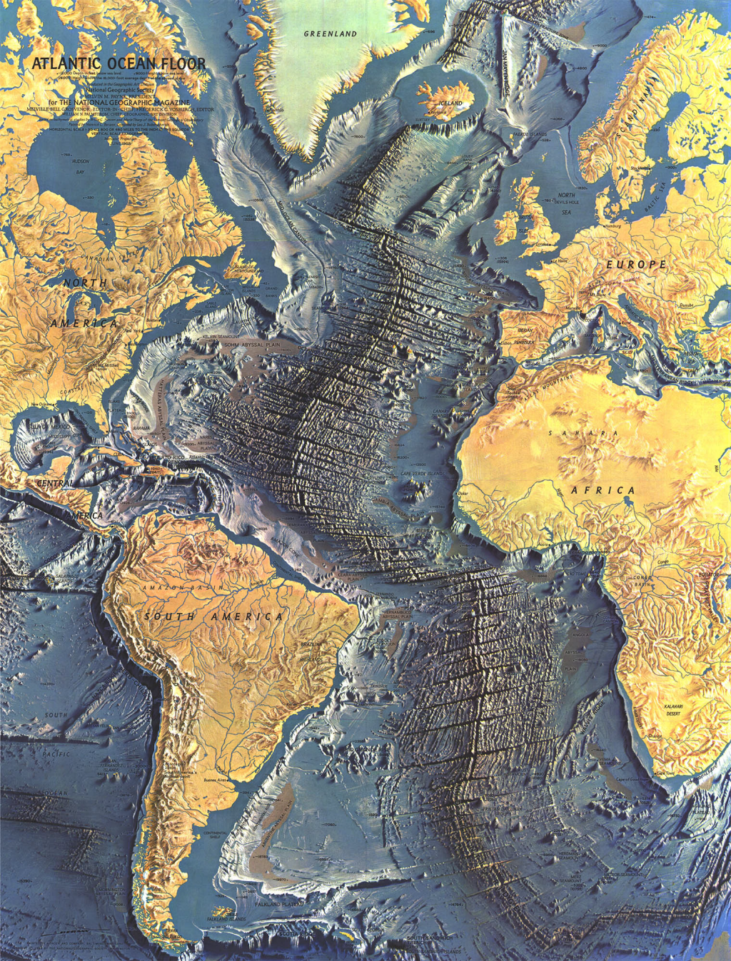
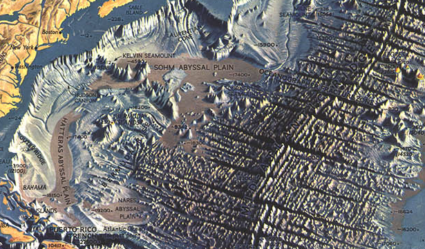
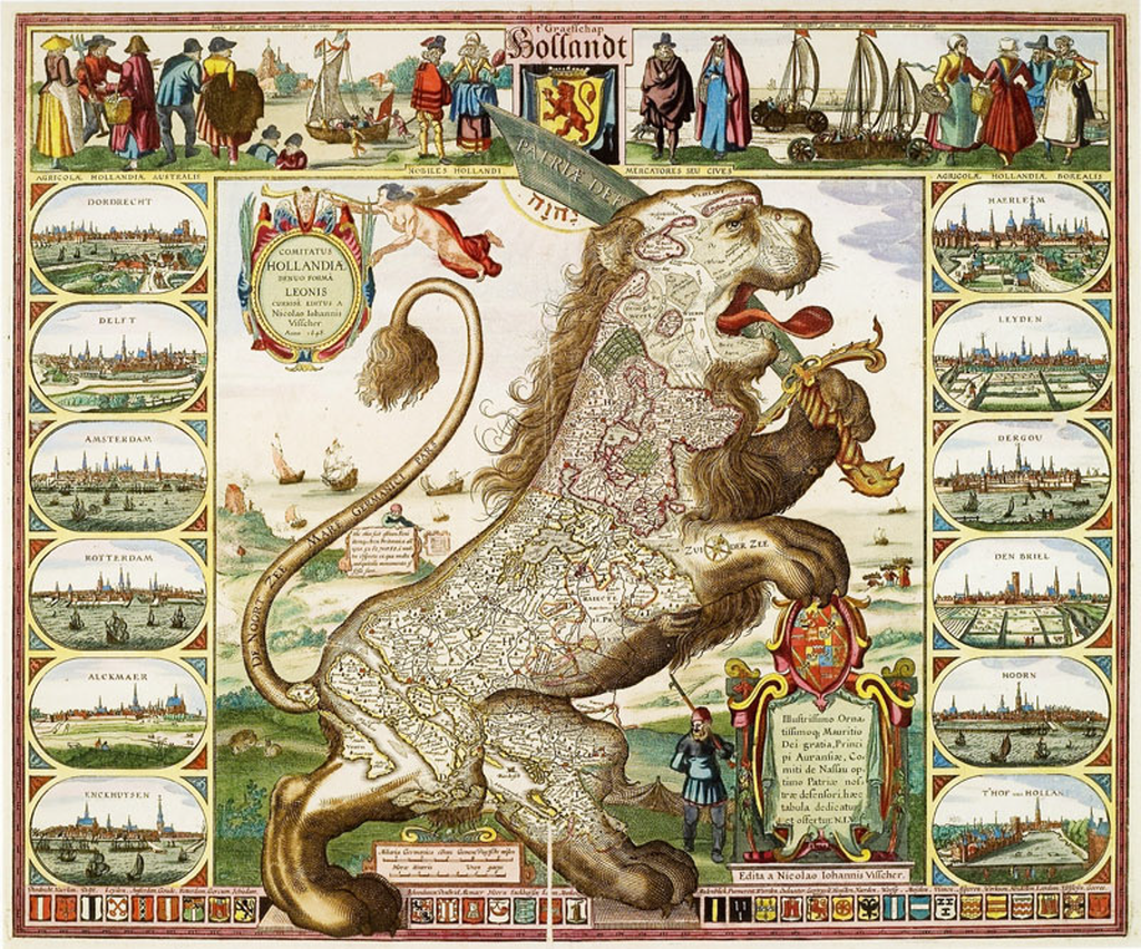
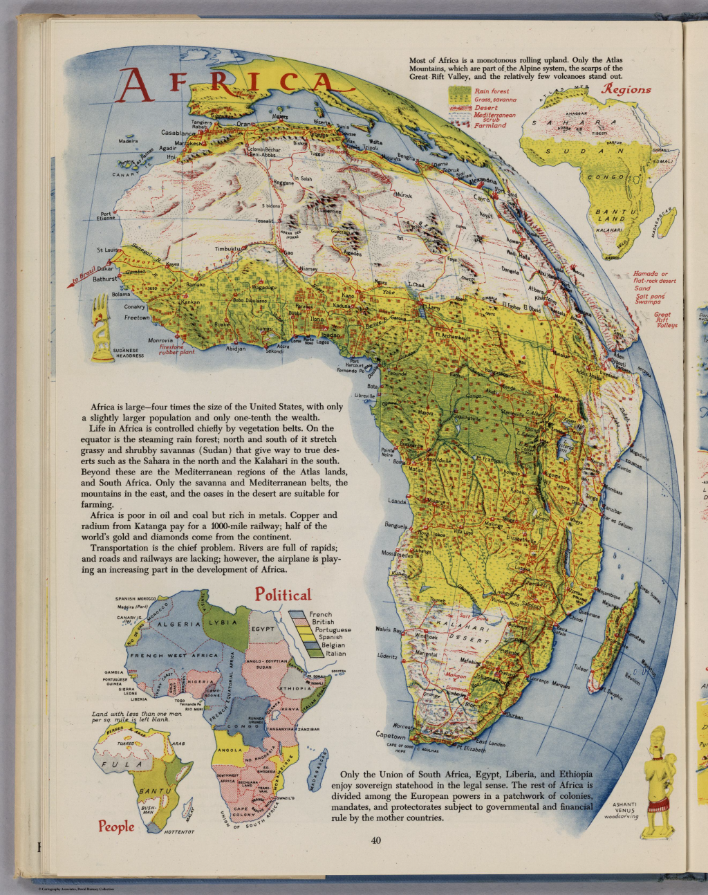
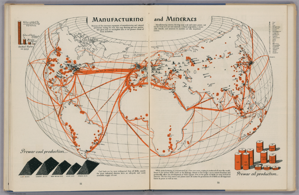
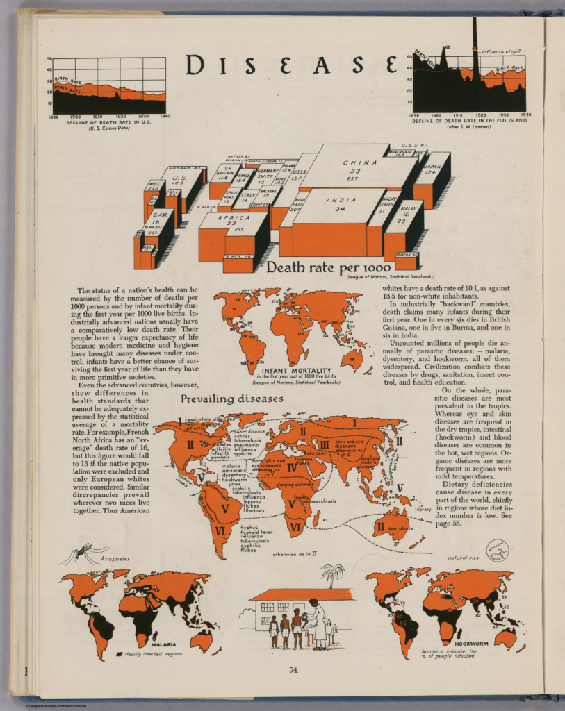
Rasiz’s maps were accurate, elegant and brought considerable aesthetic appeal to the depiction of the physical world in map form. His style was unique and his work was almost entirely pen and ink. More than his landform maps, Raisz published a seminal text on ‘General Cartography’ and introduced block-pile maps, created the orthoapsidal projection and value-by-area cartograms. His 1944 atlas showcased many of these techniques in a beautiful work. Each page of the atlas is a piece of art in its own right and shows how a cartographer should work in treating each theme as a unique challenge. While an atlas should be consistent, the consistency here comes in the quality and the variation of technique applied perfectly to each theme. The pages all look different yet they match in style and encourage exploration as each turn of the page brings a new visual delight.

The limits in colour printing meant the colour palette was at first glance very restrictive. However, this leads to a more consistent appearance with the same colours used across all maps and the thematic maps being predominantly two-colour. Such limitations also give the cartographer a strict set of constraints that focuses their design to optimize the pallete at their disposal. In short – technical constraints often bring out better work because quite simply it forces the cartographer to think and think inventively to take advantage.

MapCarte117_raisz3

Raisz spent much of his life educating people in the art and craft of cartography. In later life he experimented with the use of aerial photography in cartography but was skeptical about the use of computers to produce maps. His views were based on an impression that computers would remove the realism that a cartographer can bring to their work and that maps could end up being produced by technicians with little interest in geography or cartography.

MapCarte117_raisz4

Raisz died in 1968. Nearly 50 years on one could be forgiven for thinking he may have had a point but we can reflect on his work as a way to inform new work and bring some of his flair and technique to new map-making endeavors.

You can explore some of Raisz;s work here and also see high resolution zoomable version of pages of this atlas on David Rumsey’s site here.

MapCarte 114/365: Disneyland by Sam McKim, 1958-1964

MapCarte114_mckimIt’s well known that Walt Disney had large format, elegant maps made as part of the proposals to secure investment for the creation of Disneyland in California in the early 1950s. The perspective views of the imaginary land he envisaged, drawn by Herbert Ryman, were crucial to securing the finances he needed for the project. Another iconic map, by Peter Ellenshaw was featured on early souvenir postcards and brochures of the park. Ellenshaw was an acclaimed artist and visual effects pioneer who worked on many of Disney’s films and is credited with the first official map of Disneyland.

Disneyland opened in 1955 but an early oversight, or lack of time and funds, meant that the first souvenir map proper wasn’t available to purchase until 1958. Neither the Ryman or Ellenshaw maps were to be used. Instead, Disney artist and Imagineer Sam McKim became the master of Disney’s theme park maps. Actor turned artist McKim’s drawings inspired many of Disney’s films and theme park attractions but it is his early, intricate and fascinating theme park souvenir maps for which he is renowned. The maps are rich in detail, contain perfectly positioned drawings amongst the landscape and the text and labels sits effortlessly in the design. There are characters, animals and motion depicted throughout (e.g. running or flowing water) to give a sense of a living, breathing, exciting place.

MapCarte114_mckim_detail

What better way to remember your time in the ‘happiest place on earth’ than by taking home a map and pinning it to your wall. The detailed pictorial style of McKim’s map matched the enchantment of the park itself, allowing one to relive a visit and also think out and plan the next. The map’s detail is labyrinthine and encouraged deep exploration to uncover all of the pieces in the park which, quite simply, was impossible during a single visit to the park itself. The map, then, became an intrinsic part of the experience and even though the park was an imagined environment, the presence of such a map brought a sense of realism and permanence. Even when you are not in the park, you can pour over the map and experience it all over again. The ability of McKim to convey the sense of wonder that Disney wanted the park to evoke is a classic piece of cartographic story-telling.

Souvenir maps became a priority in 1957 and McKim was tasked with creating the map. The first edition, measuring 30″ by 45″ was sold during 1958 in a rolled up tube but subsequently, the maps were folded in twelfths measuring 8″ by 15″ to allow them to be sold more readily. McKim was responsible for revisions for two more editions of the map in 1958 and 1959 to add various new attractions as the park grew rapidly and four more of his maps were produced until 1964. They can be identified by the coloured border with the blue one shown here being the 1962 version. All followed the beautiful illustrative form of the original.

MapCarte114_mckim_detail2

McKim even managed to make a small appearance in the map himself as he hid his initials (SM) in amongst the trees and bushes next to the covered bridge (above). Many cartographers include small hidden visual treats. McKim’s original maps are now much sought after collectibles for their quality and beauty. McKim was also responsible for drawing the map for the celebrated opening of Euro Disneyland in Paris in a style similar to his original maps.

MapCarte114_mckim_window

McKim’s work lay the groundwork for theme park mapping globally. His style and approach has been used by countless other artists for many other parks. If the true measure of cartographic greatness is imitation then McKim’s work stands tall. He has been recognised with his own window on Main Street in Disneyland as which states “Cartography Masterworks – Sam McKim – Map Maker of the Kingdom – There’s Magic in the Details.” Attention to detail is more often than not what makes great cartography. McKim’s maps certainly captured the detail of the park, the imaginary world it represented and portrayed it in a captivating style.

Discover more about McKim’s work and the multitude of maps of Disneyland here.

MapCarte 113/365: Desk Globe by Bellerby & Co. Globemakers, 2012

MapCarte113_bellerby2

Globes. Possibly the finest representation of the planet in map form that exists. No need to be concerned about the awkward process of mathematically crow-barring the earth’s detail onto a flat map or a computer screen. No digital devices to be bothered with. A simple, spherical, physical model that shows us how the planet actually is – a three-dimensional physical object represented perfectly by a three-dimensional physical object. Most of us at one time or another have spun a globe in a classroom or on a desk. Many of us own a globe…most likely one made of a plastic printed shell, possibly that lights up and if you look closely you’ll likely find lines of latitude that don’t quite line up and overlaps of bits of countries and text. But not all globes are created equally and Peter Bellerby’s globes are exquisite.

In an era where digital is surpassing physical it was a brave man who decided to build his own globe making company. Bellerby did just that in 2008. He wanted to get a globe as a present for his father’s 80th birthday but couldn’t find one suitable…so he set about making his own and thus his company was born. Making globes is no easy task. Making high quality globes even harder and his story is one of dogged persistence in achieving perfection.

Peter Bellerby – The Globemaker from Cabnine.

Bellerby’s collection includes a wide range of globes from the 12″ desk globe shown here to massive 50″ Churchill globes. Each is hand-crafted, involving Formula 1 racing car fabrication techniques (to create a perfect sphere) and then hand painted. As maps they are simply beautiful with colour being expertley applied and labels sitting perfectly across the map. Of course, each globe can be customised to whatever requirements you wish but the standard desk globe is a perfectly balanced piece of work without modification. As a globe, the maps take on an extra dimension quite literally. The exacting construction means the gores line up perfectly and as you’d expect the map itself is based on up-to-date information and correct at the time of construction. The desk version weighs 3kg and sits atop a hand made black walnut plinth housing roller-bearings that allows the globe to glide and rotate effortlessly. This is the very essence of engaging with a map – to touch it and to feel it as you control its movement with perfect fluidity.

MapCarte113_bellerby1

You cannot just make a globe without a fine attention to detail. Precision and craftsmanship are what sets these globes apart and makes them not only unique but masterpieces of cartography. These globes are made to last and have brought a dying art back to the fore. Peter Bellerby has resurrected the lost art of high quality globe making and his globes are literally out of this world.

For a more detailed exploration of Bellerby’s history, collection and processes visit his web site here.

MapCarte 108/365: Watercolor by Stamen Design, 2010

MapCarte108_watercolor1

Click on image to view web map

One of the ways in which mapping technology has changed, particularly in the early 21st century is that we now have a wide range of pre-canned work that can be re-purposed as part of our own work. Google’s 2005 map revolution played a massive part in this as the idea of cached, tiled basemaps at multiple scales became the de facto digital map experience. Soon after, people began ‘mashing up’ their own content across Google’s basemap and the mashup craze was born. Cartographers have always compiled their work from a range of different sources, and often used base mapping produced for other purposes, so conceptually this wasn’t anything new but practically this developed into a radical departure. For compile, read mashup.

But what if you don’t want a Google topographic reference map as your underlay? What if you want something else more suited to the data you’re draping across the top? Many mapping companies, design studios and individuals have developed techniques for re-styling other people’s tiles or for re-cooking new tiles based on modifications you make yourself. This provides the map-maker with a fantastic opportunity to prepare a basemap that truly meets the map’s needs.

Stamen Design  have developed a reputation for thinking outside the box and using a technological sophisticated approach to produce aesthetically pleasing work. This includes digital base maps. They’ve produced many different, eye catching designs but perhaps the one that has caught most attention has been Watercolor. The map takes on an ethereal feel because it’s appearance is similar to the soft strokes of a watercolor painting. Fills are inconsistent in tone, texture and transparency, line widths are not at all uniform in width or colour and many of the features are little more than a hazy amorphous blob. But what an effect!

MapCarte108_watercolor2

Click on image to view web map

The concept of taking a digital map data set and portraying it in the most un-digital way possible provides a natural attraction. There’s something very appealing about the way that an apparently painted picture challenges the stereotype of rigid digital data and traditionally produced maps. It provides a very organic product from a very sterile set of coordinate data. As with all good digital basemaps, the detail is re-styled at different scales and the process of simplification and generalisation works well – less detail and more smudges at smaller scales and some refinement as you zoom in.

Many have used the basemap, often, it has to be said as a stand-alone map just because it has a strong visual appeal. Ironically, it’s also been printed and hung as a picture by many too. Of course, as with any basemap it’s also possible to find examples where people have used it wholly inappropriately under data not suited to the style but that’s to be expected. What Stamen did was challenge our notions of what a digital basemap can be and inspired us to move beyond functional digital maps to beautiful digital maps.

More about Stamen’s maps can be found here. Their overall design studio work is here.

MapCarte 107/365: Yosemite by Jo Mora, 1931

MapCarte107_moraOf the thousands of maps, illustrations and photographs of Yosemite one sits proud as a work of art that captures the beauty and scale of the valley and is arguably as much loved as the valley itself. Uruguayan Joseph Jacinto ‘Jo’ Mora first visited Yosemite in 1904 and as is the case with the millions of visitors since was left in awe of the sheer magnitude and splendor of the place. The park inspires and whether your interest be climbing, hiking, photography or painting, many are compelled to express their experience. Mora’s map is a response to the sights and sounds he saw in the valley.

Mora became fascinated with the American West in the early 1900s and his first visit included a two week journey from San Francisco. Upon arrival his first view of the valey was diarised as “Soon came to ‘O! My! Point.’ Perfectly charming, fine view of part of valley. Photoed. Drank it all in.”. His copious notes, diaries and photographs became a narrative that captured the ever changing natural landscape and the various ways people were seen to be enjoying their stunning surroundings. He began drawing maps in 1927. The pictorial, humorous style became a trademark that he applied to many areas but it is the Yosemite map first published in 1931 that remains his most memorable.

The map provides an overview from the Merced River entrance looking eastwards. The main physical features are clearly represented and labelled along with characters providing an associated visual pun. For instance, a cloud resting on an easy chair is drawn at Cloud’s Rest and a Bishop straddles Cathedral Spires. Indeed Mora explained his humorous style succinctly as “There is so much grandeur and reverential solemnity to Yosemite that a bit of humor may help the better to happily reconcile ourselves to the triviality of man. Give me the souls who smile at their devotions! Now, should this light effort, not altogether truthful, so not although dull, afford you a tithe of mirth, I shall feel I have added to your reverence for Yosemite.”

MapCarte107_mora_detail

Many of the people are going about tasks that hint at an autobiographical approach and a representation of Mora’s own experiences. The map was originally printed in black and white but later colour versions published by the Yosemite Park and Curry Company in 1941 and 1949. Many of Mora’s works, including Yosemite, go beyond the humour and depict visual references to indigenous cultures, animals and traditional activities particularly in the border.

Mora’s map is not only meant to entertain but also provide a window into the environment. It’s endlessly fascinating and perhaps as adults his work gives us a way to relive some of the magic of children’s pictorial atlases which we’re no longer supposed to reference as much as a ‘proper’ map. This is, though, a proper map…expertely observed, ground truthed and designed with an attractive style. It helps to begin with a magnificent place to map…but combined with the skill, artistry and humour of someone who had a passion for the place makes an exceptional map.

More of Jo Mora’s work can be seen at his trust’s web site here.

MapCarte 104/365: Angling in Troubled Waters: a Serio-Comic map of Europe by Fred W Rose, 1899

MapCarte104_rose

Outside of national mapping agencies, reference and statistical cartography many of the maps we see and enjoy regularly are satirical. They are designed to provoke some emotional response often based on stereotypical imagery and labels. We are meant to see them as light-hearted in the main though, of course, they can be successfully used to make very powerful political or socio-economic statements.

Fred Rose’s pictorial illustration depicts the threat posed to British interests by Russian territorial ambitions during the Balkan crisis in late Imperial Europe.  It falls into the latter category of propaganda mapping though takes a highly artistic approach in an attempt to woo the reader with humour. Rose’s concept is simply to take country boundaries and paint a picture of an individual that represents some particular national identity. The use of maps in this way feature heavily in cartoons and other satirical works where familiar shapes of countries are coupled with images of people or events to make a geopolitical point. Rose makes good use of the fishing metaphor to illustrate which countries are fishing and what their catches (colonial possessions) are.

The title is absolutely critical to this map’s impact. Without it we may wonder what the imagery represents yet the carefully crafted words give us not only a clear key to the metaphor but also lead us to the same impression that the map-maker intends. Certain countries are fishing and being antagonistic or even threatening. Others countries are shown as innocent and under attack. Even the fact the map has a subtitle explaining as a serio-comic map is important – it’s the clear message that this is meant to be taken as satire. Such a statement may be construed as an attempt to avoid accusations from those who may not necessarily appreciate the humour.

It’s a highly illustrative and engaging form of cartography that draws the eye in to explore the interplay between figures and parts of the map.  As a means of stirring debate and controversy, these types of map are a particularly provocative way of capturing the imagination.  The use of map shapes and images as a basis for artistic impression is a good approach to communicate such messages since the outlines of countries are familiar shapes and artists such as Rose successfully play on the familiarity to evoke a response. He provides an exceptional example of the genre with this map.

MapCarte 94/365: Wood charts by Below the Boat, 2013

MapCarte94_woodchartsPhysical models, for instance in the form of globes and vacuum-formed raised relief vinyl maps have been staple ways to depict the world for centuries. They bring a three-dimensional quality to the map that allows us to more clearly see how a landscape looks. They bring a tactile quality to the map that a planimetric sheet cannot quite match. Such maps are also extremely popular as artistic objects; objects to adorn a home and  be appreciated as much for their appearance and aesthetic qualities as their ability to deliver map-based information. In many ways the information is secondary and so much of the design is about the look and feel rather than the accuracy of the content.

A great example of this genre of mapping comes from Below the Boat who manufacture bathymetric charts using laser-cut birch wood that layers as a contour map. The Lake Tahoe example illustrates clearly the model construction where the top level is land and the contoured layers of wood sink to form the lake depths. Layers below the waterline are coloured blue to demarcate land from water and laser-etched labels and some topographic features such as major roads are added prudently.

MapCarte94_woodcharts_detail

The effect is stunning as the models take on the appearance of having the water simply sucked out of the channels to reveal the underwater world. This is map-making with an emphasis on the making. The creation of a physical model to capture the third dimension of bathymetry creates a beautifully designed map object with the attention to detail of the content as well as the construction contributing to the overall balance of the work.

More examples of Wood Charts can be seen on their web site.

MapCarte 86/365: Everything Sings by Denis Wood, 2010

MapCarte86_wood

Cartographers are very much used to making maps of human and physical features in a landscape. They are also very good at communicating statistical data through thematics. Here, though, cartographer Denis Wood challenges us to consider maps as emotional, personal and, even, idiosyncratic devices. Everything Sings is an atlas but not in the traditional sense. It’s filled with fascinating images that reflect Wood’s mapping of Boylan Heights in North Carolina US during the early 1980s. These maps are designed to offer a narrative that conveys experience of a place as he sees it. it’s a very personal cartography of the sometimes mundane, unique and bizarre fabric.

Here, two images represent the work in the atlas. The first is a map of all the jack-o-lanterns he saw around Halloween. A pitch black background with the images of the carved faces representing location of that particular lantern. The faces illuminate through the darkness reflecting the sense of Halloween. The second, of concentric circles representing the location of wind chimes but with symbology that gives us a strong sense of their audible character. other maps are of stars as seen up through treetops or light pools of illumination from street lamps.

MapCarte86_wood2

This collection of maps conveys a sense of place, of a very personal geography, like no ordinary atlas can. They are intimate information graphics that are as detached from objective cartography as is possible. They are art. They are poetic. They are an antagonist to the traditional practice of cartography.  In one review, Ira Glass notes “These maps are completely unnecessary. The world didn’t ask for them. They aid no navigation or civic-minded purpose. They’re just for pleasure.”. What Wood’s maps do so successfully is teach us that cartography can be practised in many different ways and that the world can also be seen in many different ways.

More details of the atlas on Denis Wood’s web site here.

MapCarte 78/365: Atlantic Ocean Floor by Heinrich Berann, 1968

MapCarte76_berannIn 1967, Austrian landscape panoramist and cartographer Heinrich Berann painted the first in a series of plan oblique physiographic maps of the ocean floor which ultimately culminated in the 1977 World Ocean Floor map for Columbia University and the U.S. Navy. He worked in collaboration with pioneering oceanographers Bruce Heezen and his assistant Mary Tharp and together they revolutionized the theories of plate tectonics and continental drift. The individual maps were printed by National Geographic (this from 1968) and labels added using the familiar yet unobtrusive NatGeo typeface.

Berann skillfully combined blue-greys to create a topologicallly accurate, though hugely exaggerated, picture of the ocean floor that leads readers to want to explore.  The Mid-Atlantic Ridge and fracture zones appear so life-like with a rippling effect and intricate detail that it draws your eye in and captures your attention.  This creates a strong figural component positioned central to the map page that suggests the page (and fracture zone itself) splitting down the middle. The yellow land and deep grey-blue ocean floor provides a strong contrast between land, shoreline and oceans.

MapCarte76_berann_detail

This map is also testament to the outcome of strong collaborations. Berann knew little of the sea floor topography but worked alongside domain experts whose knowledge was key to the end product. This is a lesson for all map-makers in that their designs should be based on sound data, detail and judgement. Cartographers are good at cartography. More often than not bringing in expertise gives the work authority. Of course, the counter is also true and many domain experts could use a good cartographer.

More of Berann’s work can be seen at his web site here.

MapCarte 65/365: Leo Hollandicus by Claes Visscher, 1648

MapCarte65_visscher

Maps have long provided inspiration for more elaborate artwork. The shapes of countries, in particular, can lend themselves to all manner of design opportunity. The Lion has long been associated with the Low Countries (current Netherlands, Luxembourg and Belgium) and used in heraldry so it is no surprise that many cartographers as far back as the mid 16th Century have drawn on it for inspiration.

Michael Aitzinger is credited with the earliest depiction of a lion as a way of depicting the area. The lion existed in many of the coats of arms and the arching back of the lion rearing up fits perfectly with the shape of the coastline. Claes Janszoon Visscher, a dutch engraver, mapmaker and publisher worked during the Golden Age of Dutch cartography. He began depicting the area in this way in 1609 and he made perhaps the most famous version. Here, his third version, published in 1648 after the independence of the Dutch Republic, frames the map with panoramas of major Dutch towns and cities as well as incorporating decorative flourishes (cartouches), flags and other imagery.

Beautiful artistry and integration of themes and motifs support the map’s use as a proud statement of independence and territorial dominance. As a tool to learn something of the geography of the land the map might be limited but it certainly gives a clear view of nationhood and tells something of the story of the country. Its densely packed layout contains a wealth of information and with the main map as a central actor, the surrounding detail supports the mains story.