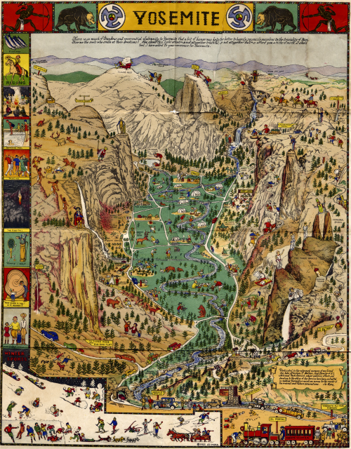
 Of the thousands of maps, illustrations and photographs of Yosemite one sits proud as a work of art that captures the beauty and scale of the valley and is arguably as much loved as the valley itself. Uruguayan Joseph Jacinto ‘Jo’ Mora first visited Yosemite in 1904 and as is the case with the millions of visitors since was left in awe of the sheer magnitude and splendor of the place. The park inspires and whether your interest be climbing, hiking, photography or painting, many are compelled to express their experience. Mora’s map is a response to the sights and sounds he saw in the valley.
Mora became fascinated with the American West in the early 1900s and his first visit included a two week journey from San Francisco. Upon arrival his first view of the valey was diarised as “Soon came to ‘O! My! Point.’ Perfectly charming, fine view of part of valley. Photoed. Drank it all in.”. His copious notes, diaries and photographs became a narrative that captured the ever changing natural landscape and the various ways people were seen to be enjoying their stunning surroundings. He began drawing maps in 1927. The pictorial, humorous style became a trademark that he applied to many areas but it is the Yosemite map first published in 1931 that remains his most memorable.
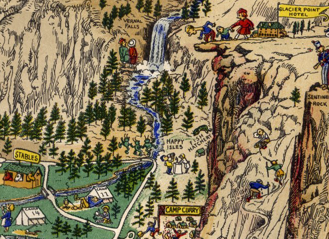
The map provides an overview from the Merced River entrance looking eastwards. The main physical features are clearly represented and labelled along with characters providing an associated visual pun. For instance, a cloud resting on an easy chair is drawn at Cloud’s Rest and a Bishop straddles Cathedral Spires. Indeed Mora explained his humorous style succinctly as “There is so much grandeur and reverential solemnity to Yosemite that a bit of humor may help the better to happily reconcile ourselves to the triviality of man. Give me the souls who smile at their devotions! Now, should this light effort, not altogether truthful, so not although dull, afford you a tithe of mirth, I shall feel I have added to your reverence for Yosemite.”
Many of the people are going about tasks that hint at an autobiographical approach and a representation of Mora’s own experiences. The map was originally printed in black and white but later colour versions published by the Yosemite Park and Curry Company in 1941 and 1949. Many of Mora’s works, including Yosemite, go beyond the humour and depict visual references to indigenous cultures, animals and traditional activities particularly in the border.
Mora’s map is not only meant to entertain but also provide a window into the environment. It’s endlessly fascinating and perhaps as adults his work gives us a way to relive some of the magic of children’s pictorial atlases which we’re no longer supposed to reference as much as a ‘proper’ map. This is, though, a proper map…expertely observed, ground truthed and designed with an attractive style. It helps to begin with a magnificent place to map…but combined with the skill, artistry and humour of someone who had a passion for the place makes an exceptional map.
More of Jo Mora’s work can be seen at his trust’s web site here.


