MapCarte 179/365: Typographic maps by Axis Maps, 2010

MapCarte179_bostontypo

Typography is more commonly used on the map as a literal symbol simply to add context to features that are symbolised using other graphics. We also see a lot of maps where typography is used both as a locative, quantitative and literal symbol combined. Such maps might contain proportionally scaled labels that are located to indicate a specific feature. Often there are no other graphics and the maps have a certain aesthetic appeal.

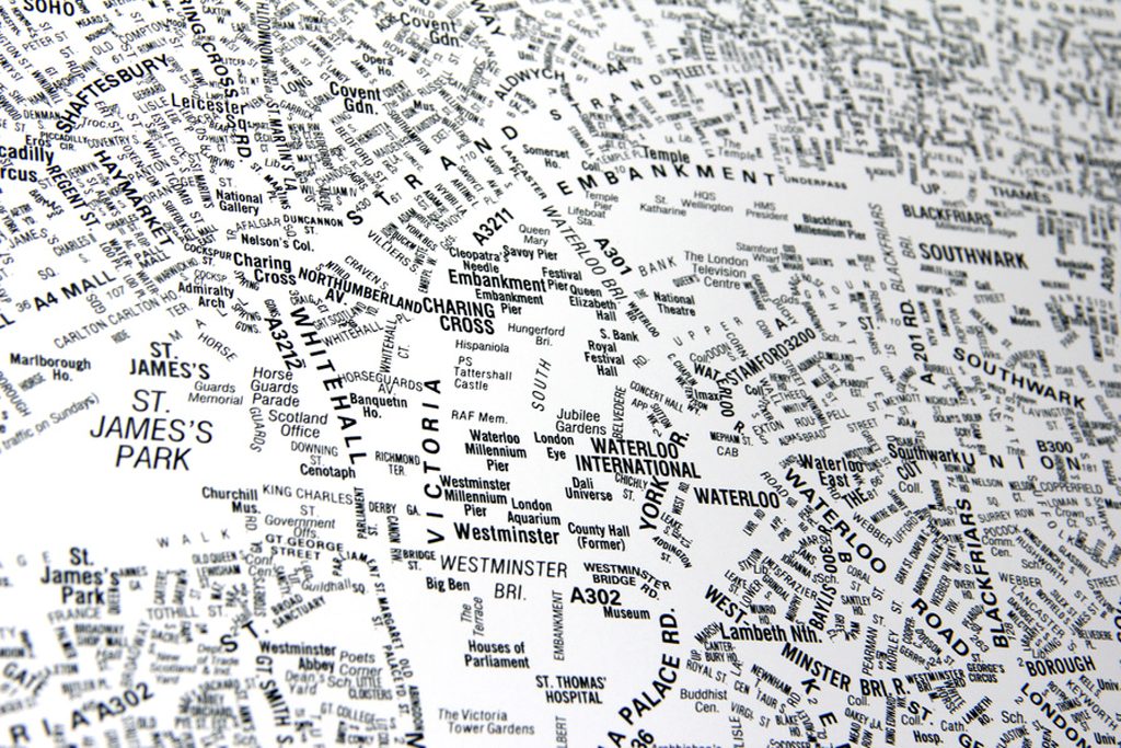
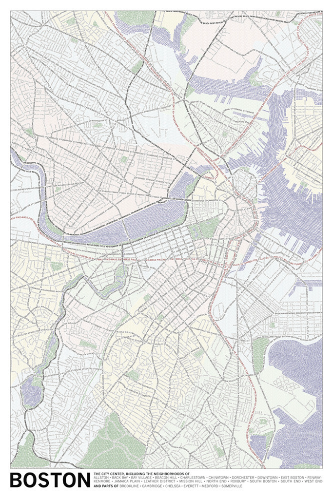
Here, Axis Maps take a slightly different approach by using typography to build the form of a planimetric map itself. The labels that might otherwise be shown once on a standard reference map are now used as a repeated shape to give form to a larger feature. Linear features contain an array of repeated labels and areas use labels as a pattern fill.

MapCarte179_bostontypodetail

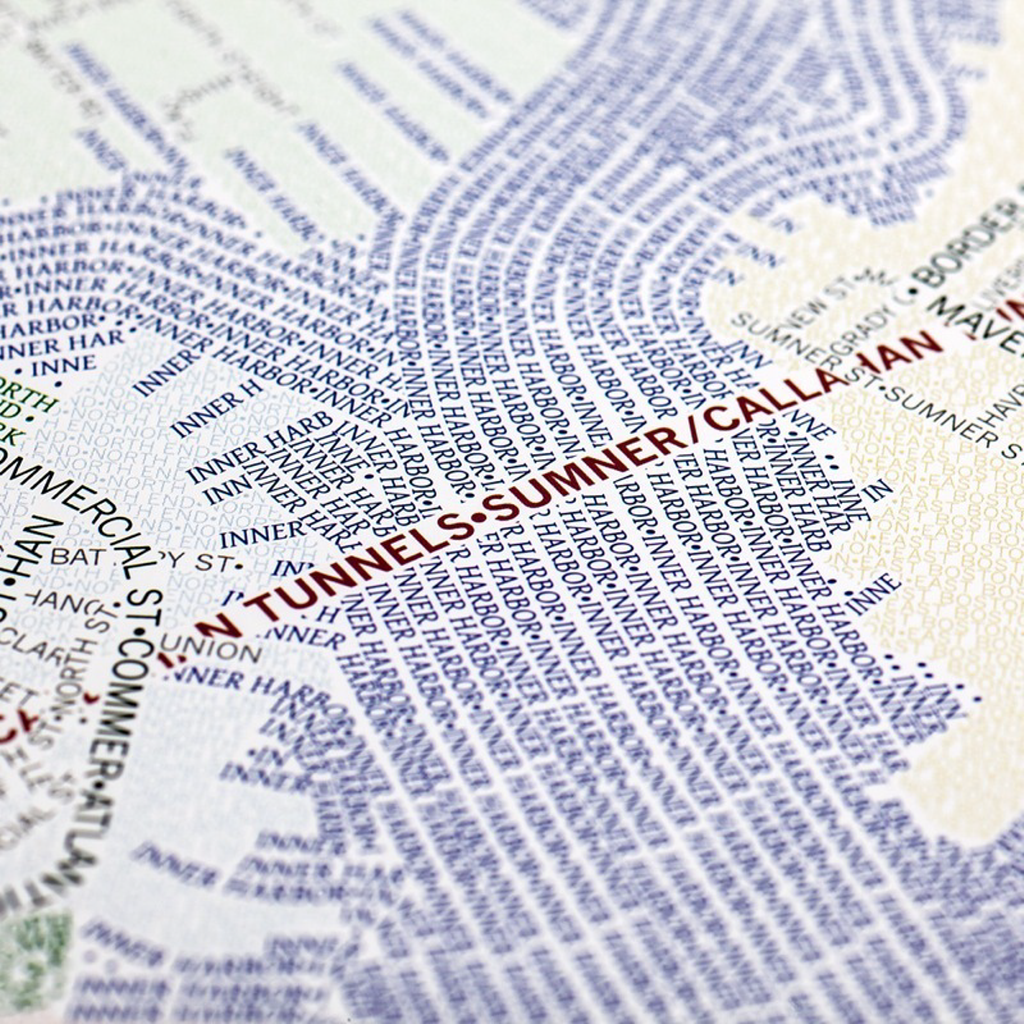
Colour is also used to accentuate the difference between features so we typically see labels that indicate water shown in blue and roads in black. Green spaces are in…green. The overall effect is very appealing both at a distance where structure can be easily seen or close-up where the individual labels can be distinguished.

The maps were produced by manually positioning each letter. While automated label placement is now advanced enough to handle most cartographic jobs to a high standard, this is more of an artistic approach to labelling and requires considerable manual adjustment to get the look and feel just right.

More details and different cities are available on the Axis Maps web site here.

MapCarte 177/365: Tracking the Economic Disaster by Daniel Mason, 2011

MapCarte177_wood

Innovation in cartography can come from anywhere. This is a prismatic choropleth map but wait…it’s made from wood. Created by Daniel Mason at Cal Poly, Pomona, the map displays each state’s unemployment rate (shown by elevation) and population density (shown by wood type).

What mason has done is worked with two very simple visual variables….lightness and height. He uses lightness of the wood stain to give us that typical choropleth look from light to dark. He then adds in height to encode a second variable and because this map is a gallery installation people are able to view from multiple angles to get the effect.

MapCarte177_wood_legendThe map is laser cut but the legend detail is presented in the same exacting way. It brings a sense of accuracy and precision to what might otherwise be seen simply as an artistic piece.

A wonderfully different approach to making a map…not something that you can put in your pocket and go hill walking with but it’s a gallery piece and works very well in this use context.


MapCarte 173/365: Wine Consumption by Alexandre Suannes, 2006

MapCarte173_wineOften the simplest and most abstract maps are the most eye-catching and when the map is designed to appear in a magazine article that’s precisely what’s needed. This is a very simple dataset of wine consumption per person by country. There isn’t much one can do with the data if you’re constrained to a standard world boundary dataset. You could use a choropleth or a proportional symbol map or perhaps venture into cartogram territory but if you have the artistic license to explore different approaches then you can develop something totally different.

This, then, is really just a set of proportional circles rearranged in the form of a bunch of grapes. One might class it as a Dorling cartograpm though there isn’t really any sense of geography being maintained. The colours work well and even though colour is not used to encode anything about the data the different colours don’t detract from the message. This proves that cartographic rules can be broken if a separate element in the design is strong enough to carry it. Normlly, we’d associate different the different hues to some qualitative difference between countries but instead, the grapes motif overrules that impression. It does so effectively.

The overlaps also add to the effect even though usually we’d avoid overlaying symbols like this using transparency as it can confuse the message. Because the colour is not part of the map’s encoding the author can get away with it. Finally, the leaves, the ornate lettered cartouche and the simple legend complete this elegant and effective map.


MapCarte 159/365: City of anarchy by South China Morning Post, 2013

MapCarte159_kowloonUrban landscapes and rich stories of the places we inhabit are often not effectively captured using standard mapping techniques. Large-scale planimetric maps of the order of 1:2000 and above nearly always reduce a place to a surveyed chart. We see road edges and building outlines, all accurately plotted but which fail to convey any sense of the character of a place. That’s not their point and they are more suited to cadastral mapping and other requirements that demand clear, simple deliniation and from which smaller-scale products are subsequently generalised.

Imagine, then, the now demolished Kowloon Walled City, situated next to the old Hong Kong airport, Kai Tak. It measured 213m by 126m and consisted of densely packed high-rise buildings. Mapped planimetrically it would look something like the following:

MapCarte159_kowloon_plan

Sure, you can see it’s dense buildings but it in no way gives you a sense of the place. The South China Morning Post have done though, with their superb isometric cut-away diagram showing the character of the place. The vertical was more important than the horizontal here as planes used to have to take a sharp 45 degree turn to land at Kai Tak to avoid a collision.

MapCarte159_kowloon_detail

Now demolished and replaced by parkland, the city had over 500 buildings and some 50,000 residents by the 1980s with only 40 sq ft of space per person. This represents a population density some 280 times more than Hong Kong itself. The layout of the page is particularly well crafted with small maps, complete isometric maps and annotations providing the detail surrounding the incredible main illustration which is drawn in exquisite detail. The maxim of adding detail to improve clarity is well evidenced in this work and we get some sense of what the place must have been like.

A dystopian place that harboured extreme poverty and unsanitary conditions brought back to life by this unconventional yet excellent map.

MapCarte 156/365: Map of lovemaking by Seymour Chwast, 1980

MapCarte156_loveMaps are often used to explore places we rarely, if ever, get to see. These may be far away lands or even fictional places. They may equally be much closer to home and medicine has long had a need to create intricate maps of the human body. More formally, these may take the form of slices through an MRI scan that provide us with images that can be seen individually or pieced together to make a 3D picture. Such images are no different to representations of terrain that we create by draping a geography over some surface feature and artists and designers have used maps as inspirational drapes over all manner of surfaces.

Here then, a playful commentary on the fascination we have of viewing inside the human body. The renowned designer Seymour Chwast has used the act of lovemaking as a focus for his map that depicts the topography of the various parts of our anatomy. Chwast founded the famous Push Pin Studios in the 1950s and the influential Push Pin Graphic publication has became known for its bold graphic design. Chwast made a number of images of the human body as part of his work.

Chwast uses contour lines to give a sense of organs and skeletal structures having a mass. He also uses familiar colours that we may find on any number of maps of land use to differentiate between body parts. The subtle difference between the male and female bodies, through different colours, allows him to map two people differently. The darkening of colours for the ‘higher’ countoured peaks also gives a sense of depth. The typography is well crafted and without this component the image would be rather one-dimensional. Using type makes the picture a map-like object.

Strictly playful cartography and definitely whimsical but why can’t we use maps to have some fun from time to time?!

MapCarte 141/365: Birds-eye view from Summit of Mt Washington by Boston and Maine Railroad, 1902

MapCarte141_birdseyePoint of interest signage often contain maps to give some context to the geographical features in an environment. We often see mountains, lakes and other prominent natural features illustrated and named. They sometimes take an elongated form that shows an aspect elevation. But the cartography of such signage often goes a little further and uses a ‘panneau’ technique. A panneau is form of panoramic view that contains a 360 degree horizon projected on a flat plane in the form of a circle. They are typical in mountainous areas but can also be found in urban areas with a well known example situated at the Arc de Triomphe in Paris.

This fine example from the early 1900s illustrates the structure of a panneau which has a central part that corresponds to the closest point of observation – in this case the summit of Mt Washington. The main illustration is placed in a wide outer ring where the drawing depicts a 360 degree view of the surroundings. Panneau’s are usually oriented with north at the top and as in this example, typographic elements are right-reading when facing out from the central point of observation.

MapCarte141_birdseye_detail

The approach is highly efficient and captures a considerable amount of detail in a relatively compact form. It gives an excellent mechanism to view each bearing which shows the landscape set out perfectly. This map also illustrates the cloud base often seen below the summit and, uniquely, is designed to show the route and ultimate destination of the cog railroad that ascends the mountain itself.

An intriguing and innovative solution to the depiction of a view around a central point of view, highly effective and a captivating approach to tourist mapping.

MapCarte 140/365: Historical map of Los Angeles by Gerald Eddy, 1929

MapCarte140_losangelesIt’s often difficult to capture a range of different events, that occurred at different times that have contributed to growth of a region. More normally, we see single themes such as how industry has developed, or how transportation networks have developed. We then have to piece together an overall view.

This map of the early 1900s does things a little differently and presents 20 or so major events that led to the growth of Los Angeles. There is no indication of time other than the labels that accompany different vignettes. The map, then, explains the historical development as a collage of events that happened at different times but which collectively have their place in the historical context of the city.

The map makes good use of a progressive projection that curves away from a plan-oblique at the foot to an oblique view at the horizon. This gives a way to accentuate and focus on the study area as well as highlight the importance of Los Angeles by making it larger in relation to the rest of the layout. There’s a good amount of detailed topographic detail, particularly the mountain ranges beautifully depicted along with lush valleys and barren desert. The vignettes occupy space sensibly and are made to fit the available space. For instance, the Stage Line of 1851 is shown relatively large not because it was necessarily more important but because the desert has no other defining detail…so it is used as a space-filler as much as anything.

The vignettes are well drawn, mostly as side elevations, and create a certain dynamism to the map showing a region of growth and importance. Railroads are clearly represented and the typographic components sit well on the landscape.

Eddy uses a great deal of artistic license but does so to a high standard. An illustrative map that tells a simple story.

MapCarte 134/365: Savile Row by Katherine Baxter, 2006

MapCarte134_savilleIllustrative maps are often those we naturally gravitate towards as pieces of art precisely because that’s their primary objective. Rather than being documents we navigate by or from which we recover information and interpret some statistical pattern in data, they exist simply to engage. Done well, illustrative maps are beautiful pieces of artistic work. There are few people who make pictorial maps a centerpiece of their work but artist and illustrator Katherine Baxter loves maps.

Baxter’s fascination with aerial views of the world has given her a focus for many of her illustrations. They have appeared in countless media, newspapers, magazines and books as illustrations, demonstrating a mastery of the axonometric projection. The axonometric is a perfect way to illustrate urban environments since it preserves scale across the entire image. Her work often details architectural detail and this example of Saville Row, London, for Cream magazine shows the attention to detail that makes her work exquisite.

The majority of buildings are depicted as boots, jackets or other tailored items indicative of the Saville Row proprietors. Street and store labels are delightfully drawn, some as clothing labels but all at perfect angles in line with the overall composition. The gardens are shown as a piece of material with chalked out lines and tailor’s scissors. Even the north arrow is made from neck ties.

It’s a delightful illustration and typical of the style Baxter has perfected and which she demonstrates in a wide range of her maps. Art meets Carte and proof positive that illustrators can find a rich seam of work in basing their work on maps to create maps.

More of Baxter’s work can be seen on her web site here.

MapCarte 131/365: London’s Kerning by NB Studio, 2007

MapCarte131_kerningMaps based entirely on typography are abstract representations of a landscape and have been used effectively as fills for land use and through repetition for linear networks.  There’s a lot of them about. They are certainly artistic and it’s fascinating to effectively just use what we used to call the names plate to show a geography that doesn’t actually exist on the ground. Map text takes up a considerable amount of space on a map. It adds meaning and allows us to interpret the landscape using labels and descriptions that we understand.

Type functions literally as well as to locate mapped features.  This example, by NB Studio, was one of the first to gain wide attention and remains one of the most accomplished.  Prepared for The London Design Festival in 2006 as a commentary on social space, the large format poster went on to win the design week awards in 2007.  The map shows only names of locations, streets or places.  Larger fonts reflect more important spaces with smaller fonts representing a less celebrated space.  Smaller type is used as a replacement for roads and view at a distance, the structure of the city emerges as the form, orientation and positioning combine to create landmarks and shapes that can be easily identified.

MapCarte131_kerning2

The map is a great example of the power of typography in map-making and also illustrates how effective a single colour can be.  Maps do not always need to be in colour to be visually stunning or effective. Indeed, this map shows you don’t necessarily need points, lines or areas either! The title is both clever and gives the work character to provide a rounded product.

The poster can still be purchased via NB Studio’s web site here.

MapCarte 127/365: Iceland Illustrated by Borgarmynd, 2012

MapCarte127_iceland1

Click on the image to view online web map

Combining the artistry of a hand drawn map with a modern digital publishing approach may at first seem like some sort of paradox yet there is nothing that states a hand drawn map has to be on paper and a digital map has to be nodes and vertices. In fact, some of the most interesting cartography comes from combining techniques that at first sight might appear to be not particularly well suited to one another.

Iceland Illustrated, by Borgarmynd, have created a large 3D hand drawn terrain map of the country principally as a tourism related product. It is available as a printed map but they have also re-purposed it to provide the backdrop to an online web map. The map provides a beautifully rendered backdrop which is used to provide a base for the location of geotagged photographs of Iceland’s spectacular scenery with modern pictograms showing the locations. Compare the approach with the same areas on Google Maps illustrates the difference. Where Google shows us barren nothingness, Borgarmynd has detail, rock drawing, colour and features. Of course, Google’s approach has to be consistent globally…but when you’re mapping a specific place you can stretch your artistic license a little.

MapCarte127_iceland2

Click on the image to view online web map

The same approach has also been taken for their map of Reykjavik proving that you can easily transfer the same detailed, hand drawn watercoloured approach to a large scale environment and make it equally fit for purpose as the base for an online web map. Again, pictograms mark the locations of photographs and other points of interest. The only difference between the country and city level maps is the former is planimetric (with some plan oblique rendering of mountains) and the latter is an isometric drawing in greater detail.

A very successful marriage of old and new.