
Click on image to view web map
One of the ways in which mapping technology has changed, particularly in the early 21st century is that we now have a wide range of pre-canned work that can be re-purposed as part of our own work. Google’s 2005 map revolution played a massive part in this as the idea of cached, tiled basemaps at multiple scales became the de facto digital map experience. Soon after, people began ‘mashing up’ their own content across Google’s basemap and the mashup craze was born. Cartographers have always compiled their work from a range of different sources, and often used base mapping produced for other purposes, so conceptually this wasn’t anything new but practically this developed into a radical departure. For compile, read mashup.
But what if you don’t want a Google topographic reference map as your underlay? What if you want something else more suited to the data you’re draping across the top? Many mapping companies, design studios and individuals have developed techniques for re-styling other people’s tiles or for re-cooking new tiles based on modifications you make yourself. This provides the map-maker with a fantastic opportunity to prepare a basemap that truly meets the map’s needs.
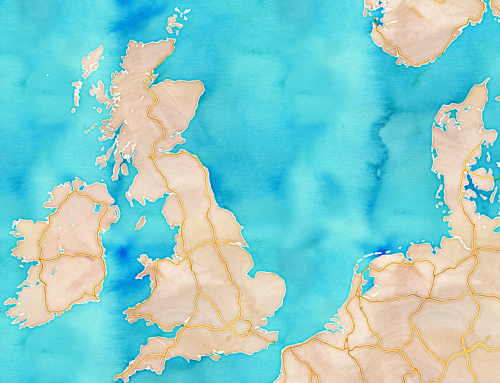
Stamen Design have developed a reputation for thinking outside the box and using a technological sophisticated approach to produce aesthetically pleasing work. This includes digital base maps. They’ve produced many different, eye catching designs but perhaps the one that has caught most attention has been Watercolor. The map takes on an ethereal feel because it’s appearance is similar to the soft strokes of a watercolor painting. Fills are inconsistent in tone, texture and transparency, line widths are not at all uniform in width or colour and many of the features are little more than a hazy amorphous blob. But what an effect!
Click on image to view web map
The concept of taking a digital map data set and portraying it in the most un-digital way possible provides a natural attraction. There’s something very appealing about the way that an apparently painted picture challenges the stereotype of rigid digital data and traditionally produced maps. It provides a very organic product from a very sterile set of coordinate data. As with all good digital basemaps, the detail is re-styled at different scales and the process of simplification and generalisation works well – less detail and more smudges at smaller scales and some refinement as you zoom in.
Many have used the basemap, often, it has to be said as a stand-alone map just because it has a strong visual appeal. Ironically, it’s also been printed and hung as a picture by many too. Of course, as with any basemap it’s also possible to find examples where people have used it wholly inappropriately under data not suited to the style but that’s to be expected. What Stamen did was challenge our notions of what a digital basemap can be and inspired us to move beyond functional digital maps to beautiful digital maps.
More about Stamen’s maps can be found here. Their overall design studio work is here.

Pingback: MapCarte 270/365: A hand drawn map of Toulouse by Karl Azémar, 2014 | Commission on Map Design