MapCarte 158/365: Visualizing friendships by Paul Butler, 2010

MapCarte158_facebook
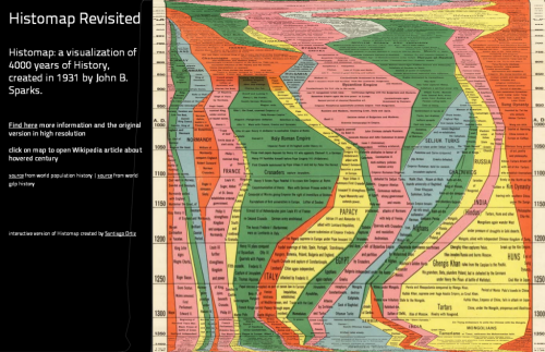
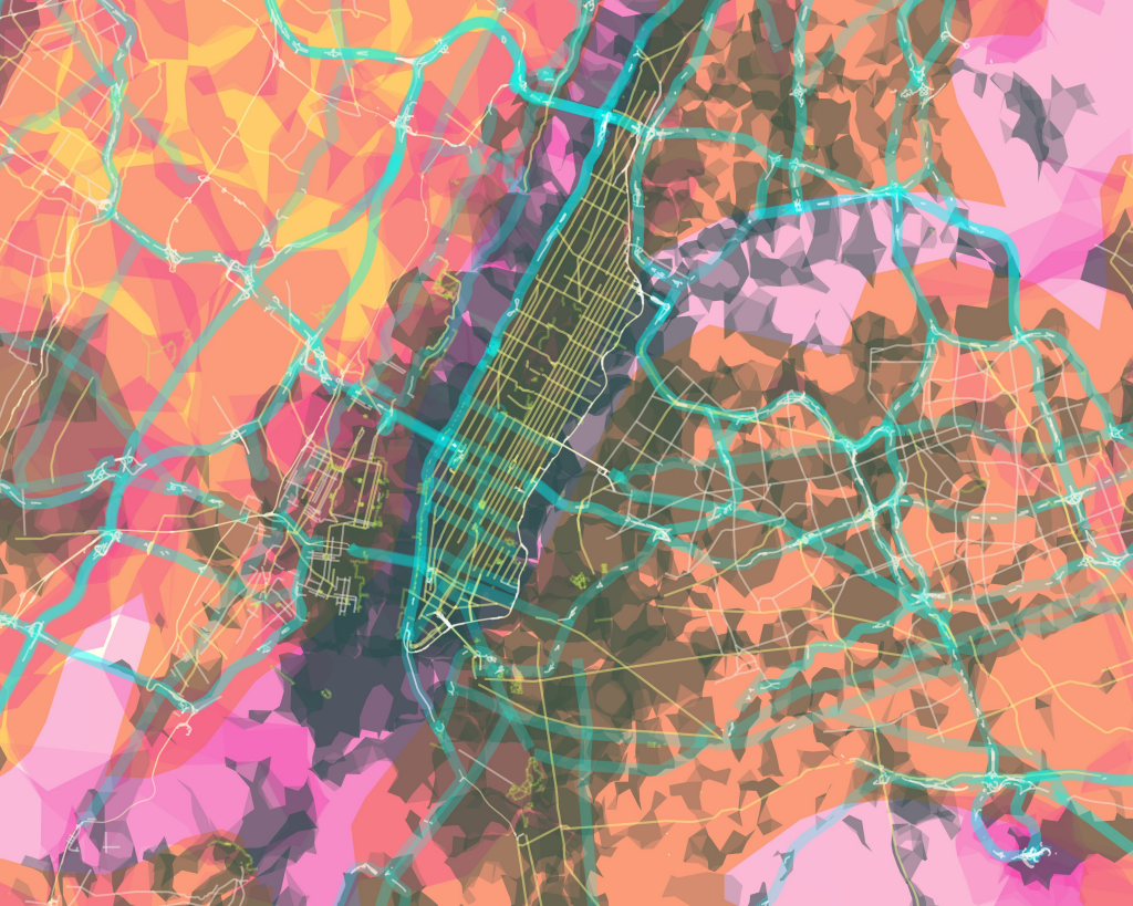
It seems almost inconceivable that we once lived in a time where mapping abstract geometries, overlaying hundreds, if not thousands of features and applying a huge dose of transparency wasn’t mainstream. Yet it was only four years ago that Paul Butler suggested that “visualizing data is like photography.  Instead of starting with a blank canvas, you manipulate the lens to present the data from a certain angle.”

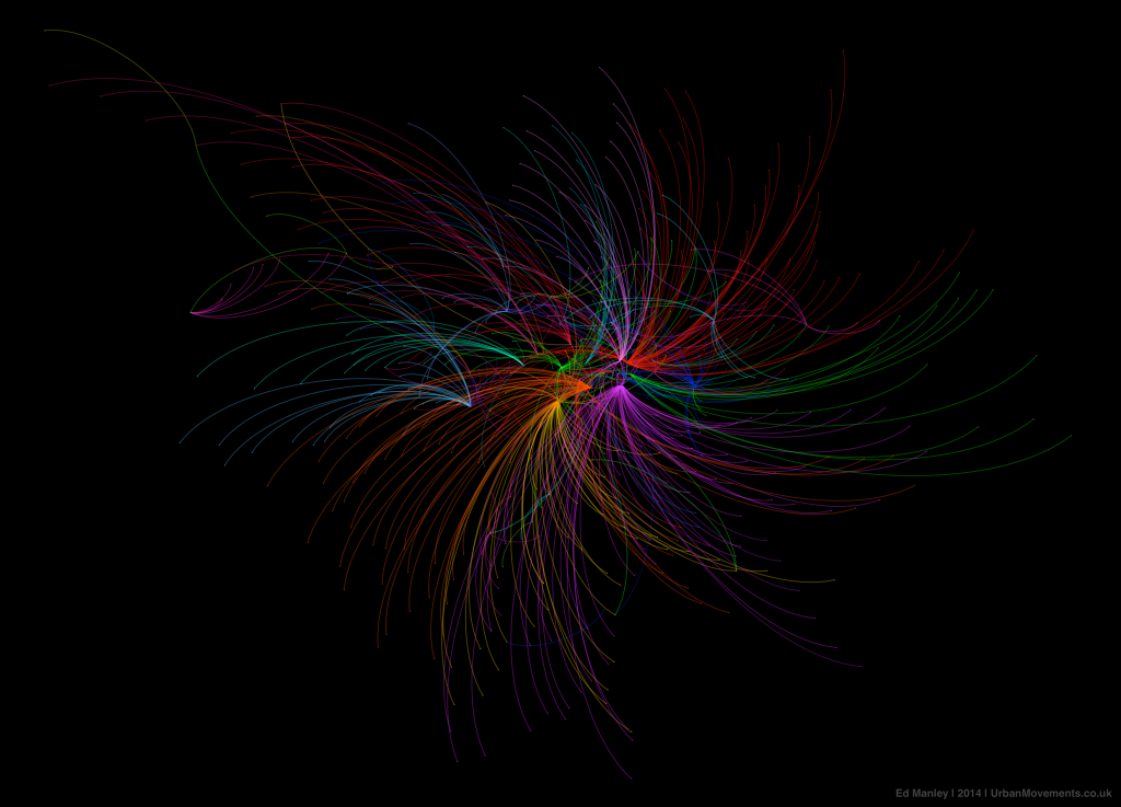
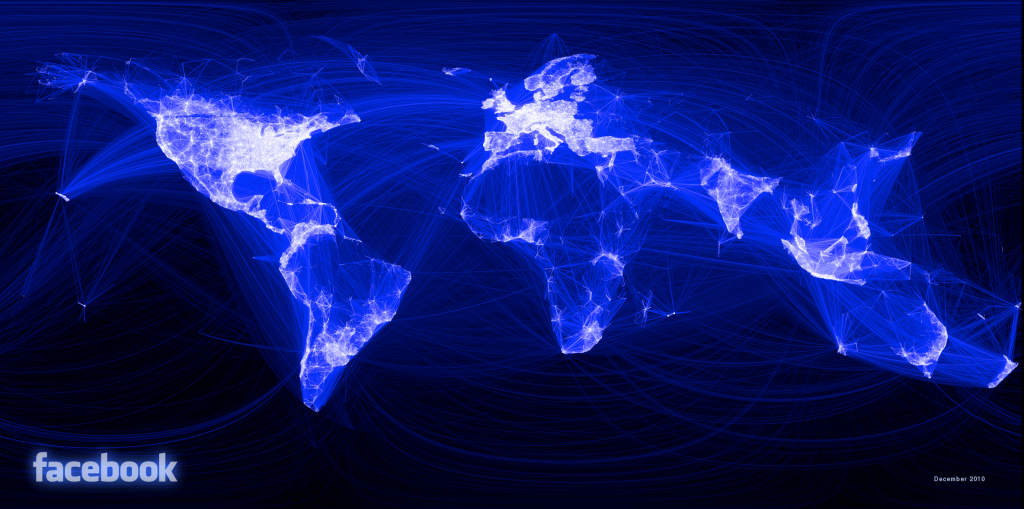
His social graph of 500 million facebook users cleverly demonstrates this philosophy.  He asks “what might the locality of friendship look like between users of facebook” and takes the links between facebook user’s location and the location of their friends, plots a black-blue-white great circle arc between them and the result is a detailed map of the world.  There are no other geographical datasets yet the shapes of continents, locations of cities and some international boundaries emerge. The map is made entirely out of human relationships and the geometries that represent them. He takes the approach of an airline route map yet applies it to other, more ephemeral connections.

The black background contrasts well with the almost fluorescent lines to create a fiber-optic appearance that lights up the globe.  The long distance curves contrast well with the shorter, almost straight, lines of local connections to create an intriguing spider-web pattern.  The facebook logo is so widely known that the map needs no other data or contextual information to enable us to make sense of the theme or patterns.

MapCarte158_facebook_detail

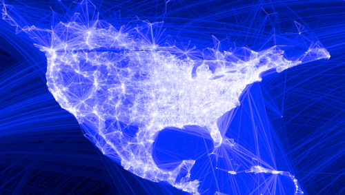
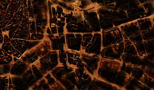
This sort of map has become commonplace; almost boring as people replicate the technique with a multitude of abstract datasets. It obviates the need for a reference basemap to ground the thematics but if you’ve got enough data then the structure of the familiar is seen. You need no other geographies.

MapCarte 157/365: Histomap revisited by Santiago Ortiz, 2013

MapCarte157_histomapView the interactive histomap by clicking the image above

Maps don’t have to be made to look the same. Often, very abstract graphics can be equally deserving of the title ‘map’ even though they may not look anything like our conventional view of a map. In 1931, John B. Sparks produced what he referred to as a histomap which was a detailed diagrammatic layout and explanation of history with a focus on the relative power of contemporary states, nations and empires. It’s a pictorial map that plots four thousand years of world history linearly and which shows us how different countries came to be. The map begins at 2000 B.C. and identifies different ‘people’ loosely based on their geographical location in the world. Time passes as you read from top to bottom over 158cm and these peoples form identifiable groups and eventually, countries.

The original can be viewed on David Rumsey’s Map Collection site here and is an excellent information graphic in its own right. It has twin timelines on the left and the right to aid rapid reading across and the sans serif typeface allows a copious amount of detail to be included. Colours are simple and bold and allow the ebb and flow of the relative proportions of sub-groups to be seen through time. Representing time on any map poses challenges because to be really useful we need to see comparisons between and across different periods. Sparks was successful to an extent because he chose simply to plot everything on one lengthy document but there’s no denying it’s cumbersome.

Step forward 80 or so years and technology offers a new way to view the information. Rather than completely re-imagine the original, Santiago Ortiz has taken it and amplified it by creating a scrolling magnifier. The reader’s focus remains central to the image and simple mouse movements up and down (no clicking or dragging!) make the diagram scroll. The entire diagram fits within the window on screen and simply warps to unfurl as you explore. When you do click, you open a second tab that links to the Wikipedia article for that century. The map, then, not only gives information directly through the original image but adds to it through a link to additional resources. It’s an organised graphical map portal to world history.

There’s often very little that can be done to improve upon classic information design yet Ortiz brings a new approach, user interaction and aesthetic to the work. He enriches it and makes it attractive to modern eyes using modern viewing and data linkage mechanisms.

MapCarte 139/365: Comstock mines by USGS, 1881

MapCarte139_comstockTopology is a vital concept that helps us understand how geographical features are related to one another. There are a number of ways that different topological relationships can be defined so that we better understand what features border one another, or are enclosed by another feature for instance. In cartography, such relationships are often implicit yet the relationship of connectivity is often something that can be used explicitly. Subway maps are really just topological diagrams showing connectivity between stations along with symbology that defines lines of equal value (for instance a named route).

Maps do not always have to show planimetric detail though; and this example of the Comstock Mines map by USGS illustrates how connectivity can be mapped in vertical space. The point at which a mine system enters the ground is largely insignificant in the context of the labrynth that exists below ground. In a system that lacks any form of alternative spatial context it’s vertical and horizontal distances and the connectivity between shafts that dictates the geography. The Comstock Mine maps, a collection of beautifully simple diagrams depicting the mining of silver ore in Nevada in the late 1800s, illustrate how a map can be drawn to show vertical (z) space but on an x, y plane). The slice through the system shows the relative horizontal distance of different shafts but more importantly the vertical distance. Connectivity is clearly illustrated and the use of a graphed background allows the reader to very quickly determine a mine’s depth and also distance.

MapCarte139_comstock_detail

Colours are used effectively to demarcate different horizons in the map and different systems by demarcating each separate hundred feet of depth. These maps, then, are much the same as a modern subway map in that they shows connectivity and the relationship between one component and another clearly.

The Comstock Lode was legendary for the amount of mineral wealth it yielded – something close to an inflation-adjusted $400 million in silver and $270 million in gold per year at its peak. It was also instrumental in the development of extraction technology. Here, though, we can marvel at the gorgeous mapping that was produced by George Becker and USGS.

MapCarte 138/365: Surveying illumination in public spaces by Spin Unit, 2014

MapCarte138_illuminationThe trend for dark backgrounds and base maps in modern web mapping is widespread. There’s often a good reason since contrast between a base and the figural foreground is helped considerably when you use a flat, sparse background. This could be plain white or, conversely, dark grey or black. Given that most screens use an RGB additive colour model then the natural background is black (0,0,0). This is analogous to a traditional blackboard – with contrast being achieved through the use of white chalk. On screen or on a black background, the natural human perception of darker colours meaning ‘more’ is inverted…so as colour increases in lightness and tends towards white, we perceive more.

It’s a dramatic effect and often used with data that itself creates the shape of the geographical features being studied. The impetus for many of these types of image are NASA’s classic Earth at night image where human settlement is clearly picked up through the pattern of urban lighting across an otherwise dark backdrop. We clearly see the outlines of countries and other features.

What makes Spin Unit’s work here so mesmerising is that they haven’t merely represented a single phenomena with symbology that ranges from dark to light values to pick out the form of a street network. That would simply be the location of street lights, each one symbolised with a radial symbol with a light centre that fades to black or a linear feature representing a road with equal treatment along its length.  Of course, light does not appear that way in reality. Instead, they go way beyond simply showing the position of street lights to define a cartography that measures light from the ground level, where people walk, drive and ride. They use statistical models to predict how public space is illuminated. It’s a predicted surface which reveals far more subtlety in shade and areas of dark and light that define lit and unlit neighbourhoods.

MapCarte138_illumination2

The map shows light intensity for central Tallinn but it’s not actual light…it’s statistically modelled light. The beauty of the map is that it gives us a look and feel that gets close to what we actually experience walking through dimly lit streets. There isn’t uniform light so why map it as such? Maps do not have to show actual features with simple symbology; instead they can show us information derived from an analytical process to give us a more realistic appearance.

What makes this map so intriguing is we perceive it as reality because it makes use of an increasingly familiar mapping style. It works because we are increasingly attuned to seeing such map styles and symbology. It also captures a certain atmosphere and almost looks painted in a smudged fashion with a wide range of dark, light and shadow that picks out different real world features as they might be seen by our own eyes.


MapCarte 137/365: European subterranean veins by Accurat, 2012

MapCarte137_veinsIf a map’s main intent is to communicate information through graphical form then they are, by definition an information graphic. Modern parlance has seen the rise (and over-use) of the term infographic which has become synonymous with dramatic, often abstract representations of data. They are often composed of a collection of linked graphs, punctuated by key words, phrases or numerical highlights…the better ones offer some sort of coherent whole that places an emphasis on a well structured layout. This is also the description of a map. Maps have always been infographics, long before someone invented the term…though in the same way that not all infographics are meaningful or well designed, so the same goes for maps. Maps that are abstract (or highly diagrammatic) might very well be seen as belonging to the new fashion for journalistic infographics more than more traditional styles.

This example by Accurat is a terrific example of taking a single theme and developing a strong, abstract depiction of space through the organisation of a range of graphical elements. The shapes of land/water and any typical geographies are eschewed in favour of a mechanism that simply showcases the information. The structure of these components makes the geography implicit rather than the geography itself being used to organise the content.

MapCarte137_veins_detail

The map provides the reader with a fascinating exploration of the underground transport  veins that traverse major European cities. The title is attractive and catchy. The layout is clear and well balanced. The colours are simple and do not compete with each other. The main elements – the proportionally scaled circles give an immediate sense of comparison and scale. There’s a wealth of information on the number of lines, the number of users, the cost, the length of extensions and the geographical reach of the system. The use of size is used to great effect in different ways to connotate magnitude. Colours show us difference. Small multiples illustrate number of users. Labels and textual components are used as a literal symbol to give us headline facts and figures. All classic visual variables, well executed. There’s an extremely subtle visual hierarchy also at work that organises textual components and shades of colour which together give us a sense of figure and ground as well as contrast.

The map itself is clean and well composed but the legend is also extremely well organised giving clear information with even the title ‘legend’ (one of the most pointless labels on any map) being replaced by the far more useful ‘how to read it:’. The graph shows us some comparisions with other distances – rivers, mountains, roads and the Tour de France route. Great comparisons that provide some additional perspective.

This is a very well constructed information graphic. It deals with data that is organised spatially and the spatial dimension affords us comparisons. It’s a map…in the same genre as those by Beck, Minard, Snow etc.

MapCarte 106/365: Mapping Connected Places by Ed Manley, 2014

MapCarte106_manley

Big data is one thing but Ed Manley describes the dataset he used to create this map as ‘massive data’. It’s the Oyster Card tap ins and tap outs across London’s transport network over a 3 month period in 2012. That’s a log of every single journey made by public transport. trying to make any sort of sense of such data requires a clear head but also the ability to mine the data to get to the crux of a very specific question. Without focus and homing in on a tightly controlled idea then work such as this becomes nothing more than a visual data dump. What Manley has achieved here is to extract meaning from the data and represent it with clarity.

The map shows how associated two places are in the transport network by mapping the most popular destination station for any origin station. It’s a gross generalisation but then that’s the idea…to see what the most likely end-point might be for a traveller from the origin of a journey. Manley only used peak period journeys between 7-10am on weekdays to avoid ‘noise’ caused by bidirectional journeys or the very different patterns of weekend travel. He therefore uses selective omission to great effect as well as a range of generalisation operations on the data to capture the nugget of detail he wants.

At a meta level it gives us a glimpse of the structure of the network by route for the morning commuter influx rather than the real network which might map infrastructure itself rather than the routes people travel. The curved lines emphasise the abstract nature of the concept well. Mapping true geography and a network would assign too much meaning to the actual route which may be inaccurate anyway given the multitude of ways to get from A to B. The saturated colours, clean black backdrop and sensible use of transparency add to the visual appeal of the map as does the fact there isn’t a title. The map stands on its own as abstract art. It demands that you read an associated commentary to understand the complexity. An interesting approach that works well.

MapCarte106_manley_detail

The map supports basic knowledge acquisition about interdependencies, key stations, spatial concentrations and stations which act as local hubs in addition to the concentration in central London.  too which are detailed on Manley’s blog about the map.

The old KISS principle of ‘Keep It Simple Stupid’, often taught in cartography classes, is a key tenet of this work. To clarify a complex system, keep it simple. This is exactly what Manley has done in designing not only a piece of data driven map art, but one with a purpose and which can be used to explore questions of the data. A lot of data driven map art is purely for appearances and when explored critically often shows up some serious liberties taken by the designer.

Check Manley’s blog here for more detail and a link to a higher resolution version as well as a version with labels.


MapCarte 99/365: Music for Airports by Brian Eno, 1978

MapCarte99_enoNot strictly a map but Bran Eno’s seminal work carries a map as the album sleeve and it’s as much a part of the package of the work as simply the music itself. As the first in Eno’s Ambient series (each of which had map-like sleeves) the album was composed to provide a relaxing, soporific counter to the hustle and bustle of the modern airport. From the moment you begin a journey, packing everything yet managing to forget that crucial item; through the battle of merely getting to the airport, parking, checking-in and negotiating the inevitable security line, Eno’s audio is designed as the antidote. As you sit back in your own piece of tiny real estate of the aluminium can the music helps soothe the pain of modern travel. Eno exposes the lack of romance to modern travel as we’re swept away in a world of audible delight but the experience begins with the album sleeve.

The map is a fundamental element of the overall package. It’s simple and plays well as a visual accompaniment to the music. It depicts the hazy out-of-focus view we get from high altitude as we crane our necks to make sense of the vastness below. There are few cities; few urban places that cover the earth; and we tend to use air travel to traverse the voids in between…deserts, plains, mountains and oceans. Here, the cover shows little more than a desolate landscape criss-crossed by rivers. It’s distinctive, abstract cover art designed by Eno himself. There’s a network of tendrils that may be rivers…they may equally be tree branches, or lines on an ancient map. There’s differences in colour that may relate to land use and there’s even lines that suggest a graticule. The palette of colours is equally simple and muted with earth tones that are designed to allude to nature and the peace and tranquility that it provides in contrast to the sterile surroundings of an airport.There’s an uppercase T in the lower right giving a nod to some abstract, un-named place but the map has no labels because, of course, labels do not exist in real life. Instead, we’re left not knowing where we are or what the various features are that we can barely make out.

It’s at the artistic end of the cartographic spectrum for sure, but maps make very good art and this example shows how the design of the imagery for the album creates a package that allows you to listen with your eyes before you even plug the headphones in. Happy Flighting!

MapCarte 61/365: PrettyMaps by Stamen Design, 2010

MapCarte61_stamenpretty

View the online map here

Described as an ‘experimental design’, Stamen have thrown away the rule book with this example of styling digital data to the extreme. It’s not so much a map as a work of art taking many aspects of modernism and applying it liberally to the data. It owes much to artists such as Jasper Johns who made the map of the U.S.A. famous when he used it as a basis for his own experiments with abstract map imagery (MapCarte 3/365)

Virtually every aspect of this map is counter to how you would typically style features with bright contrasting colours and angular shapes yet hiararchy of features is preserved, they are recognisable and can be distinguished from one another in the landscape. The map is not especially useful as a backdrop for other thematic detail yet the point of this is to explore ways of re-imagining the map and challenging our preconceptions of map design.

It has a strong aesthetic and although rendered as an online map, the beauty of this work is not necessarily as an online map – as it makes heavy weather of rendering in the browser – but the style it deploys.

MapCarte 50/365: Web trend map 4 by iA Inc, 2009

MapCarte50_webtrend

Not the only map of the internet but his well produced schematic maps the most influential internet domains and people onto the Tokyo Metro map. Each domain is assigned to individual stations on the map in ways that complement the characters of each.  Complementary websites are grouped to a line that suits it and the map produces inter-linkages among companies in multiple ways inspiring some intriguing interplay.  For instance, Twitter is assigned the station with the biggest ‘buzz’ and Google is mapped at Shinjuku which is the world’s busiest station.

MapCarte50_webtrend_inset

Web domains can be evaluated based on their position (proximity to a main line or hub representing importance), height (success measured in traffic, revenue and media attention) and width (stability as a business entity).  The axonometric gridlines define street level with all subways positioned below the gridded surface.  The Trend Setters are labeled using speech bubbles as if they are saying their name and other labeling works well to support differentiation of major trends.  The colour palette is extraordinarily vivid and works well against pure black.  Why map the internet in this way?  As iA say themselves: because it works.

MapCarte 9/365: Country Codes of the World by John Yunker, 2008

MapCarte8_Yunker

A map of the world’s top level country code domain names (as of 2008) that efficiently captures a number of pieces of information using some simple cartographic approaches. Locational information is encoded simply through the positioning of each label in the centre of the territory it relates to. There are no lines or boundaries on the map but because of the use of the label in this way we see the familiar shape of the world emerge. The sizing of labels helps this by varying according to relative population totals…with a contraction of China and India to enable them to fit the layout and a grouping of those countries under 10 million residents to avoid infinitesimally small type. The result is a proportional symbol map of population that uses text as both a literal and a scalable symbol. Colour is used to good effect to identify continents and as a visual link to the legend. Simple and abstract concept and a good example of the genre of maps whose form relies heavily on typography.

The map is available to buy as a high quality print here.