MapCarte 193/365: London Underground Circuit Map Radio by Yuri Suzuki, 2012

MapCarte193_tubecircuit

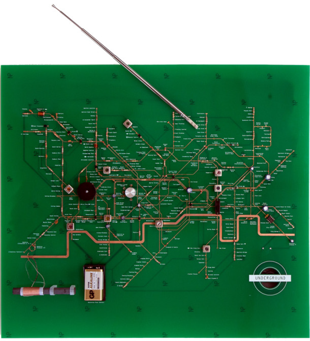
There are not many maps that would be included in any list of great examples of design that are based entirely on another map to the extent that they are practicaly copies. This map, we feel, is different. For a start it is based on one of the most iconic maps and a design classic – the Beck tube map of the London Underground railway. So it’s got ‘good bones’ which is a start. But the inclusion of Suzuki’s map here is simply because he has turned a classic into something altogether different.

This map is a radio. Suzuki has built a map in the form of the London Underground map that operates as a transistor radio. The circuit board plots out the map’s lines and various components on the radio such as transistors and dials, form stations and interchanges. The marriage of form and function may at first seem baffling but Harry Beck was an electrical draughtsman and though he was supposed to have based his own map on an electrical circuit this was somewhat of a myth. Suzuki, though, has used this as homage to Beck and created the diagram as an electric circuit. He also builds upon a version of the actual map drawn by Beck some years after the original that was in the style of a real electric circuit…a response to some of the comments he had received about the similarities to an electric diagram.

MapCarte193_tubecircuit_detail

Suzuki has created a wonderful object. The map is an undeniable classic but building upon the idea of the map as an electric circuit brings is fitting. A great piece of map art…that has form and a function.

MapCarte 139/365: Comstock mines by USGS, 1881

MapCarte139_comstockTopology is a vital concept that helps us understand how geographical features are related to one another. There are a number of ways that different topological relationships can be defined so that we better understand what features border one another, or are enclosed by another feature for instance. In cartography, such relationships are often implicit yet the relationship of connectivity is often something that can be used explicitly. Subway maps are really just topological diagrams showing connectivity between stations along with symbology that defines lines of equal value (for instance a named route).

Maps do not always have to show planimetric detail though; and this example of the Comstock Mines map by USGS illustrates how connectivity can be mapped in vertical space. The point at which a mine system enters the ground is largely insignificant in the context of the labrynth that exists below ground. In a system that lacks any form of alternative spatial context it’s vertical and horizontal distances and the connectivity between shafts that dictates the geography. The Comstock Mine maps, a collection of beautifully simple diagrams depicting the mining of silver ore in Nevada in the late 1800s, illustrate how a map can be drawn to show vertical (z) space but on an x, y plane). The slice through the system shows the relative horizontal distance of different shafts but more importantly the vertical distance. Connectivity is clearly illustrated and the use of a graphed background allows the reader to very quickly determine a mine’s depth and also distance.

MapCarte139_comstock_detail

Colours are used effectively to demarcate different horizons in the map and different systems by demarcating each separate hundred feet of depth. These maps, then, are much the same as a modern subway map in that they shows connectivity and the relationship between one component and another clearly.

The Comstock Lode was legendary for the amount of mineral wealth it yielded – something close to an inflation-adjusted $400 million in silver and $270 million in gold per year at its peak. It was also instrumental in the development of extraction technology. Here, though, we can marvel at the gorgeous mapping that was produced by George Becker and USGS.