MapCarte 109/365: Mt McKinley by U.S. Army Corp of Engineers, 1941

MapCarte109_mckinley
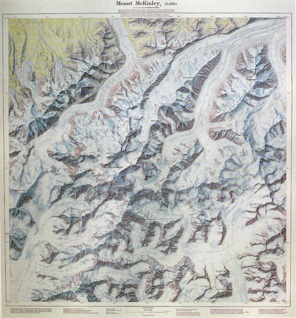
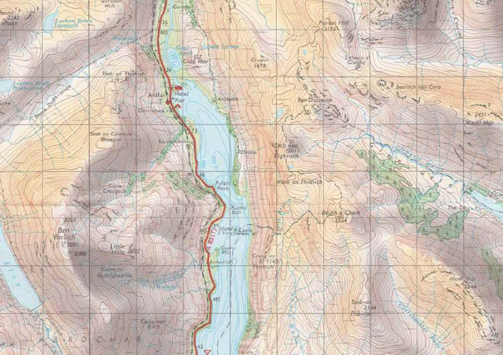
Relief representation is always a challenge for cartographers. It often makes or breaks a map giving the representation realism or appearing to sit uncomfortably. The choice of method alone is cause for a headache…illuminated relief shading, hachures, contours, hypsometric tinting and a multitude of alternative approaches provide a rich palette. The ultimate goal is to create a representation that mimics the three-dimensional character of the landscape itself and which can be easily understood by the map reader. Unless you know how to read a map, traditional techniques such as contours can appear confusing despite them being blatantly obvious to the map-maker. Here then, is perhaps the most readily understood form of relief representation – the plastic relief model.

This example of Mount McKinley illustrates the pinnacle of small format plastic relief model design. The model itself is well produced. The two dimensional surface is created in a mould that warps the plastic using heat. The physical character of the landscape, its hills, valleys, ridges and depressions are faithfully reproduced and once the topographic map has been overprinted the landscape springs to life in real 3D. Of course there are problems with this sort of map. Firstly, they often require considerable vertical exaggeration to make features across a large area appear sufficiently to make the third dimension believable. Exaggeration, of course, is part of the cartographer’s generalization toolbox and applied with care can emphasise the features sensibly which this example evidences.

The Lambert conical projection gives this map its curvature but the cartographers have used the flat borders to great effect to relay the detail for the legend. Rather than orientating everything to read in the same way, the reader has to rotate the model to see different information. A nice touch that promotes the idea that the model can and should be viewed from multiple angles to reveal different perspectives. The printed map is of a high quality that helps ensure the model is pleasing to the eye as well as detailed and informative.

MapCarte109_mckinley_detail

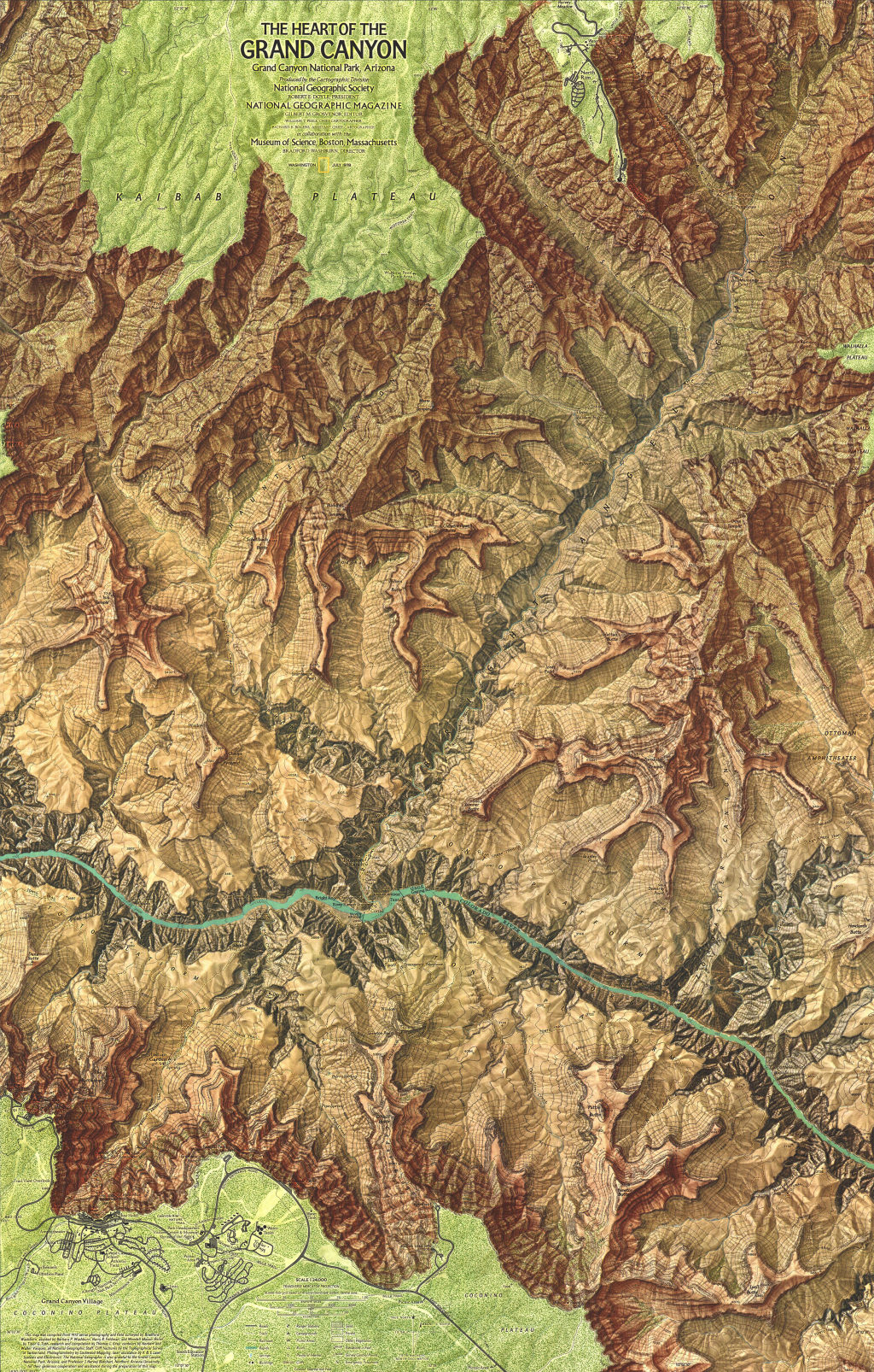
The main drawback to the adoption of plastic relief models is their relatively high cost of production, storage issues and the fact that the plastic degrades. Maps such as these remain collectible and sought after. They have also been used as a way of generating two-deimensional shaded relief using a camera with a long focal length and then combining the photograph with other planimetric detail. The use of LiDAR scanners have also been used to create three-dimensional point cloud of plastic relief models to allow the recreation of a computerised 3D model.

Nothing compares to the use of a three-dimensional object to show relief.  It provides a tactile representation of reality that no computer generated model can similarly achieve. This is a beautiful example of the type and as a delightful map object in its own right. Of course, a 2D computer screen cannot do this work justice but…go find a copy!

MapCarte 105/365: Mount McKinley by Bradford Washburn & Swiss Federal Office of Topography, 1980

MapCarte105_mckinleyDr Bradford Washburn and his wife Barbara dedicated much of their life to exploration of many of the United States’ most extreme, inhospitable and uncharted environments. Their quest to study such landscapes in detail requires many months of effort and the results are brought to life and to the eyes of others through such sublime works as this map of Mount McKinley, Alaska – the highest mountain in the United States.

McKinley and the Washburns hold a number of firsts. Barbara Washburn was the first woman to climb McKinley’s North Peak. Bradford Washburn first climbed McKinley via the Muldrow route in 1942 and again in 1947. He was also the first to ascend the West Buttress in 1951 and led the first flights to capture aerial photographs of McKinley in 1936 for National Geographic Society. He was also the first person to land a helicopter in the mountain in 1949. It is this sort of dedication to understanding a place that gives the Washburn’s an unparalleled understanding. Many maps these days are constructed by people who have never visited the place they are mapping. They use secondary data sources. That’s not to say their work cannot be detailed and accurate yet the fact the Washburn’s spent over 200 days mapping McKinley’s terrain gave them a wealth of first hand knowledge to transfer to the map. That sort of knowledge is priceless in the attention to detail that a truly great map exhibits.

MapCarte105_mckinley_detail

This is a masterpiece of topographic cartography, not just for the detail but also for the artistry in its presentation. Printed by the Swiss Federal Office of Topography the shaded relief is an example of the expertise in relief depiction we have come to expect from Swiss mapping. The relief on this map, though, goes a stage further and combines a range of soft shades of blue that give the map an ethereal feel of cold desolation. It creates an impression of atmospheric haze enveloping the mountain. The same colour palette is used for the contours so they sit within the design rather than becoming too prominent in their own right. The map is supposed to relay some of the realism of the place so the map’s contours are made to appear as much a part of the landscape as they can.

A perfect topographic map that combines artistry with scientific achievement and dedication.

MapCarte 100/365: The Heart of the Grand Canyon by the National Geographic Society, 1978

MapCarte100_washburn

Bradford and Barbara Washburn were mountaineers, explorers and cartographers.  During an impressive career they were strongly supported by the National Geographic Society and many of Bradford Washburn’s maps are unrivaled in the realm of mountain cartography.

It took seven years and numerous skilled individuals to survey and map the Grand Canyon at 1:24,000.  Washburn’s original maps were combined by Lockwood Mapping, cliff-drawing was by Rudi Dauwalder and Alois Flury in Switzerland and relief-shading crafted by Tibor Toth at National Geographic.  Browns bear similarity with natural wood and textures help immerse readers in the landscape.  The colour transition of the landscape from the vivid green plateaus to the ocher red canyon arms to the deep brown-grey valleys and turquoise waters creates a stunning contrast.  The colour palette is exquisite.

MapCarte100_washburn_detail

At such a scale, Washburn was able to represent the Canyon in a way never before seen and as a large format poster the map remains a classic National Geographic product for which the Washburns received the Alexander Graham Bell Medal for “unique and notable contributions to geography and cartography.” Maps are simply not made like this any more. It’s the epitome of dedication and commitment to the craft of making a map.

It’s a spectacular map that represents  some of the very best in terms of data acquisition as well as detail, accuracy and cartographic representation. The fact that the map has such a strong aesthetic is the icing on an already impressive cake. If only all maps were made to this standard!

MapCarte 75/365: Khumbu Himal by Institute of Cartography at TU Dresden, 2013

MapCarte75_dresdenIf you’re going to take over the job of mapping the famous Scientific Association for Comparative High-Mountain Research maps of Nepal then you’d better do a good job. Here, Manfred F. Buchroithner, Thomas Himpel and Hannes Künkel from TU Dresden have artistically redesigned the 1965 original map and employed somewhat unconventional colour schemes to create a beautiful printed map. Using extensive fieldwork and current satellite imagery the map content has been updated and changes in the land use are in evidence as for the first time, tourist information is presented.

MapCarte75_dresden_detail

At a scale of 1:50,000 the map shows considerable topographic detail. The lineage of classic Swiss-style depiction of mountain terrain is evident but the colours have been tweaked to give even clearer lines. The detail is breathtaking and although the map is abstract (the earth doesn’t actually look like that of course), the colours and symbology give you an unparalleled sense of place. The production of the map as a large format printed sheet gives strong credence to the claim that print mapping is not dead in an era when the balance of map publication is shifting towards the screen. When maps are designed and produced to this high quality they deserve to be created as tangible objects to enjoy.

MapCarte 68/365: Grand Canyon: Bright Angel by United States Geological Survey, 1903

MapCarte68_usgsRepresenting relief is always a challenge for cartographers and there are numerous alternatives. How, then, do you decide to represent the Grand Canyon which has one of the world’s greatest vertical difference across one of the shortest horizontal distance?

United States Geological Survey chose to simply use contours and their map of 1903 shows how simplifying the map by choosing only a single representation can bring increased clarity. More normally, you would see hill shading or hypsometric tinting used in conjunction with contours but in Grand Canyon the contours are packed so tightly together that they capture the topographic variation perfectly on their own.

MapCarte68_usgs_detail

The ochre colour of the contours adds to the effect since they reflect the reddish sandstones found in the canyon and the thickening of key contours gives a sense of the sandstone layers that in the canyon have a very distinctive pattern. There is very little additional detail other than the hydrology and labels. There doesn’t need to be any additional detail as the contours make this map what it is.

MapCarte 56/365: Die Landschaft Toggenburg by Johann Scheuchzer, 1710

MapCarte56_scheuchzerOne often forgets the amount of work that was required to prepare a map in centuries past and this example illustrates the craft of copper-engraving as a method by which maps were drawn. The copper plate was engraved as a mirror image to prepare for printing…and the craftsmanship was down to highly skilled engravers. The results were often highly illustrative.

Here, Johann Jakob Scheuchzer prepared a beautiful map of the landscape of Toggenburg district, St. Gallen Canton. It shows the location of major topographic features such as cities and towns but the map belies the continuous religious strife that engulfed the area in the fifteenth to eighteenth centuries. What it does do is present the mountains as an illusive and highly symbolic, almost mythical element of the natural landscape. The reasons for such a representation were to give a sense of place to the home of ‘dragon sightings’ catalogued extensively by Scheuchzer in the early 1700s.

The marriage of mythology and copper plate artistry creates a magical picture of the dramatic mountainscape.

MapCarte 52/365: United States by Raven Maps, 1987

MapCarte52_ravenThis spectacular large format wall map of the contiguous 48 states of the U.S. displays the diversity of the country’s landforms in detail. At a distance, the map clearly shows the topography using beautifully rendered hypsometric tinting and masterful hill-shading that crates contrast between mountainous regions and the great plains.

As you move closer, the state capitals, cites, and highways  are revealed and the design illustrates how to apply hierarchy in a map that can be read in different ways at different viewing distances. The use of pure white as a background gives the map a crisp, clear contrast against its background that accentuates the dramatic colours used. A great example of the craft of making a large format wall map.

At nearly 5ft wide, this map uses the available space to good effect and although a reference map designed for hanging, makes a piece of wall art too. Designed by Stuart Allan and published by Raven Maps and Images, the same approach has been taken to map larger scale versions of individual states. More details on their web site here.

MapCarte 42/365: Mount Everest by the National Geographic Society, 1988

MapCarte42_natgeo

Mount Everest has been mapped extensively using a plethora of relief representations.  Possibly the most frequently cited example of excellence in design is by Eduard Imhof in the 1960s for his impressive use of colour. Here, though, Bradford Washburn used Swissair Survey aerial photos and Space Shuttle infrared photos to plot Mount Everest at 1:50,000 before applying his beautifully drawn representation.

Possibly the last example of hand drawn Swiss relief representation makes clear the most detailed and accurate map ever made of Mount Everest.  The digital age has yet to provide ways of matching such exquisite artistry.  The peaks, glaciers, rocks and hydrography are particularly clear with scree slopes depicted in astonishing detail.  Blue contours sit well in the overall design and take on the appearance of layers of ice.  The typography is beautifully set and the map has a soft, photo-realistic feel that adds visual impact.  The border separating China and India is so subtle it looks like it is actually painted on the ridgelines.  A masterpiece of accurate planimetric terrain representation showing natural beauty and scientific information in the most vivid possible way.

MapCarte 30/365: Tourist Editions of the One Inch map by Ordnance Survey, 1950s/60s

MapCarte30_os1

By the middle of the twentieth century, developments in surveying, photogrammetry, cartographic reproduction and printing technology had modernised medium scale topographic mapping. Ordnance Survey’s popular One-inch to the mile series provided the foundation for various tourist editions that demonstrated the mapping technology using the dramatic geography of the united kingdom’s most scenic and varied landscapes. The example here is from the Loch Lomond and The Trossachs Tourist Map (1:63,360) and illustrates the accurate contouring that characterised the work but also the way in which the design effectively captures both high and low relief areas.

The maps could have merely illustrated contours for representing relief but they added purple/grey hill shading for the shaded slopes and a light yellow-buff for the lit slopes that gave character to the slopes and which mimic, to some extent, the purples often seen on heather-clad slopes. Pale green tints are applied to lowland areas. This map would not have worked as well with Imhof-inspired blue hues better suited to mountainous areas and demonstrates that the geography of an area should in part lead the map-maker to make choices in depiction that relate to specifics and not just cartographic principles. There’s a subtlety in the colour choice that works particularly well on this map.

MapCarte 20/365: Seafloor map of Hawai’i by Tom Patterson, 2012

MapCarte20_Patterson

Tom Patterson’s beautiful map of the seafloor topography of the Hawaiian islands is pleasing on the eye due to the balanced layout and choice of blues he uses for the bathymetry. Blue, of course, is routinely used for representing water features but here, Patterson veers towards turquoise and aquamarine that gives us an impression of clear tropical waters. The lighter coastal waters provide a natural vignette to emphasise the land/water zone.

The often dramatic and explosive volcanic forces at work that create the islands are in some respects subdued by the colours but the seafloor terrain is captured in all its jagged detail using a plan oblique technique. Text is well placed and designed with a simple sans serif font and colour aids in differentiating text by function and also to place the labels in different visual planes.

Large hi resolution versions and wall maps can be downloaded from Tom’s website here.