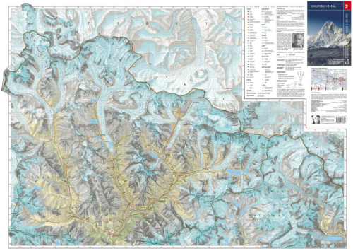
 If you’re going to take over the job of mapping the famous Scientific Association for Comparative High-Mountain Research maps of Nepal then you’d better do a good job. Here, Manfred F. Buchroithner, Thomas Himpel and Hannes Künkel from TU Dresden have artistically redesigned the 1965 original map and employed somewhat unconventional colour schemes to create a beautiful printed map. Using extensive fieldwork and current satellite imagery the map content has been updated and changes in the land use are in evidence as for the first time, tourist information is presented.
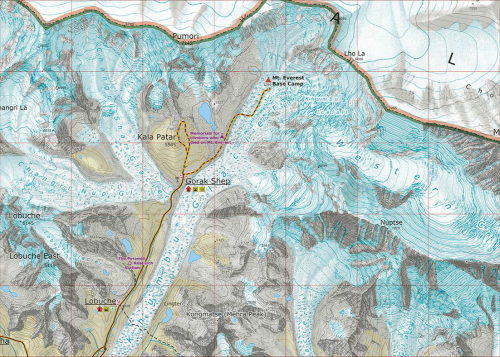
At a scale of 1:50,000 the map shows considerable topographic detail. The lineage of classic Swiss-style depiction of mountain terrain is evident but the colours have been tweaked to give even clearer lines. The detail is breathtaking and although the map is abstract (the earth doesn’t actually look like that of course), the colours and symbology give you an unparalleled sense of place. The production of the map as a large format printed sheet gives strong credence to the claim that print mapping is not dead in an era when the balance of map publication is shifting towards the screen. When maps are designed and produced to this high quality they deserve to be created as tangible objects to enjoy.


