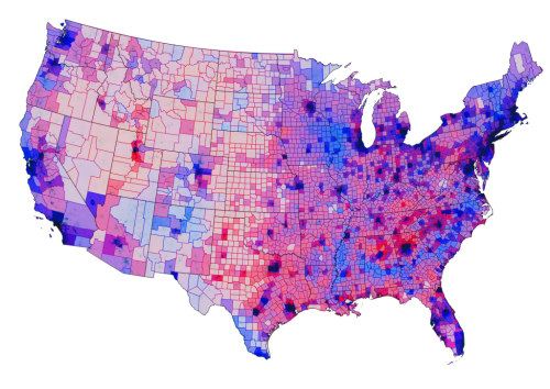
MapCarte 334/365: 2012 Presidential election by Chris Howard, 2012

MapCarte334_howardThe choropleth technique is a standard thematic mapping approach which is flexible and relatively easily understood by map readers. The principle is simple…where enumeration areas have a greater relative magnitude, they get shaded darker and vice versa. There’s some simple design rules for choropleths such as ensuring you’re using normalized data, that is, data that equalizes for population or some other denominator which is important to ensure we see areas symbolized properly in relation to others. It’s also important to set up the shading scheme with colours that connotate some quantifiable difference between areas. We naturally see shades of any hue in this way (e.g. light to dark red or light to dark blue). That’s not to say we can’t get a little creative with the choropleth which is what Chris Howard has done here with his map of the 2012 Presidential election result in the USA.

Howard uses a diverging colour scheme with a mid purple where the Democrats and Republican’s shared a pretty even vote. The colour moves towards a strong blue for areas that have a strong Democrat share and to red for a strong Republican share. This is a standard approach where you have a dataset that tends around some mean, average or key value. He goes further though and creates a version of the value-by-alpha technique created by Roth, Woodruff and Johnson. The original value-by alpha technique assumed a black background and the general idea is to use a layer of transparency across the top of the standard choropleth that modifies what we see according to a second piece of information. For the results of the election, transparency is used to encode the population density. The alpha layer is highly transparent where the population density is highest, and near black where it’s at its lowest. This has the effect of highlighting the areas that have more voters. Howard has simply created a version against a white background with increasing white added to the alpha layer where there are lower population densities. We therefore see a set of muted colours that decrease their importance in visual perception…in line with the very nature of such areas in voting terms. Fewer people just don’t contribute as many votes.

It creates a beautiful map with a wide range of colours but one that is perfectly understandable. Howard also goes further by adding a layer of populated places that sits in the map and just gives a subtle highlight to the major cities, helping them stand out a little. He also changes the colour of the County borders to either a red or blue to show the predominant vote in that area.

Choropleths can seem rather boring despite their utility. By thinking a little about how you might be able to develop the visual message you can end up with some very attractive thematic maps that invite perhaps a little more interest.

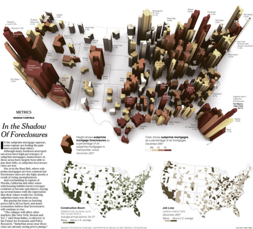
MapCarte 248/365: In the shadow of foreclosures by the New York Times, 2008

MapCarte248_foreclosures

Very few newspapers have a team dedicated to data visualization and information design. Many produce data dumps that are the antithesis of design.  The New York Times, however, creates consistently high quality maps and graphics to tell their stories.

Small Labs Inc provide an excellent repository of over 300 superb examples of their work to date which are a catalogue of best practice in thematic map design – viewable here.  It’s almost invidious to select one example of their work that sits above all others but we’re going to try…

The map of foreclosures from 2008 displays multiple variables in a striking 3D graphic giving the map the look of buildings on a city landscape.  The map labels don’t dominate even though they add important contextual statistics.  Subtlety is the key here.  The fine san serif shape means it sits further in the background and doesn’t obstruct the foreclosure shapes.  The white US country background provides a neutral landscape for the buildings to emerge from.  Simple, thin, solid black lines delineate the state lines. The map page is complemented by two traditional but expertly constructed choropleths and the overall page maintains a clean fresh appearance with excellent visual balance.

We could point to the fact that the perspective 3D view makes measuring the building heights for comparison a little difficult but in the context of the readership and presentation it’s sometimes perfectly reasonable to break a few cartographic rules. A great example of data journalism that uses cartography to good effect and with purpose.

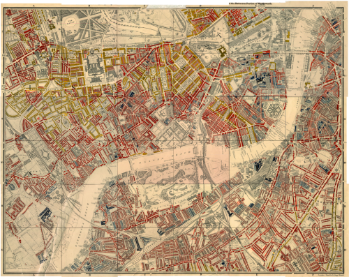
MapCarte 161/365: Maps Descriptive of London Poverty, by Charles Booth 1898-9

MapCarte161_boothCharles Booth, an English philanthropist and businessman is renowned for his survey into life and labour in London at the end of the 19th Century.  Critical of the value of census returns as a way of identifying inequality, he set to work investigating poverty for which he was recognized by awards from the Royal Statistical Society and the Royal Society.

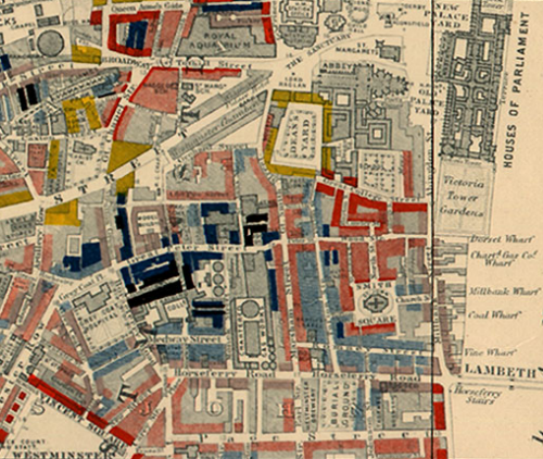
The Maps Descriptive of London Poverty (there are 12 in the set of whichare an early example of social cartography..or cartography that draws attention to social circumstances in order to encourage some sort of social change.  Using Stanford’s  6 inches to 1 mile Map of London and Suburbs, Booth coloured each street to indicate the income and social class of its inhabitants.

MapCarte161_booth_detail

This choroplethic overlay on a light base is an early form of ‘mashup’ and used a rudimentary diverging colour scheme with black for the lowest class (Vicious, semi-criminal inhabitants) through dark blues and into reds and yellows (Upper-middle and upper classes, wealthy).  Neighbouring colours were deliberately similar in hue so the map illustrated social transitions across space though strong gradients are easily seen when blacks and reds are in close proximity.  The overlay is slightly transparent to allow the underlying base map detail to be seen for interpretation.

Taking a planimetric basemap that gives a sense of structure and overlaying thematic detail seems commonplace these days but at the time these maps were evolutionary. They weren’t the first thematic maps but they were some of the most detailed and well prepared. As a device to communicate they could hardly be more perfect.

More details at the Charles Booth online archive here.

MapCarte 11/365: Immigration Explorer by New York Times, 2009

MapCarte11_NYT1

Click image to view the online web map

Beginning with a clear story, user controls allow effortless mining of layers of information across an unobtrusive colour palette with sensibly deployed pop-ups.  The temporal dimension can be explored and the switching between choropleth and proportional symbol maps perfectly marries the map type to the data. Users can select variables and modify their depiction such as changing the relative size of symbols to make the best use of screen size. Using terms like ‘bubbles’, rather than ‘proportional symbols’, simplifies terminology so it makes sense for the average reader.  A simple, neutral basemap supports the overlay detail and zooming is enabled but not beyond levels not supported by the data.  Symbology is transparent, allowing overlapping symbols and base map detail to remain visible.  Fine white outlines around only those symbols that overlap, subtle halos and abbreviated labels at small scales which switch to full names at large scale are examples of a high attention to detail.  This is a well-crafted web map that perfectly blends form with function using the medium appropriately. The devil is always in the detail and it is the details NYT Graphics get right time after time.