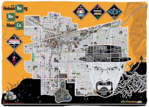
Imaginary cartography comes in all shapes and sizes but making the map look convincing goes a long way to creating the illusion of reality. Aaron Kidwell has based this work on the hugely successful television show Breaking Bad and named his town after the alter-ego of main character Walter White. The imagery used throughout the map aligns well with the symbolism of the show itself, particularly the graphics and the periodic table style typographic elements.
The map is more than just a cultural reference though. The cartography is clean and balanced. The map detail, predominantly in greyscale but with some accent colours, is fresh and well crafted. The hierarchy of detail and the contrast between features shows that the style would work perfectly well on tourist maps and brochures for more standard map products.
The golden/black background situates the map and the detail of the abstract mountainscape on the right is again unique. Finally, the character of White peers out from the topography and Kidwell has done a great job of merging the ‘reality’ of the map with the non-reality of the other imagery.
All in all, a very well constructed map that leans heavily on cultural references and rides the coat-tails of the hit television show. The cartography needed to be up to the mark though; and it is.


