 It’s becoming common practice to log personal details of life events. In some ways this began in earnest with the consumerisation of GPS technology. The ability to purchase a cheap consumer grade GPS receiver allowed people to capture points of interest and record tracklogs of their journeys. Smartphones brought the same technology into a consumer device and, with that, it was no longer geogeeks that were interested in recording such information. Now, everyone can record their paths through life.
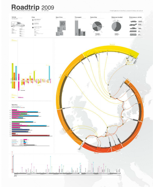
The mapped result is often little more than a data dump of routes with all of the errors that GPS data returns. What these maps tell us is often very little but when you apply some cartographic nous they can become something altogether different as Ole Østring illustrates. His poster recalls a road trip around Europe in 2009. The geography of the trip is presented in a typical way by showing the routes he used on a basemap outline. What he then does though is use that as a background and re-works the data to show a timeline illustrated diagrammatically as a modified golden spiral.
While not a true golden spiral, the work benefits from using such a purist’s shape. We are immediately drawn to it’s flow and see that it holds flow information of the route as a timeline. Thus, the journey is imagined in two ways – geographically and temporally. The poster contains all sorts of other useful statistical nugget of information clearly and cleanly presented. The overall image is strong with a clever use of colour and hierarchy for maximum contrast of key elements.
An example of taking what may otherwise be rudimentary data and turning it into something graphically exquisite.
There’s a detailed, zoomable version at Østring’s web site here.

