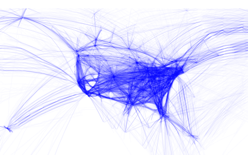
 Making maps from digital data has become a key outcome of the democratization of data and the use of the internet to store and share. Ad to that the availability of a wide range of digital mapping tools from full-scale professional GIS, through high-end illustration packages to open source offerings and new players offering ways to build maps through coded solutions. Each to their own but there’s a rich suite of products to suit tastes and abilities. A number of people have played with flight data from openflight.org but here, Aaron Koblin goes that extra mile to create a range of different products.
He used the Processing language to convert origins and destinations to geodectic curves to show all commercial flights routes between paired airports. His products are relatively simple…perhaps more data art than map but certainly their end appearance is map-like and they portray spatial relationships. He has created a number of alternatives that show all routes or which classify them by colour based on make or model of aircraft. He’s extracting the detail in the data and working with them in map form.
 His maps aren’t just static though. There are zoomable slippy maps that show the work in greater detail, overcoming one of the limitations of digital map design that means we have a constrained format. The ability to use multiple scales means we can design across a range of scales despite the dimensions of the viewing mechanism being relatively constrictive.
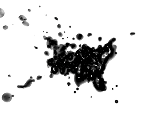
 Finally, he turns the relatively easily understood linear representations into animations and more artistic forms such as the blobular version. Of course, this perhaps ventures a little far from a form that allows people to interpret the data but it’s bringing new approaches to the cartographic aesthetic. Experimentation with form is useful. It perhaps doesn’t always carry a function other than to look appealing but beautiful data art is pleasing cartography all the same.

