MapCarte 272/365: London Galaxy by Charley Glynn, 2013

MapCarte272_galaxy

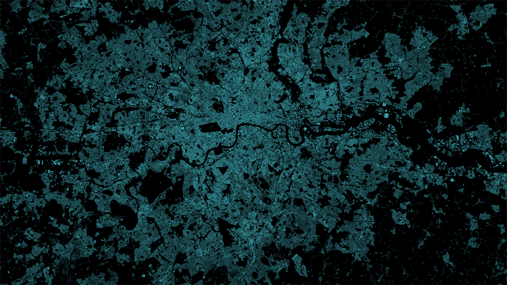
Sometimes the simplest of approaches can yield some of the most compelling work. The combination of digital data and a plethora of different software tools with which to manipulate it makes the job relatively easy. To create something that makes people sit up and take notice still requires an idea; throwing data into your favourite software tool doesn’t result in a beautiful product by default.

Here, Charley Glynn has used a dataset of lower order roads in the London area and simply rendered them with a light line weight and a neon turquoise colour on a black background. The effect gives us not only an impression of the density of the road network but also of an electrical storm with shafts of bright light emerging fractured from the centre of the image. The density creates a natural central bright spot but it’s also easy to pick out the River Thames, major parks and also the major routes in and out of the city which have been left black.

Simple idea. Well executed and resulting in an evocative, crisp image of London that we rarely see in more mainstream products. It’s data art in map form.

MapCarte 54/365: The Island by Stephen Walter, 2008

MapCarte54_walterThe Island is a satirical map which takes the view of London, UK being an isolated island floating somewhere amidst its various commuter towns.  It appears independent from the rest of the country, emphasized by the border of Greater London being depicted as a coastline.

Walter’s map is entirely hand drawn using pictorial sketches and text and instead of the known landmarks you might find on a traditional topographic map, he fills the space with a vast array of local information based on his personal knowledge, feelings and impressions of a place.  He details the interesting and mundane and the map becomes a social commentary that invites others to create an emotional bond with the work through a shared lens.

MapCarte54_walter_inset

Walter uses a large format (101 x 153cm) to give himself enough space to contain the intricate detail and builds visual hierarchy in the map through the density of ink. Central London, for instance, contains reverse white type on a black shaded background to emphasize the density of the centre of the city.

Walter has applied the same approach for other cities and also created a negative version (predominantly white on black) for showing subterranean London. His work can be seen on his web site including zoomable versions of many of his maps.