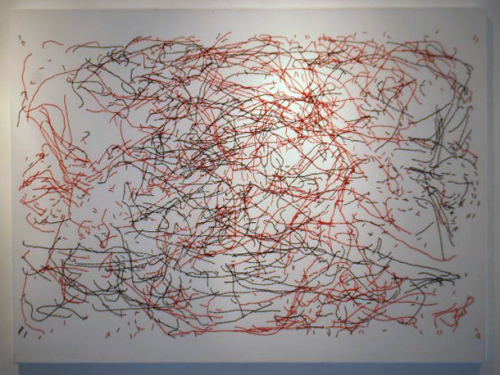
Cartography is often about expression. It’s about taking simple geometries and working with them to tease out salient characteristics through a range of processes of simplification, classification and symbolisation. What we end up with is an expression, through cartography, of something interesting or informative that perhaps the data as a jumbled mess couldn’t convey itself. What happens, then, when we do nothing and simply present the data. David Marsh has done just this with his map of player movement from the 1966 World Cup final between England and Germany at Wembley. It’s a map but it also exhibits an abstract aesthetic.
Marsh has plotted the movement of players during the entire game and the overlapping tracks create a fascinating image of the game. There isn’t any real need to bin the data into simpler visual units, or create heat maps or do any sort of cluster or hot spot analysis. Marsh proves that the raw data in itself can be revealing as well as giving us a look at the match unfiltered. It’s a data portrait of the match.
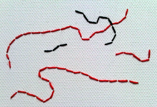
The original map itself is stitched onto canvas using the same material as worn by the players.
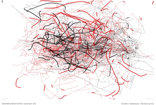
Prints of the vectorised data also work and Marsh has applied the technique to other matches and also to different components of the match (such as the battle between Bobby Charlton and Franz Beckenbauer shown below) where he modifying the line type, weight and colour to categorise some of the fundamental aspects of play such as whether a player is on the ball (thick line) or not (thin line).
A thematic flow map, artistically rendered.


