Click image above to go to web map
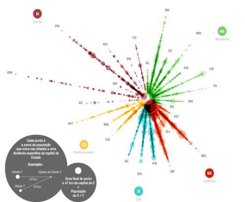
The word infographic has become a part of the lexicon used to describe information delivered using graphics. Maps have always been information graphics and although this example is described as an infographic it’s actually a map; an abstract, interactive web map, but a map nevertheless. It deals with spatial information and organises it in a manner that assists the communication of the message the author wishes to impart.
Lemos shows the distribution of the population of municipalities in relation to the capital of each Brazilian state. It illustrates the urban hierarchy too in a clean, efficient graphical manner. It’s a cartogram that dispenses with the real geography in favour of a version that ignores everything except the crucial aspects…population sizes illustrated as proportional symbols, organised in a linear fashion, by state.
The map’s use is supported by a simple yet elegant functionality including data display returned via a hover rather than a click. You can zoom to disentangle the symbols giving clarity to each spoke of the map. Transparency is well used and gives a sense of density.
Simple. Effective. Enthralling and informative. Maps do not need to be graphically complex to impart their information but they do need to be engaging.


