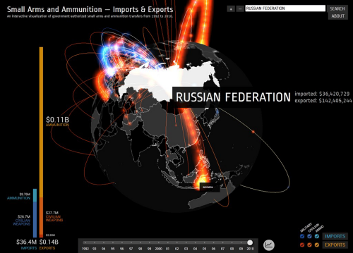
Click the image to go to Armsglobe
This data visualization (map?) was produced by Google as part of the 2012 Google Ideas INFO (Illicit Networks, Forces in Opposition) Summit. The data was provided by the Peace Research Institute Oslo (PRIO) and comprises a database of small arms imports and exports. There are over 1 million data points of individual exports and imports that map the transfer of small arms, light weapons and ammunition across 250 states and territories across the world between 1992 and 2010.
The purpose of the map was to highlight the illicit trade in small weaponry as a way to shed light on the fact that 60% of all violent deaths are due to small arms and light weapons. Creating a visually arresting, in-your-face map provides just the right aesthetic for capturing people’s attention. Sure, the data could have been mapped on a flat map with muted colours and a conservative approach but sometimes the subject matter and the purpose need something altogether different. The design is deliberately startling and captivating and illustrates patterns and trends in the import and export market so that one can better understand how they might relate to conflicts.
The armsglobe is fully interactive and allows intuitive zooming and rotation. Click events highlight a particular country and the labels rotate and scale as the map view updates. Graphs provide some quantifiable comparisons that show a breakdown of imports and exports. The viewer has control over showing or hiding some of the graphs as well as different ways to filter the data. In this way, one can show everything to gain an overall impression or focus on a specific type of import or export. there’s even a temporal slider to explore historic data.
Use of Armsglobe during the 2012 INFO Summit
The most impactful aspect of the design is the contrast between the map’s background and the flow lines themselves. A black background and a globe that has black water bodies and grey landmasses, turning lighter on selection is a perfect backdrop for the neon, pulsing flowlines. the animated symbology clearly shows the flow’s origin and direction as well as quantity. It’s unconventional but hugely effective.
Often the trick to producing a well designed map is not simply going with convention, but trying something altogether different. It’s often harder to succeed with the latter. This design approach wouldn’t suit every mapping need but here, it works in concert with the theme and the map’s purpose. Form and function.


