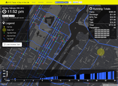
Increasing access to unique and intriguing datasets is driving a massive map-making movement. People are exploring data in many interesting ways and occasionally developing some creative cartographic products in the online medium particularly. Chris Wong has done just that. Taking a dataset of different New York taxi cab fares he’s processed and manipulated the data into a form that can be mapped in a compelling way.
Notwithstanding any dataset such as this is prone to some level of uncertainty and the fact that Wong took some cartographic license (the actual routes mapped are based on the Google API suggestion, not a GPS tracklog for instance) it’s the mapping that is really quite impressive.
By taking a single journey we are pairing the data right back from the millions of cab journeys. It helps show how real each cab is and how it travels independently of the rest. Our imagination can extrapolate to the whole and it’s a good way to personalize a theme when mapping. It overcomes the generalisations that must be made to make any sense when mapping the entire dataset.
The mapping is clean and intuitive. The yellow/black theme aligns with the taxi cab colours and creates a sleek, modern look and feel with high contrast between components and good use of ancillary colours and transparency. The hovering data panels provide cumulative information on time and running totals. The graph shows the linear pattern of fare accumulation. The movement of the map is particularly creative as the focal point (the cab) remains central in the map view as the map pans and the journeys are traced. This gives an excellent way of holding the gaze while the map does the work rather than relying on the user to pan and zoom around. It reduces effort on the part of the user who can simply sit back and view the moving map.
A beautiful web map in terms of design and the marrying of form and function.


