One of the problems of having an unequally shaped planet, divided by both physical and human borders, for cartographers is how to map it consistently. Individuals, nations and organisations have prepared thousands of different ways of maping based on different projections, datums and coordinate systems. That makes it difficult when moving across the planet and wanting to use a uniform set of mid-large scale maps.
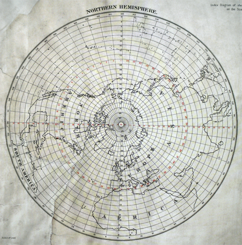
German geographer Albrecht Penck was a proponent of the need for consistent and accurate maps that covered the entire planet. In 1891 he proposed a worldwide system of maps. The International Map of the World would consist of 2,500 maps, each at 1:1,000,000 and representing 4 degrees of latitude and 6 degrees of longitude. Perfect! His schema can be seen in the map above.
In 1913, Penck’s idea came to fruition at a conference to establish standards and symbology. Decisions were taken on use of the Roman alphabet, colours, linework and topographic representation. Unfortunately the idea never really took off despite the ingenious design. With each country responsible for its own mapping it was impossible to coordinate or expect the requisite surveys to be undertaken. By 1914 only 8 maps had been produced following the schema. By 1945 405 sheets had been produced but only half followed the schema and despite being an early adopter, the United States soon decided to go it alone.
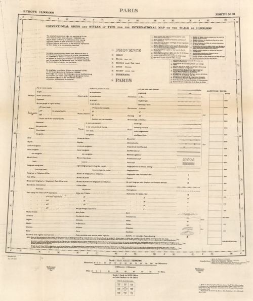
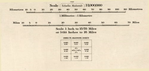
The following examples from Bartholomews shows their 1910 proof of the concept that they produced under direction from the International Map Committee. The map sheet specifications and legends are included as a template.

 Cartography can be many things to many people. This project was designed to be educational, edifying and philanthropic – a consistent international map of the world for the good of humanity. History shows us it never materialised.


Pingback: Who Owns the Map? | Next Nature Network