It’s been a while… so why not meet up in Madrid?

Dear Map Design Community:

It’s been a while since this blog has been used. A lot has happened since the last post, in both map design and life. My apologies for the Commission’s absence. This falls on me.

For those of you who have stuck it out, thank you.

I plan to use this regularly again moving forward.

To reward your patience, I invite you to…

Submit a paper abstract to the upcoming conference –  Atlases in Time – taking place in Madrid, Spain, from April 20 – 23, 2022.  

The Atlases in Time Conference is being coordinated by three ICA Commissions, including Map Design, Toponyms, and Atlases, and Spain’s IGN to celebrate the organization’s 150th birthday.

Due to this conference being part of a birthday celebration, there are no conference fees. You only need to cover transportation, lodging, and meals. Field trips planned by the IGN will also be included – information on these is forthcoming.

For more information, please visit our conference website.

Or go directly to the Call for Abstracts page for more detailed information.

The deadline for submission is coming fast – February 15 – but the abstract needs to be 500 words or less, so don’t let the time crunch deter you! 🙂

If you have any questions, please don’t hesitate to contact me directly or reach us via our conference contact page here.

Let’s meet up in Madrid this April! I look forward to seeing many of you there.

Best,

Ian Muehlenhaus
Chair, ICA Commission on Map Design

——–

Official details extracted from the Call for Abstracts web page follow:

On the occasion of the 150th anniversary of the National Geographic Institute of Spain (IGN) being founded in 1870 – the IGN is the publishing institution of the National Atlas of Spain – the ICA Commission on Atlases, the ICA Commission on Map Design and the ICA/IGU Commission on Toponymy, together with the IGN and the Spanish Society for Cartography, Photogrammetry and Remote Sensing (SECFT) organise a conference on National and Regional Atlases from 20 to 23 April 2022 in Madrid.

During six sessions of four presentations each, questions concerning evolving dissemination concepts and techniques for atlases, recent development and examples of National Atlases as well as important map design and toponomastic issues in atlas production will be discussed.

Presentations will be held in a classic 20 min format of 15 minutes speaking with 5 minutes of discussion. A publication of the contributions as papers or abstracts will be carried out. Also accepted abstracts will be published using the ICA-Abstracts platform.

Your abstract shall not exceed 500 words and may be submitted as doc., .docx or .pdf-file.

Cartography (full stop)

The Commission web site has been a little quiet recently, largely because my main focus has been in the completion of a major new book. I’m delighted to announce that Cartography. (Cartography, period OR Cartography, full stop) was published on June 28th by Esri Press and is available from all good online retailers. While not an official ICA publication it does bear the ICA logo due to the support received from many ICA friends and colleagues during its preparation. It therefore represents one of the main outputs from Commission members for the current period 2016-2019.

Making maps has progressed from filling empty spaces with mythical creatures to trying to unravel the complexities in data to present meaning with clarity. Cartography. sets out to demystify the discipline and promote the idea that thinking is key. Approaching mapmaking by thinking about what you want your map to say, how to build something meaningful from visual ingredients, how people read the graphical signage, and what emotions you want to spark is the magic needed to make a better map.

Data and the tools to make maps have become ubiquitous and so many more people are making maps. Technology has made the mapmaking task fast, simple, and reproducible but thinking what the technology is actually doing helps you make a better map. It is almost incomprehensible to understand how maps were made even 20 years ago. Automation has played a huge role in design and production but in some ways it may have led to a lack of appreciation of what goes into making a good map. Making a map fast does not necessarily lead to a great map.
Cartography doesn’t need to be hard and whilst there’s plenty of what might be called rules, these are just guidelines developed from decades of practice and people working out what works and why. Maps should be objective and have scientific rigor but there’s plenty of scope for creativity. Any design-led field sits at the intersection of science and art, and learning some of the rules means you’ll know when best to break them.

A lot of thought and experience has gone into making this book. It encapsulates the wisdom of many people who have taught me and from whom I have learnt. What I have tried to achieve is a translation of cartography from a specialist domain to one that builds a bridge between cartographer and mapmaker. I’ve tried to make the subject practical and valuable, not only as a reminder to professionals but as a companion to all who need to make a great map. We’ve all been beginners somewhere along our journey, and we’re all amateurs at some things. As a cartographic professional, I hope this supports people in their own cartographic journeys.

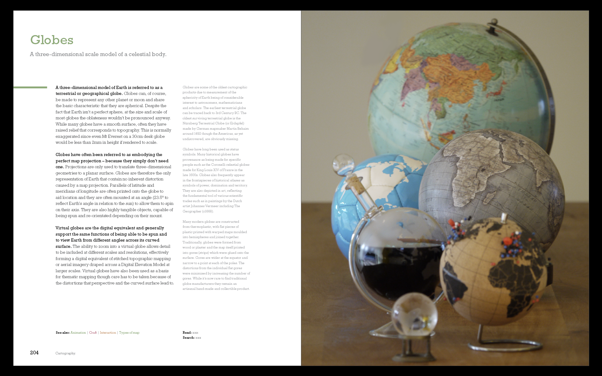
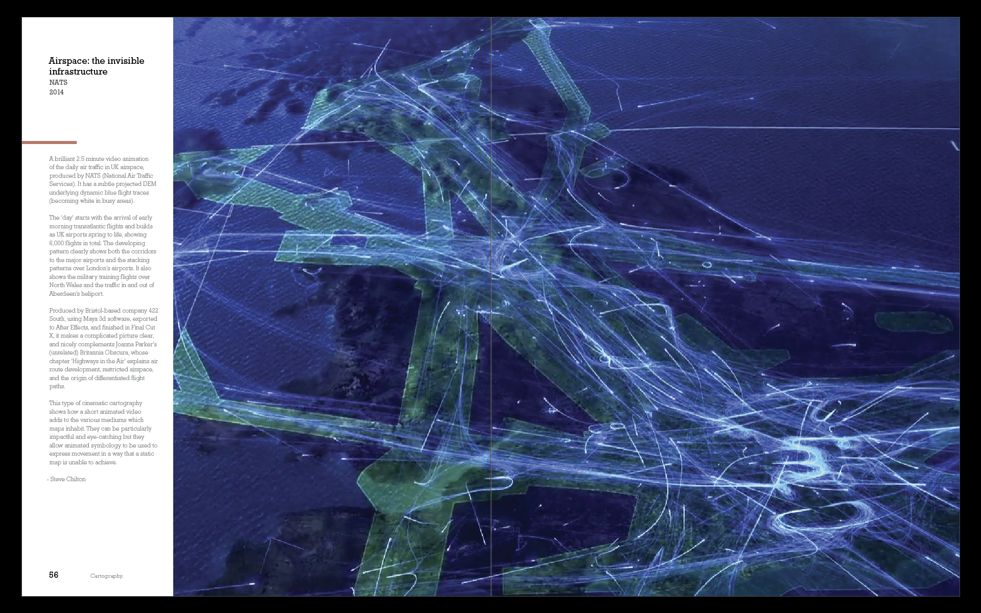
The book weighs in at 576 pages. There’s over 180,000 words, and 333 illustrations which mix classic and contemporary maps with original examples and illustrations. Over 100 organisations and individuals have contributed by giving permission for their work to be incorporated. Material is organized alphabetically, providing an accessible, encyclopedic approach rather than presented linearly as a traditional text book. The book, then, is a collection of not just my ideas but that of many, many experts in the wider cartographic, and allied fields. To that end, I believe it brings together the very brightest talent currently involved in both academic and commercial cartography to help me bring this book to life

The Bulletin of the Society of Cartographers has referred to it as a ‘game changing book’. Reviewer Christopher Wesson sums the book up: ‘What Kenneth Field has created here is a brilliant reference book on behalf of our field of cartography. Finally! A book that truly represents Cartography in 2018.’ But don’t take my word for it, you can read the review here. Once you’ve had a look, let me know what you think. I can be found on Twitter @kennethfield and I’m using the hashtag #cartographybook.
Cartography. Is available in softcover (ISBN: 9781589484399, 576 pages, US$94.99) and in hardcover (ISBN: 9781589485020, 576 pages, US$129.99). Both editions can be obtained from most online retailers worldwide. They are available for purchase at esri.com/series or by calling 1-800-447-9778. Outside the United States, visit esri.com/esripressorders for complete ordering options, or visit esri.com/distributors to contact your local Esri distributor. Interested retailers can contact Esri Press book distributor Ingram Publisher Services.


Some praise for the first edition:

“An Impressively creative and useful scholarly contribution.” – Mark Monmonier, author of How to Lie with Maps; Distinguished Professor of Geography, Syracuse University, NY.

“Read the book for pragmatic advice or to braden your horizon; for me, it did both.” – Menno-Jan Kraak, president of the International Cartographic Association (ICA); professor, University of Twente, Enschede, Netherlands; author of Mapping Time and coauthor of Cartography, Visualization of Geospatial Data.

“What Kenneth Field has created here is a brilliant reference book on behalf of our field of cartography. Finally! A book that truly represents Cartography in 2018.” – Christopher Wesson, The Bulletin of the Society of Cartographers.

“This beautifully designed book, meant to inspire and lead by creative exemplars, illuminates well-grounded cartographic concepts in a way that emboldens you to implement ideas onto maps.” – Patrick J. Kennelly, Ph.D., professor of geography, Long Island University, NY

“This book actually makes me think that I should teach cartography again, now that there is a decent text” (Assc. Prof. Bernie Jenny, Monash University, Australia)

“I would accept this as a gift.” – Daniel Huffman (somethingaboutmaps.com)

“A work of substance and passion” – Colin Field (my brother)

“who’s going to buy that?” – Amelia Field (my niece)

“I’ve read a little bit and I’m impressed.” – Eleanor Field (my daughter)

“It’s incredible – an amazing publication” – Lauren Tierney (Washington Post)

“It’s not bad” and “a masterpiece” – Ian Sims (Esri, with British humour)

“a real gamechanger in the field” – Steve Chilton (Chair, Society of Cartographers)

“A bit big to take on a plane” – anon reviewer

“A work of creative scholarship, sort of like a painting hanging in a gallery—something about which one is reluctant to question the brush strokes or choice of colors. Art is supposed to make you think, and Ken’s book does that.” – anon reviewer

“a beautifully designed book that highlights important considerations for those interested in map making” – anon reviewer

“the structure is immensely satisfying. Dive as deep or as shallow as needed and in and out of topics as you please. Kudos.” – Warren Davison (via Twitter)

“This edition just blows my mind amazing!!” – Fernando Benitez (via Twitter)


Style Guide Submission template

Thank you for your interest in helping the ICA Commission on Map Design assemble its style guides! Our goal is to provide a series of “quick-start kits” that provide inspiration and examples for mapmakers looking to reference an existing aesthetic.

We need your help finding the materials from which to build these guides! If you have a style you’d like to propose, please submit the following details to kfield@esri.com. A sample guide is provided here so you can see the sort of details we’re trying to collate.

Style Title
A clear, simple title will help people find what they’re looking for.

Style Introduction
A succinct statement of under 50 words that points out the key characteristics of the style.

Adjectives
Provide 3 to 5 adjectives which describe the style.

Artists
List 2 or 3 artists, cartographers, or graphic designers whose work demonstrates the style; this will help users of the style guide know where to search for further inspiration.

Map Examples
Attach (or provide links) to 2 or 3 existing maps which exemplify the style. If attaching files, provide full credit information.

Other Inspirations
Attach (or provide links) to 2 or 3 examples of other graphic art (posters, postcards, album covers, book jackets, etc.) which exemplify the style. If attaching files, provide full credit information.

Typefaces
List 3 typefaces which fit with the style. You might consider the typography used in the Map Examples & Other Inspirations sections as a starting point here. At least one of the typefaces should be freely available. Ideally, the three typefaces will show some range, rather than being very similar to each other.

Colours
Provide 3 colour palettes, each with 5 colors, that fit with the style. Again, these can be borrowed from the Map Examples & Other Inspirations sections.

The legacy of MapCarte

When we embarked upon our MapCarte series last year we wanted to inspire people with examples of beautiful, creative and well designed cartography. Showing people examples of quality was an attempt to counter the tsunami of poor mapping that passes across our digital devices daily. There’s no reason that a general public fascinated with maps can be expected to sift the quality from the quantity. MapCarte was our way of curating a set of maps of all genres that demonstrate the very best in map design. Curated by cartographers for everyone. While we cannot claim credit for a swing in the public desire for better mapping we’d like to think we’ve played a small part and some of the previous offenders are buying into the shift (e.g. here, here, and here for example). It’s what the Commission is designed to do…to promote quality in cartography and be an evangelist for work that showcases the very best in the art and science of map design.

The last year or so have seen the publication of a number of excellent books that perform a similar task. These include Jerry Brotton’s ‘Great Maps‘, Daniel Huffman and Sam Mathews’ ‘Atlas of Design Vol 2‘, Rose Mitchell and Andrew Janes’ ‘Maps: Their untold stories‘ and The Times History of the World in Maps. These all contribute to the canon of work that showcases, describes and promotes cartographic design. Commission Chair Kenneth Field contributed to the Atlas of Design with an introductory essay and to The Times’ publication with a discussion of Google Maps. Ken is also involved in his day job at Esri helping a wider team to curate an online gallery of maps that demonstrate the cartographic potential for people using Esri’s ArcGIS platform. The site’s called Maps We Love and while you may not love them all, it performs a parallel purpose to MapCarte. Indeed, the idea of Maps We Love was inspired by what we did with MapCarte more generally.

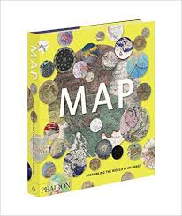
The trend of publishing collections or compilations of examples of good quality map design has also been implemented by many other mapping organisations and publishers continue their fascination with great cartography. There’s a new book on the market that continues this trend…’MAP‘ by Phaidon Press (published 28th September).

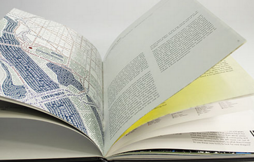
MAPKen was asked to contribute to this edited collection of 300 maps and this became a great opportunity to use the words we penned for MapCarte in a different way. Ken wrote descriptions for 23 of the maps alongside a huge team of contributors. Edited by John Hessler from the Map Division, U.S. Library of Congress, the maps are given space to shine in the 12″ by 10″ hardback book. Heavy duty paper literally adds weight to the tome and the text is kept to a minimum by simply identifying key characteristics or aspects of importance. Curated content is the key to this and other publications alike. It’s authoritative and provides a terrific window onto cartography and maps more generally. It also includes a timeline of the history of cartography, a glossary of useful cartographic terms and links to further reading.

Much like MapCarte the collection is eclectic and it’s fascinating to see there’s probably only an overlap of 100 or so maps between our own collection and the maps featured in MAP. This is to be expected…any collection of maps chosen by one group of people will include examples not selected by others. That’s part of the beauty and breadth of cartography. On reflection, yes, there’s probably some from MAP that we might have put in MapCarte but if you join the dots in all of the above collections there’s commonality as well as divergence. The simple fact is as a group of academics, practitioners and map experts we’re finally taking what we know to the general public. Taking responsibility to share some of what we know as cartographic experts is vital to informing people about map design. It’s also important that this drives their yearning to become smarter map-makers. Knowing a little of the cartographic design process allows people to better understand what they require for their own work, and how to discern quality from the plethora of rather uninspiring (or plain wrong) work out in our world.

It’s been tremendous to see how MapCarte has both inspired and sat alongside other similar projects. This can only support the dissemination of better mapping and help people to demand more of their maps. We’ll continue to publish infrequent MapCarte entries as and when the whim takes us…and as we look toward the culmination of our first 4 years as an ICA Commission we look forward to our second term.

Survey into colour design – participation request

Our colleagues at the University of Zurich, led by Professor Sara Fabrikant, are undertaking a fascinating study into the use of colours for displaying complex data – an issue that resonates with many of the basic tenets of map design.

If subscribers to the ICA Map Design Commission could spend a few minutes (15-20) by way of participating in a survey this would greatly help the research endeavor.

You can find the survey here.

Thanks.

Atlas of Design call for maps

atlasofdesign

The call for map submissions has just been announced for the second volume of the Atlas of Design. An initiative by the North American Cartographic Information Society (NACIS), the atlas acts as a showcase of beautifully designed maps alongside commentaries that explain a little of why the map is as it is and how and why it works so well both graphically and as an information product. In many ways the atlas was an inspiration for our picto-bite approach MapCarte series but crucially both are curated by cartographic experts. This provides a look into the world of mapping from authoritative sources. We need more of this!

Edited by Tim Wallace and Daniel Huffman, the first volume (published in 2012) presented 27 beautiful maps and even though beauty is so often in the eye of the beholder there can be no argument that the selection represents some of the finest contemporary mapping of the last few years. The 2014 volume looks set to improve on the first (no pressure there!) but this is a community effort so we’d encourage those of you who produce stunning maps to consider contributing.

In a world where quantity is currently out-pacing quality, the Atlas of Design is a much-needed antidote to much of what we see. It acts to inspire people towards a greater appreciation of well-crafted maps and how they can be far more powerful when properly thought-through, designed and produced. This is more than just ‘pretty maps’ and a gallery of aesthetically pleasing maps; this is about showing the value of the art and science of cartography; the expertise that a cartographer can bring to bear; and a return to high quality over mass production.

Submit your maps here. Go on…you know you want to!

New Commission web site

The new International Cartographic Association (ICA) Commission on Map Design was approved at the International Cartographic Conference in Paris July 2011. It is designed to foster discussion, exchange of ideas and the development and spread of the principles and practice of high quality, effective cartographic and infographic design.

Good design and better mapping is core to effective spatial communication and the Commission is focused on engaging international experts from a wide range of fields to provide a body of knowledge that guides cartography as it tackles the challenges brought about by GIS, the internet, cloud-based computing, pervasive web-based map services and the mashup culture. Such changes bring with them new map-makers who have not been formally trained in cartography yet still require knowledge of the basic tenets of good cartographic design; and new principles that are required for emerging cartographic landscapes (e.g. temporal, animated, interactive and 3D). Additionally, emerging production and display environments require new approaches to effectively implement well-understood design techniques alongside tackling the challenges and harnessing the opportunities brought about by new technologies.

The web site of the Commission is now live…if you’re reading this then you’ve already found it! Welcome…and please participate by joining using the subscribe panel on the right.