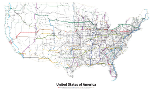
One of the drawbacks of Harry Beck’s fine subway map (MapCarte 1) is that far too many map-makers and designers have relied upon it as a template for their own map. It’s perhaps stifled creativity when we may have seen the next ‘Beck’ emerge instead. Once in a while though, the Beck magic is actually put to good use and Cameron Booth’s one such graphic designer who has worked with the general formula but deployed it meaningfully (sidenote: Booth maintains the informative and detailed Transit Maps Tumblr too). Of course, Beck isn’t his only design cue.
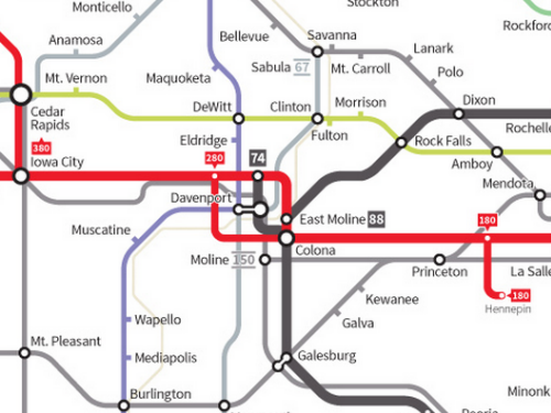
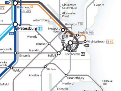
Booth has designed a number of maps in the schematic style but here we highlight his Highway’s of the USA which is the result of a two-year effort to check and codify every current Interstate and Highway. The schematic approach works well but Booth is quite keen to point out that rather than it being seen as a subway map, it’s a simplified road map and that thinking allows us to break loose from the subway metaphor to an extent. The clarity of the map is supported by the simplified linework which uses clean distinguishable colours. Station circles are used for towns and cities that contain an intersection and ticks for places that fall along the road. Places are sized according to their importance in terms of the number of roads that intersect and there are nearly 4,500 place names on the map which given the white space is a monumental achievement in controlling the graphic hierarchy and overall balance of the work.
Route naming conventions are systematically applied and again contain a well developed hierarchy and overall the map is a harmonious work that while containing a strong nod to the subway genre makes use of the style and form to support a clear design requirement. The attention to detail is meticulous which illustrates the importance of ensuring every last element of your map is given due consideration. There’s good sense in the maxim that 90% of a map is produced in 10% of the time and the final 10% takes the remaining 90% of time. I don’t know, but I’d wager this sort of balance reflects Booth’s work on this map.
This isn’t just a map that takes a previous design and pours new data onto it. This is a fresh take on the genre and regardless of whatever subway maps have gone before, its form and function are perfectly articulated.
You can read more (and buy prints) about Booth’s map at his blog here.


Pingback: Transit Maps: Review of my “Highways of the USA” Map by Kenneth Field