MapCarte 120/365: Environment and health atlas by Imperial College London, 2014

MapCarte120_sahsuClick the image to go to the atlas web site

Mapping health and disease is often fraught with difficulties. Data is often aggregated to a resolution that doesn’t really provide much insight; is lacking a temporal dimension that is important to identify trends; or is not able to be published due to patient confidentiality issues. What we tend to see are over-generalised maps or snap-shots of a partial story that then get misconstrued in terms of what they might reveal, or which paradoxically seek to infer some outcome that the data might not support.

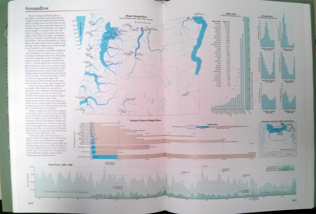
The Small Area Health Statistics Unit at Imperial College London has been researching patterns of health and disease for several decades. As a research grouped backed by the UK Medical Research Council and Public Health England they have unique access to detailed health data both at a fine resolution and across multiple years which they have been researching to better understand patterns of health and disease. The ability to publish the results of research is often restricted to scientific papers but this new atlas for the first time brings to life much of their effort in this area of scientific endeavor for the public and policy makers.

MapCarte120_sahsu_kidney

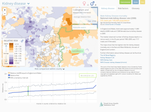
Kidney disease, an example atlas page. Click image to view online.

The atlas is the result not only of the 20+ years of research that has gone into understanding patterns of health and disease but also the 7 years it has taken to bring it to light as a publication. Navigating the complexities of working with this type of data and producing a worthwhile publication are not inconsiderable. This is a significant and monumental achievement. It combines data from many different sources over many years and the maps are not only well designed thematics but represent considerable analytical work in their production. This isn’t just mapping numbers, it’s analysing vast amounts of information in a statistically rigorous fashion and preparing maps that summarize the results succinctly. They are authoritative and are exemplars in treading that fine line between ensuring data privacy while revealing worthwhile information.

Many of the maps deal with hugely sensitive topics but they do so in a mature and considerate fashion. The online atlas is clean, modern and allows people to access the work through an efficient, unencumbered user interface. Each map allows users to view female or male patterns, to zoom in, rollover to see administrative boundaries and labels and to click to reveal detailed graphs. So many elements of the maps are linked. As you move across the map, the graph updates, there is a simple statment of above or below averahe that updates and even the legend brings the class into focus. These are all small but very effective controls that give the work a cartographic polish. The side panel is reserved for interpretative text and further information – critical to ensuring that the map’s message is not taken out of context. There’s even a set of risk factors to enable viewers to understand patterns in a socio-economic context and a glossary that explains medical and statistical terms clearly. This sort of attention to detail is too often missing from modern maps.

Making this work freely and openly available in map form is a triumph and sets the standard for online atlases of health for years to come. In many ways the online version may well cannibalize the potential sales market of the print version, itself a beautifully constructed print atlas but that alone is testament to the prime motive of this work. It’s data about the public, mapped for the public. The work has gained many plaudits and rightfully so.

MapCarte 119/365: Armsglobe by Google Ideas, 2012

MapCarte119_google

Click the image to go to Armsglobe

This data visualization (map?) was produced by Google as part of the 2012 Google Ideas INFO (Illicit Networks, Forces in Opposition) Summit. The data was provided by the Peace Research Institute Oslo (PRIO) and comprises a database of small arms imports and exports. There are over 1 million data points of individual exports and imports that map the transfer of small arms, light weapons and ammunition across 250 states and territories across the world between 1992 and 2010.

The purpose of the map was to highlight the illicit trade in small weaponry as a way to shed light on the fact that 60% of all violent deaths are due to small arms and light weapons. Creating a visually arresting, in-your-face map provides just the right aesthetic for capturing people’s attention. Sure, the data could have been mapped on a flat map with muted colours and a conservative approach but sometimes the subject matter and the purpose need something altogether different. The design is deliberately startling and captivating and illustrates patterns and trends in the import and export market so that one can better understand how they might relate to conflicts.

The armsglobe is fully interactive and allows intuitive zooming and rotation. Click events highlight a particular country and the labels rotate and scale as the map view updates. Graphs provide some quantifiable comparisons that show a breakdown of imports and exports. The viewer has control over showing or hiding some of the graphs as well as different ways to filter the data. In this way, one can show everything to gain an overall impression or focus on a specific type of import or export. there’s even a temporal slider to explore historic data.

Use of Armsglobe during the 2012 INFO Summit

The most impactful aspect of the design is the contrast between the map’s background and the flow lines themselves. A black background and a globe that has black water bodies and grey landmasses, turning lighter on selection is a perfect backdrop for the neon, pulsing flowlines. the animated symbology clearly shows the flow’s origin and direction as well as quantity. It’s unconventional but hugely effective.

Often the trick to producing a well designed map is not simply going with convention, but trying something altogether different. It’s often harder to succeed with the latter. This design approach wouldn’t suit every mapping need but here, it works in concert with the theme and the map’s purpose. Form and function.

MapCarte 118/365: Britannia by John Ogilby, 1675

MapCarte118_ogilbyIn 1674 translator and publisher John Ogilby was appointed as His Majesty’s Cosmographer and Geographic Printer and published Britannia, a road atlas of Great Britain, in 1675 which set the standard for many years to come.

The atlas contained 100 strip maps accompanied by text at a scale of one inch to one mile.  The scale was innovative for the time and later adopted by Ordnance Survey in its first (one inch to one mile) map series. Ogilby’s maps are a linear cartogram and north varies between strips.

MapCarte118_ogilby_detail

People can orient themselves in the direction of travel regardless of the true direction.  The scroll effect suggests their use for navigation as if they were to be opened and used on the journey itself.  The lines have been necessarily straightened to fit into each strip but the essential details along the route are maintained. Features are artistically represented but all have a practical value and a great deal of extraneous detail is omitted.  Hills are included, oriented to depict whether you would be ascending or descending depending on the direction approached. Distances are included as well as place names, illustrations of villages, towns and forests. The maps, marginalia and cartouches are particularly ornate and typography also includes flowing ascenders and descenders.

Ingenious for its time and a style still used today to show the linearity of route networks (e.g. motorway networks) in many street atlases. Certainly, the use of straightened lines has become a very familiar cartographic approach for depicting transport networks with subway maps being perhaps the most abstract.

MapCarte 117/365: Atlas of Global Geography by Erwin Raisz, 1944

MapCarte117_raiszOne of the twentieth centuries foremost cartographers, Erwin Raisz was born in Hungary but emigrated to the US in 1923 and spent much of his professional career teaching cartography and curating the map collection at Harvard University. He was a prolific map-maker who produced thousands of maps comprising mainly of landform drawings. His style supported the easy interpretation of landform features “combining a scientist’s fascination with geomorphology with an artist’s drawing ability”

MapCarte117_raisz2

Rasiz’s maps were accurate, elegant and brought considerable aesthetic appeal to the depiction of the physical world in map form. His style was unique and his work was almost entirely pen and ink. More than his landform maps, Raisz published a seminal text on ‘General Cartography’ and introduced block-pile maps, created the orthoapsidal projection and value-by-area cartograms. His 1944 atlas showcased many of these techniques in a beautiful work. Each page of the atlas is a piece of art in its own right and shows how a cartographer should work in treating each theme as a unique challenge. While an atlas should be consistent, the consistency here comes in the quality and the variation of technique applied perfectly to each theme. The pages all look different yet they match in style and encourage exploration as each turn of the page brings a new visual delight.

The limits in colour printing meant the colour palette was at first glance very restrictive. However, this leads to a more consistent appearance with the same colours used across all maps and the thematic maps being predominantly two-colour. Such limitations also give the cartographer a strict set of constraints that focuses their design to optimize the pallete at their disposal. In short – technical constraints often bring out better work because quite simply it forces the cartographer to think and think inventively to take advantage.

MapCarte117_raisz3

Raisz spent much of his life educating people in the art and craft of cartography. In later life he experimented with the use of aerial photography in cartography but was skeptical about the use of computers to produce maps. His views were based on an impression that computers would remove the realism that a cartographer can bring to their work and that maps could end up being produced by technicians with little interest in geography or cartography.

MapCarte117_raisz4

Raisz died in 1968. Nearly 50 years on one could be forgiven for thinking he may have had a point but we can reflect on his work as a way to inform new work and bring some of his flair and technique to new map-making endeavors.

You can explore some of Raisz;s work here and also see high resolution zoomable version of pages of this atlas on David Rumsey’s site here.

MapCarte 116/365: Google Maps by Google, 2005-present

MapCarte116_google1Lars and Jens Rasmussen’s mapping company was acquired by Google in 2004 and the mapping landscape transformed on February 8th 2005 when Google Maps was released as a web-based product (maps.google.com).  Google Maps (and numerous complimentary products) has both disrupted and revolutionised the way the people view, use and make maps and how they interact with their surroundings. Google’s intent to organise the world’s information to support their Search capabilities has often been expanded to the ideal of “organising the world’s information, geographically”. Let’s not forget that Google are a company whose focus is advertising and the revenue raised from placing adverts on web pages, their search results and on the map is what funds the business. The map has become a key mechanism for people and we perhaps cannot have predicted the astonishing rise of its use.

MapCarte116_google5

Several other disruptive technologies have converged to enable this to happen, not least the ubiquity of the internet and rapid development and uptake of mobile devices. People now expect information to be streamed rapidly, often through a map interface. Google’s map is now part of our everyday toolkit in a way that can perhaps never have been imagined. Designed to support Google’s mission but designed so well that it is perfect form of viral marketing itself.

MapCarte116_google4

In addition to becoming the default map of choice for finding places and navigating, the Google Maps API has also underpinned the democratization of online mapping to allow anyone to create geographically contextualized mashups and also customise the base map data to their own style. The original design left much to be desired and problems of disjointed data and poor cartography have been addressed so today’s product gives a finely tuned, responsive and clean map experience.

MapCarte116_google3

The design is recognizable and supports a strong, clear brand that is consistent at a local scale, globally.  Integration of complementary functionality (e.g. routing, traffic information, overlay of social media and photographs, zooming, panning, querying and measuring) provides an application with a multitude of purposes that goes beyond a general reference map.  The design is automatically modified depending on its use.  For instance, secondary roads widen at particular scales when you overlay traffic information to show each direction of traffic flow.  The appearance of 3D buildings and moving shadows at large scales (in some cities) represent the built environment like never seen before.

MapCarte116_google2

Google Maps is used every day by millions to actually ‘do something’. No other map in history can claim such widespread adoption and use. it’s successful because it works. With that many people using and testing if it wasn’t up to the task it’s use would soon diminish. It is content rich yet very straightforward. The colour is subtle and the typography sits well at each scale and transitions between scales. This is a single map but designed at 20+ scales to work at each scale and to work across the scales. It accommodates a wide and diverse range of users and is localised. It supports terrain layers, satellite imagery and hybrid mapping. it allows you to incorporate photo tours and switch between 2D and 3D and StreetView. There isn’t much this map does not do.

MapCarte116_google6

Can we ignore the fact that Google brought Mercator back to prominence? Maybe not…but Web Mercator is a perfect technical solution for serving tiles of data because it tesselates in squares, is efficient and scales rapidly. It won’t be long before projections can be modified in web maps so until then we just have to accept them (and deploy our own maps using different projections) when necessary.

Quite simply the map is, and continues to be revolutionary. The 2005 map would get nowhere near MapCarte. The 2014 version is state-of-the-art and in less than 10 years Google are leading big league cartography and fully deserve inclusion.

I’d be surprised if anyone reading this doesn’t know how to access Google Maps but just in case…it’s here.

MapCarte 115/365: Landsat imagery by USGS, 1972-present

MapCarte115_landsat1

Hawaii

The Earth Resources Technology Satellites Program to launch satellites able to acquire remotely sensed images of Earth began in 1972 with the launch of what was to later become known as Landsat . April 2014 marks the 15th Anniversary of the launch of Landsat 7 and May 2013 saw the first data returned from the latest Landsat 8. Now managed by USGS in conjunction with NASA, the Landsat programme is the world’s longest running continuously acquired collection of space-based imagery of Earth. It’s imagery has revolutionised the way we view, explore, analyse, map and understand our world. It has provided an indispensable set of data to support agriculture, geology, planning, forestry and global change research.

MapCarte115_landsat2

Dry valleys in Antarctica

The images and maps that have been made from Landsat data have given the world a new perspective. They’ve brought the beauty of the planet to popular media and the desktop. They’ve been uniquely informative in shedding light on our environment and how humans have reshaped it for better and worse. They enable us to better map and understand land use, land use change and help bring us discoveries that are only visible from space.

MapCarte115_landsat3

Mississippi River

While Landsat is only capable of capturing ‘data’, the way in which we interpret that and map it has given us some spectacular images of the earth. Remotely sensed images are, of course, a form of map.  The resolution of each pixel is a generalised representation of the predominant land cover captured. Successful data processing and symbolisation can bring to light very specific features. In particular, false-color composites can be processed to a true-colour likeness as the leading image of Hawaii shows from the Enhanced thematic mapper (ETM+) instrument on Landsat 7. What the image captures is the beauty of Hawaii’s land cover that shows us hardened lava flows, volcanic smoke plumes, lush tropical forests, plantations and human settlement.

MapCarte115_landsat4

World Trade Center site in New York, September 12, 2001

Depending on the precise timing of the satellite orbit and data captured, Landsat has also brought us spectacular images of major events such as tornadoes, hurricanes, sandstorms and even the 9/11 attack on the World trade Center in New York. It has also shown us natural beauty such as the almost Van Gogh-like appearance of the swirling waters and plumes of phytoplankton around the Swedish island of Gotland.

MapCarte115_landsat5

Swedish island of Gotland takes on the appearance of Van Gogh’s ‘Starry Night’

This MapCarte entry cannot possibly do justice in describing the detail of the Landsat programme or showcase the many fine examples of maps and imagery it has underpinned. It is a masterpiece of technological innovation and design to overcome our need for acquiring remotely sensed data to support our mapping of the planet.

For more, check out the Landsat pages on the USGS web site here and view and download Landsat scenes here.


MapCarte 114/365: Disneyland by Sam McKim, 1958-1964

MapCarte114_mckimIt’s well known that Walt Disney had large format, elegant maps made as part of the proposals to secure investment for the creation of Disneyland in California in the early 1950s. The perspective views of the imaginary land he envisaged, drawn by Herbert Ryman, were crucial to securing the finances he needed for the project. Another iconic map, by Peter Ellenshaw was featured on early souvenir postcards and brochures of the park. Ellenshaw was an acclaimed artist and visual effects pioneer who worked on many of Disney’s films and is credited with the first official map of Disneyland.

Disneyland opened in 1955 but an early oversight, or lack of time and funds, meant that the first souvenir map proper wasn’t available to purchase until 1958. Neither the Ryman or Ellenshaw maps were to be used. Instead, Disney artist and Imagineer Sam McKim became the master of Disney’s theme park maps. Actor turned artist McKim’s drawings inspired many of Disney’s films and theme park attractions but it is his early, intricate and fascinating theme park souvenir maps for which he is renowned. The maps are rich in detail, contain perfectly positioned drawings amongst the landscape and the text and labels sits effortlessly in the design. There are characters, animals and motion depicted throughout (e.g. running or flowing water) to give a sense of a living, breathing, exciting place.

MapCarte114_mckim_detail

What better way to remember your time in the ‘happiest place on earth’ than by taking home a map and pinning it to your wall. The detailed pictorial style of McKim’s map matched the enchantment of the park itself, allowing one to relive a visit and also think out and plan the next. The map’s detail is labyrinthine and encouraged deep exploration to uncover all of the pieces in the park which, quite simply, was impossible during a single visit to the park itself. The map, then, became an intrinsic part of the experience and even though the park was an imagined environment, the presence of such a map brought a sense of realism and permanence. Even when you are not in the park, you can pour over the map and experience it all over again. The ability of McKim to convey the sense of wonder that Disney wanted the park to evoke is a classic piece of cartographic story-telling.

Souvenir maps became a priority in 1957 and McKim was tasked with creating the map. The first edition, measuring 30″ by 45″ was sold during 1958 in a rolled up tube but subsequently, the maps were folded in twelfths measuring 8″ by 15″ to allow them to be sold more readily. McKim was responsible for revisions for two more editions of the map in 1958 and 1959 to add various new attractions as the park grew rapidly and four more of his maps were produced until 1964. They can be identified by the coloured border with the blue one shown here being the 1962 version. All followed the beautiful illustrative form of the original.

MapCarte114_mckim_detail2

McKim even managed to make a small appearance in the map himself as he hid his initials (SM) in amongst the trees and bushes next to the covered bridge (above). Many cartographers include small hidden visual treats. McKim’s original maps are now much sought after collectibles for their quality and beauty. McKim was also responsible for drawing the map for the celebrated opening of Euro Disneyland in Paris in a style similar to his original maps.

MapCarte114_mckim_window

McKim’s work lay the groundwork for theme park mapping globally. His style and approach has been used by countless other artists for many other parks. If the true measure of cartographic greatness is imitation then McKim’s work stands tall. He has been recognised with his own window on Main Street in Disneyland as which states “Cartography Masterworks – Sam McKim – Map Maker of the Kingdom – There’s Magic in the Details.” Attention to detail is more often than not what makes great cartography. McKim’s maps certainly captured the detail of the park, the imaginary world it represented and portrayed it in a captivating style.

Discover more about McKim’s work and the multitude of maps of Disneyland here.

MapCarte 113/365: Desk Globe by Bellerby & Co. Globemakers, 2012

MapCarte113_bellerby2

Globes. Possibly the finest representation of the planet in map form that exists. No need to be concerned about the awkward process of mathematically crow-barring the earth’s detail onto a flat map or a computer screen. No digital devices to be bothered with. A simple, spherical, physical model that shows us how the planet actually is – a three-dimensional physical object represented perfectly by a three-dimensional physical object. Most of us at one time or another have spun a globe in a classroom or on a desk. Many of us own a globe…most likely one made of a plastic printed shell, possibly that lights up and if you look closely you’ll likely find lines of latitude that don’t quite line up and overlaps of bits of countries and text. But not all globes are created equally and Peter Bellerby’s globes are exquisite.

In an era where digital is surpassing physical it was a brave man who decided to build his own globe making company. Bellerby did just that in 2008. He wanted to get a globe as a present for his father’s 80th birthday but couldn’t find one suitable…so he set about making his own and thus his company was born. Making globes is no easy task. Making high quality globes even harder and his story is one of dogged persistence in achieving perfection.

Peter Bellerby – The Globemaker from Cabnine.

Bellerby’s collection includes a wide range of globes from the 12″ desk globe shown here to massive 50″ Churchill globes. Each is hand-crafted, involving Formula 1 racing car fabrication techniques (to create a perfect sphere) and then hand painted. As maps they are simply beautiful with colour being expertley applied and labels sitting perfectly across the map. Of course, each globe can be customised to whatever requirements you wish but the standard desk globe is a perfectly balanced piece of work without modification. As a globe, the maps take on an extra dimension quite literally. The exacting construction means the gores line up perfectly and as you’d expect the map itself is based on up-to-date information and correct at the time of construction. The desk version weighs 3kg and sits atop a hand made black walnut plinth housing roller-bearings that allows the globe to glide and rotate effortlessly. This is the very essence of engaging with a map – to touch it and to feel it as you control its movement with perfect fluidity.

MapCarte113_bellerby1

You cannot just make a globe without a fine attention to detail. Precision and craftsmanship are what sets these globes apart and makes them not only unique but masterpieces of cartography. These globes are made to last and have brought a dying art back to the fore. Peter Bellerby has resurrected the lost art of high quality globe making and his globes are literally out of this world.

For a more detailed exploration of Bellerby’s history, collection and processes visit his web site here.

MapCarte 112/365: Atlas of Oregon 2ed by William G. Loy, Stuart Allan, Aileen Buckley and Jim Meachem 2001

MapCarte112_oregon_coverDescribed as a ‘tour-de-force in cartography and design’ by Allen Carroll, former Chief Cartographer at National Geographic Society and one of Edward Tufte’s favourite atlases for its clear design, this atlas provides a detailed exposition of the physical and human geography of Oregon in the United States. It contains 320 pages each beautifully depicting a wide range of fascinating information across some 700 maps and accompanying graphs and commentary.

MapCarte112_oregon1

The atlas contains rich information graphics and, in particular, the thematics are well produced with a strong figure-ground relationship that allows the detail to literally jump off the page. The statistical map pages are detailed and clear. The colours throughout show a clear lineage to co-author Stuart Allan’s Raven Maps.

MapCarte112_oregon2

The atlas has rightly won a number of awards and plaudits for it’s state-of-the-art design and production. A richer set of maps that demonstrate the very clearest cartography you’ll struggle to find. An atlas should present a place in detail but making an atlas a work of art brings another dimension to the work and encourages people to explore and keep coming back for more.

MapCarte 111/365: Mapdive by Instrument, 2013

MapCarte111_mapdive1

Click image to go to the web site and play MapDive.

Maps don’t have to simply provide us with reference information or a way to understand the world. They can simply just be art or provide a vehicle for entertainment. Here, Instrument showcase the Google Maps API and capabilities of the Chrome browser in creating an interactive game. It’s simple and effective.

Google’s map, itself, provides a bright and well crafted product suited to the screen. The player controls Google’s Peg Man (from the Streetview product) in skydiving gear as he hurtles towards earth (the map!) and attempts to navigate to a particular location (e.g. Statue of Liberty). You have to control the skydive through hoops and collect objects along the way but what makes the game so well produced is the way the map sits in the view, out of focus until you get closer to its surface. As you end your successful dive the fireworks begin.

Google Maps API: Map Dive Installation from Instrument

While you can play the game in the browser, the use of Google’s Liquid Galaxy shows how maps can provide a platform for an installation where players can navigate through motion-sensed gestures. There’s a highly complex set of technologies that work together to provide this capability and make the game play and experience so smooth and enjoyable. This mirrors the map itself – a lot of great work is required to make a product perform well.

We include Mapdive here because it’s a well designed piece of work that has a map as the central basis of the work. Instrument did not just rely on Google’s default map design though, they showcase a variety of styles by re-styling the base map to correspond to various climates. It’s also just fun and cartography can just be fun!

Plenty more details and images at the Instrument web site here.