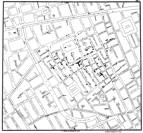
 No-one learns about cartography without studying the map of cholera around the Broad Street pump in Soho, London in the mid 1800s by John Snow. By any measure of importance, Snow’s map has become perhaps the standard-bearer for showing us how a map can say so much more than words alone.
Snow wasn’t a cartographer. In fact many of the maps showcased in MapCarte are by non-cartographers. He was an epidemiologist, a physician and the father of anaesthesia. He was also the personal physician to Queen Victoria. Snow also gave us a classic piece of cartography which resulted in his work in tackling the cholera epidemic of 1854. Knowledge of the disease transmission process was poorly understood. Snow set about trying to make sense of the disease and its spread by plotting all known deaths on a map. It was this instrument that led to his postulating that since most deaths seemed to occur in the vicinity of a water pump on Broad Street then cholera was likely a water borne disease.
“On proceeding to the spot, I found that nearly all the deaths had taken place within a short distance of the [Broad Street] pump. There were only ten deaths in houses situated decidedly nearer to another street-pump. In five of these cases the families of the deceased persons informed me that they always sent to the pump in Broad Street, as they preferred the water to that of the pumps which were nearer. In three other cases, the deceased were children who went to school near the pump in Broad Street…
With regard to the deaths occurring in the locality belonging to the pump, there were 61 instances in which I was informed that the deceased persons used to drink the pump water from Broad Street, either constantly or occasionally…
The result of the inquiry, then, is, that there has been no particular outbreak or prevalence of cholera in this part of London except among the persons who were in the habit of drinking the water of the above-mentioned pump well.
I had an interview with the Board of Guardians of St James’s parish, on the evening of the 7th inst [7 September], and represented the above circumstances to them. In consequence of what I said, the handle of the pump was removed on the following day.
—John Snow, letter to the editor of the Medical Times and Gazette
And so spatial epidemiology was born. Thematic cartography was also brought to the fore as Snow’s overplotting of a phenomena on a street map brought to light new information from the spatial pattern of data.
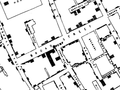 Snow’s map was ingenious and it’s remarkable that such a simple technique had not become more widely used prior to his efforts. It’s design is so utterly simple that we perhaps ignore its beauty. The simple black and white street network with road labels and the stacked approach to plotting deaths along the roads couldn’t be simpler if we tried to recreate it. The complexity of the study is brought to life through the simple graphical interface of the map. Snow didn’t need any more complex map to interpret his thesis and in so doing, he shows how maps can say so much with so little.
Of course, history tells us that by the time Snow had realized the mode of transmission, and action was taken to remove the handle from the pump, the disease was already abating. That shouldn’t reduce the importance of his work to epidemiology and public health or to his map in relation to cartography. It is rightly one of the most important maps ever made.
You can learn more of Snow’s map through the John Snow Society here or view a digital copy of the book he wrote (which contained the map) here.

