Sometimes what seems the most insignificant of map topics makes for some of the most intriguing cartography. In fact, the quality of the cartography might be one of the reasons that makes a perhaps uninteresting topic all the more interesting.
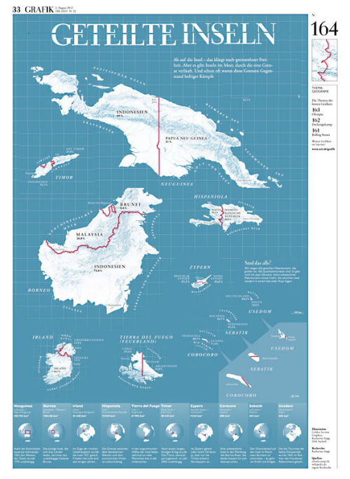
Here. Die Zielt magazine has created an illustration of the world’s divided islands. There’s no more explanation needed because the title says it all. In fact, it goes to show how important a title can be in framing the map. Of course, the geography is completely dispensed with as the islands are illustrated from the largest at the top of the page to the smallest giving a good balance. The faux-grid in the background hints at a proximity that doesn’t exist but it helps to group the islands together not just by theme.
The use of colour is exceptional by using blues for all features including the background, white for text and a strong red line to illustrate the borders themselves. The globes at the foot of the page give us a good structure and the overall composition is well crafted.
A simple idea, almost whimsical but which demonstrates the power of high quality cartographic design.


