 One of Edward Tufte’s often repeated quotes goes something like this… “The world is complex, dynamic, multidimensional; the paper is static, flat. How are we to represent the rich visual world of experience and measurement on mere flatland?”. Indeed, this problem is at the heart of cartography and becomes prominent when we’re looking to map multivariate thematic data. With a palette of points, lines and areas and a range of visual variables it’s often difficult to concoct a way to mp the data without seriously compromising something. It’s a challenge to represent complex data using simple, easy to decipher graphics.
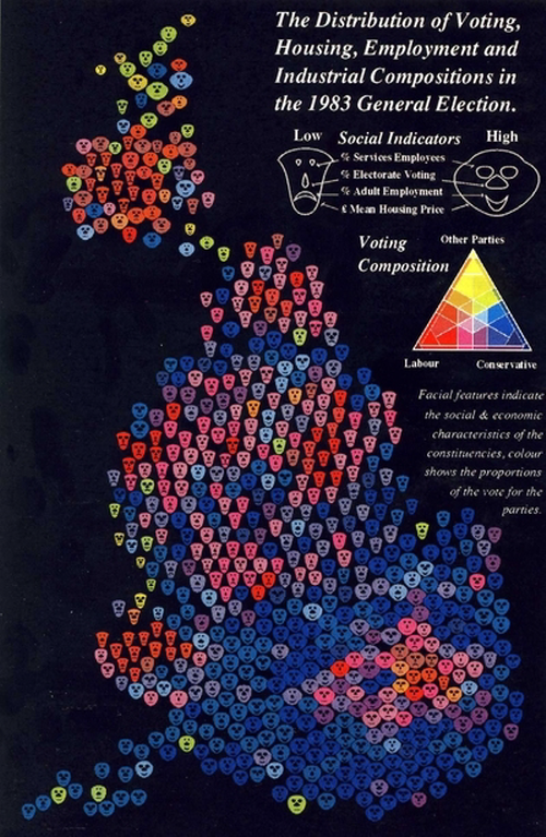
This example of a multivariate cartogram by Dorling does just that. The cartogram that he created is based on the redistribution of proportional symbols such that they do not overlap. The underlying geographical structure is largely ignored though symbols are placed as close to their original position and in relation to their neighbours as possible. Here, the complex social landscape would normally be represented by a geometric symbol such as a circle which would be proportional to the population of the area they represent. Dorling goes one step further though by using Chernoff Faces to ascribe additional information.
Sizes of faces are proportional to the electorate and shape, eyes, nose and mouth each display additional socio-economic variables allowing a theoretical maximum of 625 different faces. In reality only a fraction of these permutations exist, each coloured in one of 36 trivariate colours. Maps such as this require a clear legend. Dorling makes the legend larger to support the fact that this map requires readers to refer to it frequently. While this idea might be contrary to a lot of cartographic design theory (symbols should be capable of being interpreted with minimum recourse to the legend), such multivariate symbology needs clear unambiguous explanation.
The strength of the image is its overall impact as well as allowing readers to mine detail. Faces evoke emotional reactions and show social differences we can easily interpret. Sharp local divisions or gradual changes emerge. While such glyphs can often overload a map image, Dorling combines them masterfully and the strong colours on a black background create additional contrast and impact and the recognisable shape of the Great Britain emerges.
Another of Tufte’s mantras is that you can symbolise complexity by giving detail. Here, Dorling makes a very efficient and simple looking graphic by providing a wealth of detail. It’s an art form to be able to represent complexity simply but maps can be very efficient ways of presenting multivariate data if done well.

