MapCarte 150/365: Aeromagnetic map of part of Connecticut by USGS, 1969

MapCarte150_aeromagneticMaps have always been used as basemaps for the creation and publication of other maps. Normally referred to as compilations (as in the compilation stage in the cartographic process), but also as mashups in the modern map-making vernacular, we use existing work atop which we place our own new information. This allows us to use someone else’s surveyed work to reduce the need for making an entirely new map but it also gives us a useful reference geography.

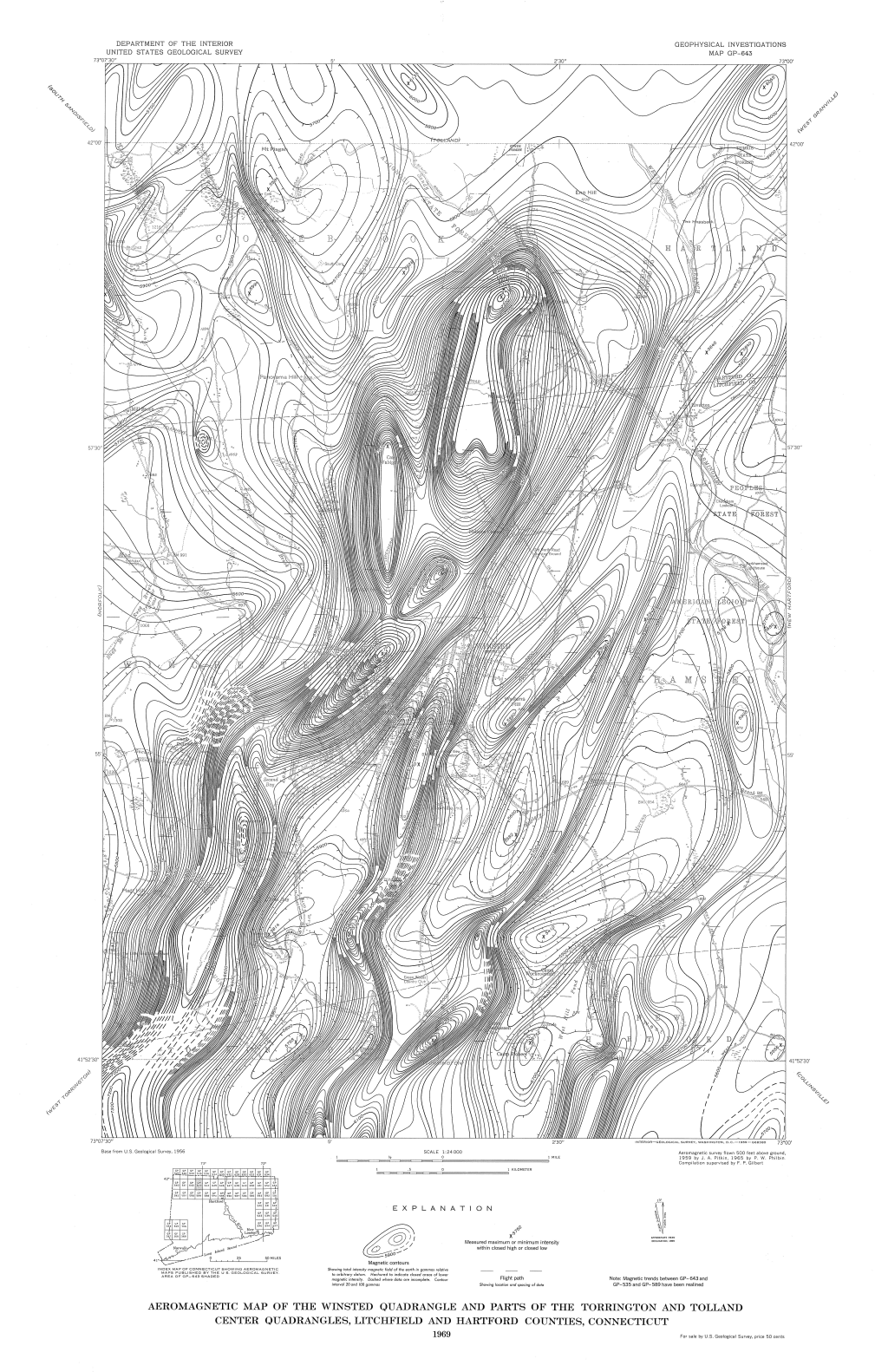
This excellent example from a USGS aeromagnetic survey of 1969 uses their own 1956 topographic quad sheet as a base. They’ve removed all colour and retained only the very basic linework, typography and patterned fill symbology. These are in thinner line weights to enable them to recede to the background. The new data was captured from a survey plane flying at 500ft. The resulting data points subsequently interpolated as lines of equal magnetic value (in gammas) and drawn as magnetic contours (isogonic lines).

MapCarte150_aeromagnetic_detail

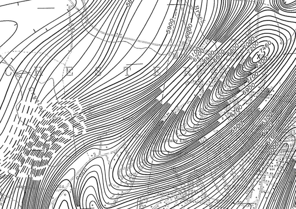
The resulting map of the intensity of the magentic field is at medium scale (1:24,000) and shows considerable variation across the mapped area. The detail is impressive but the approach is novel for the way in which individual contours are dropped in heavily detailed areas leaving only the index contours. Given the dramatic variation in magnetic field intensities there simply isn’t another suitable approach and the balance of detail and clarity is maintained throughout. Good contour labelling assists in interpretation.

A great map compilation showing the use of an uncluttered and simplified base map for the display of detailed thematic overlays. The fact the entire map is in monochrome shows how well the authors have managed to combine the base with the overlay sensibly. It also shows that an overlay needs to enable the base to be seen (otherwise what is the point!) and shouldn’t shroud it. Finally – colour isn’t always necessary and this map shows you can create complex and detailed maps with the simple approach of black on white. There’s an art to it but this map illustrates it well.

MapCarte 116/365: Google Maps by Google, 2005-present

MapCarte116_google1Lars and Jens Rasmussen’s mapping company was acquired by Google in 2004 and the mapping landscape transformed on February 8th 2005 when Google Maps was released as a web-based product (maps.google.com).  Google Maps (and numerous complimentary products) has both disrupted and revolutionised the way the people view, use and make maps and how they interact with their surroundings. Google’s intent to organise the world’s information to support their Search capabilities has often been expanded to the ideal of “organising the world’s information, geographically”. Let’s not forget that Google are a company whose focus is advertising and the revenue raised from placing adverts on web pages, their search results and on the map is what funds the business. The map has become a key mechanism for people and we perhaps cannot have predicted the astonishing rise of its use.

MapCarte116_google5

Several other disruptive technologies have converged to enable this to happen, not least the ubiquity of the internet and rapid development and uptake of mobile devices. People now expect information to be streamed rapidly, often through a map interface. Google’s map is now part of our everyday toolkit in a way that can perhaps never have been imagined. Designed to support Google’s mission but designed so well that it is perfect form of viral marketing itself.

MapCarte116_google4

In addition to becoming the default map of choice for finding places and navigating, the Google Maps API has also underpinned the democratization of online mapping to allow anyone to create geographically contextualized mashups and also customise the base map data to their own style. The original design left much to be desired and problems of disjointed data and poor cartography have been addressed so today’s product gives a finely tuned, responsive and clean map experience.

MapCarte116_google3

The design is recognizable and supports a strong, clear brand that is consistent at a local scale, globally.  Integration of complementary functionality (e.g. routing, traffic information, overlay of social media and photographs, zooming, panning, querying and measuring) provides an application with a multitude of purposes that goes beyond a general reference map.  The design is automatically modified depending on its use.  For instance, secondary roads widen at particular scales when you overlay traffic information to show each direction of traffic flow.  The appearance of 3D buildings and moving shadows at large scales (in some cities) represent the built environment like never seen before.

MapCarte116_google2

Google Maps is used every day by millions to actually ‘do something’. No other map in history can claim such widespread adoption and use. it’s successful because it works. With that many people using and testing if it wasn’t up to the task it’s use would soon diminish. It is content rich yet very straightforward. The colour is subtle and the typography sits well at each scale and transitions between scales. This is a single map but designed at 20+ scales to work at each scale and to work across the scales. It accommodates a wide and diverse range of users and is localised. It supports terrain layers, satellite imagery and hybrid mapping. it allows you to incorporate photo tours and switch between 2D and 3D and StreetView. There isn’t much this map does not do.

MapCarte116_google6

Can we ignore the fact that Google brought Mercator back to prominence? Maybe not…but Web Mercator is a perfect technical solution for serving tiles of data because it tesselates in squares, is efficient and scales rapidly. It won’t be long before projections can be modified in web maps so until then we just have to accept them (and deploy our own maps using different projections) when necessary.

Quite simply the map is, and continues to be revolutionary. The 2005 map would get nowhere near MapCarte. The 2014 version is state-of-the-art and in less than 10 years Google are leading big league cartography and fully deserve inclusion.

I’d be surprised if anyone reading this doesn’t know how to access Google Maps but just in case…it’s here.