 Maps have always been used as basemaps for the creation and publication of other maps. Normally referred to as compilations (as in the compilation stage in the cartographic process), but also as mashups in the modern map-making vernacular, we use existing work atop which we place our own new information. This allows us to use someone else’s surveyed work to reduce the need for making an entirely new map but it also gives us a useful reference geography.
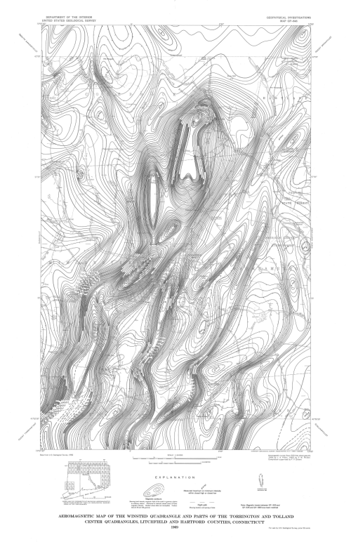
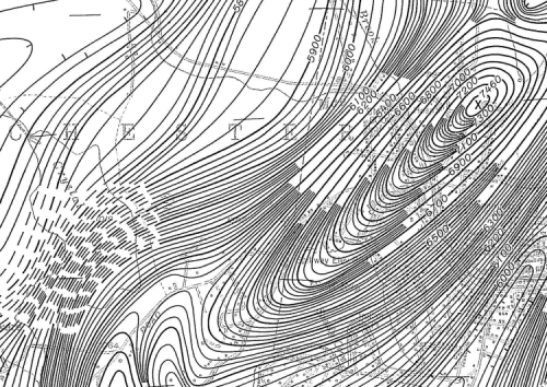
This excellent example from a USGS aeromagnetic survey of 1969 uses their own 1956 topographic quad sheet as a base. They’ve removed all colour and retained only the very basic linework, typography and patterned fill symbology. These are in thinner line weights to enable them to recede to the background. The new data was captured from a survey plane flying at 500ft. The resulting data points subsequently interpolated as lines of equal magnetic value (in gammas) and drawn as magnetic contours (isogonic lines).
The resulting map of the intensity of the magentic field is at medium scale (1:24,000) and shows considerable variation across the mapped area. The detail is impressive but the approach is novel for the way in which individual contours are dropped in heavily detailed areas leaving only the index contours. Given the dramatic variation in magnetic field intensities there simply isn’t another suitable approach and the balance of detail and clarity is maintained throughout. Good contour labelling assists in interpretation.
A great map compilation showing the use of an uncluttered and simplified base map for the display of detailed thematic overlays. The fact the entire map is in monochrome shows how well the authors have managed to combine the base with the overlay sensibly. It also shows that an overlay needs to enable the base to be seen (otherwise what is the point!) and shouldn’t shroud it. Finally – colour isn’t always necessary and this map shows you can create complex and detailed maps with the simple approach of black on white. There’s an art to it but this map illustrates it well.

