MapCarte 370/365: A world of lotus, a world of harmony by Liao Zhi Yuan, 2015

MapCarte370_yuan

Cartography has always been, in part, an artistic pursuit and in a world where many more maps are now made digitally we see a lot of bland cartography in design terms. Still, hand drawn maps inspire and have something very human about them. The marks of the pen and the shades of the colouring give the map character. Of course, when we’re growing up we routinely draw with pen and paper and the recent entries to the International Cartographic Association’s Barbara Petchenik children’s map competition evidence the imagination and artistry among the world’s youngsters.

This beautiful map from 15 year old Liao Zhi Yuan of China typifies not only a high level of artistry but also in interpretation and use of the map form. Pictorial maps often make heavy use of non-map imagery or combine elements to make up a map form. Here, the use of the aquatic lotus flower, reflecting cultural significance, forms the shape of the landmasses of the world map within an ornamental pond. It’s a simple yet effective idea that communicates a message of harmony using established symbolic visual metaphors. The map itself is a lovely piece of cartographic art and well drawn.

Of course, we don’t all have to have an artistic talent to make maps but if you’re going to make maps like these it certainly helps. It should also act more generally as an inspiration to think creatively and to aspire to make maps that are set apart from the rest.

MapCarte 369/365: Illustrated London by Mike Hall, 2011-present

MapCarte369_hallHigh quality linework and meticulous colouring give rise to clean cartography. In this age of web maps it’s good to see that illustrators still find value in crafting maps by hand to create one-off sheets. Mike Hall has been creating a series of maps of London’s Boroughs since 2011. This example of tower hamlets is an example of the skill with which he fashions beautiful, well balanced maps that combine detailed cartography with marginalia that harks back to historic maps.

The inclusion of crests, shields, illustrations and views of key places along with decorative borders and typography show mastery in layout that displays a keen sense of the importance of form as well as function. The map is intended to delight; to be seen and used as much as an artistic piece as a way of exploring the geography. Maps always did ‘fill in the gaps’ to create a whole that was greater than the sum of the parts and Hall brings the philosophy up to date with his creative cartography.

Each of the maps in the series riffs off particular themes or historical events from the Borough so each has a unique identity. As a set, they bring to life the rich variety of London’s landscapes as a tapestry of maps that reflect their very different characters.

Hall’s work goes beyond this series of maps. His isometric drawings and other map-based illustrations are equally impressive. Modern map-makers can certainly learn a few things about the art and craft of cartography by studying his work.

See this series of maps and Hall’s other work at his web site here.

MapCarte 368/365: PAC-MAN Google Maps by Google, 2015

MapCarte368_pacmanPAC-MAN Google Maps at Taj Mahal, India

Take a classic map and combine it with arguably the world’s most loved video arcade game PAC-MAN. Genius! We’ve highlighted the importance and design credentials of Google Maps in MapCarte already (MapCarte 116) but the ability of Google to take their platform and come up with imaginative ways for us to engage with maps knows no end. Of course, they’re no strangers to using their map as a basis for a game as their Cube game demonstrated in 2012 (MapCarte 90)

You navigate the maze of streets as PAC-MAN, consuming pac dots and other bonus items while avoiding Blinky, Inky, Pinky and Clyde. The bonus items include the typical fruit icons from the original game but added are a Google Maps marker and Peg Man – nice touches. The game play is superb and very faithful to the original as you use cursor keys to move PAC-MAN around. They’ve even managed to get it working nicely on mobile devices using swipe gestures.

The re-styling of streets from Google Maps into the PAC-MAN maze is also faithful to the original with the dark background and neon blue maze structure being applied to street casings. It’s wuite simply a lovely re-imagination of the game and a fun way to repurpose the map to provide an entertainment medium.

Sadly, the game appears to be a temporary fixture for Google Maps but in marrying these two design greats they’ve proven that maps really can afford a template for all manner of purposes.

This video from C:NET illustrates the gameplay


Instructions to play Google Maps PAC-MAN are here.

MapCarte 367/365: ATP Tennis World Tour Venue Map by Damien Saunder, 2015

MapCarte367_saunderClick on the map to view the web map

We’re currently awash with web maps of this and that which is inevitable as the availability of data and the tools necessary to make maps increases. Quality web maps are still a rare commodity because many still lack the thought required that turns data into something useful and useable. This map is a refreshing highlight. It does one job and does it remarkably well.

Take a dataset of the locations of all the men’s tennis tournaments for the year and present them across a map. Simple yes…the map could just have a dot for every tournament but at small scales it would look ugly and the dots would be lost amongst the background at large scales. Here, Saunder has taken advantage of the tool of production to have locations aggregate at small scales and ‘explode’ to reveal individual tournaments as you zoom in or you click on the numbered symbols. The fact a few always appear gives the user a clear hint of what to expect when you tackle the numbers.

The side panel is unencumbered and presents the taxonomy of tournaments with simple colour motifs that link to the map. Expanding the side panel allows you to access the tournaments by name or location and is sensibly presented in date order. The information panel opens when you click a tournament to reveal consistent information and the pictures go beyond just showing us the main court of play. Across the map, they reveal a pattern of surface types with hard courts, clay and grass tending to occupy discrete regions. These also tend to reflect the seasons in which a tournament takes place. While the panels contain a lot of content, brevity has been achieved using icons to avoid the need for superfluous text and which presents prize money, the current champion etc in a different visual style. This adds interest and breaks up what might otherwise have been a dense panel of text. The large symbols are a bold statement but they work to fill space and to make the theme and function of the map explicitly figural.  They also work well across an imagery basemap and of course, using imagery means we get to zoom into and see the actual venues.

Fundamentally, a simple but detailed dataset that is handled well in a web map. Clean and clear design thinking underpins the map and elevates it beyond many of its contemporaries that simply dump data and expect the map to work.

MapCarte 366/365: Non-stop by Alberto Lucas López, 2015

MapCarte366_lopezJust when you thought your daily dose of MapCarte from 2014 had finished…here’s the beginnings of a less frequent, intermittent post of great maps on which to feast your cartographic senses.

In an age where flashy, spinning, animated, colourful web maps seem to be all the rage it’s refreshing to see that applying some control on your cartography can still bring to life a fantastic example of the art of map-making. Here, Alberto López has created a simple but graphically effective map showing the non-stop flight paths from Hong Kong. The first aspect that grabs you is the use of RB Fuller’s Dymaxion projection. Visually interesting, it adds something unique to the display. The same data could easily be shown across a cylindrical projection or, if we wanted concentric flight time zones, an azimuthal projection dentred on Hong Kong…but the map would not have been as interesting or stimulating.

Similarly, instead of the usual use of flowlines that arc across the map (on a cylindrical projection) or which would radiate from a point (on the azimuthal), López has chosen instead to use time bands.  The simple two colour approach to showing time also echoes the coastline, graticule, map frame and other components. The use of blues for the destinations and also the outline of the area outside the range of non-stop aircraft is subtle and uses contrast to good effect.

There’s a subtle use of two different typefaces, one for the main map components and descriptions and another for the introductory panel that again creates a visually useful and pleasing contrast. The inverted distance band labels in white situates them well in the visual hierarchy. The simple but useful graphs add to the story by showing us some of the salient aspects of the data in a more useful way.

This is effectively a two-colour map (maybe use the blue for all textual components instead of black?) which creates an interesting and engaging map. There’s a lot of good cartographic design going on here to establish good hierarchy, contrast and balance which when brought together creates a great finished product. It doesn’t need to be anything more than it is and proves that keeping things simple is both an art and an effective solution.

The map was published as part of the South China Morning Post’s infographics feature here including links to a larger version.

A year of MapCarte

Wow! I did it. This time last year I was getting so disillusioned with the avalanche of bad maps and the criticism, from some, that cartographers do nothing but moan about bad maps that I decided to turn the tables. I committed to writing a daily blog about great maps. We all have our personal favourites but I wanted a broad selection that reflected a diverse view rather than it being my list. I think I just about managed it with a little help from my friends.

The idea was simply to create a repository of maps, along with short commentaries, that exhibit high quality design principles. The collection proves that design can morph and be presented in a multitude of different ways but this is precisely what makes cartography such a wonderful subject. In essence, everything is designed…it’s just that some designs end up being better than others. They may be beautiful to look at; they may support a particular function with clarity and efficiency; and they may become recognised as classics. Many maps are based strongly in science and the display of ‘truth’ so they are constructed in a particular way. But they are also an artistic endeavor and they display their wares according to many influences. As such, they pique our interest as much based on our own likes and dislikes in style. Fashion and trends play a major part in map design and we can also chart the way in which maps have changed in appearance over time. perhaps due to technological change and the instruments we use to make the map; perhaps also as our preferences change in the same way we see genres develop in both art, literature and film.

My hope for this collection is that whenever we are stuck for inspiration, or whenever someone says ‘show me a good map’ then here are 365 examples to whet the appetite. They represent as broad a definition of cartography as you could possibly see in a single collection. They’re authoritative because they’ve been compiled by cartographers. There’s probably some of your own favourites missing. Some of mine are too…but that’s not the point. It’s a collection that illustrates the diverse, rich world of cartographic design from the perspective of the professionals that inhabit that world.

A quick way to get an overview is to visit the accompanying MapCarte Pinterest Board at http://www.pinterest.com/icamapdesign/mapcarte/

So here’s a few thank yous to those who have helped…

I ended up writing all but 5 of the entries. Alex Kent wrote the other 5. I’ve also had maps suggested to me by many people including Damien Saunder, Linda Beale, Daniel Huffman, William Cartwright, Georg Gartner, Anja Hopfstock, Steve Chilton, Bernie Jenny, Manuella Schmidt, David Fairbarin, Craig Molyneux, Roger Smith, Geoff Aitken, Gennady Adrienko, Craig Williams, David Watkins, Peter Jones, Karel Kriz, Keith Clarke, Eric Steiner and Rollo Home. There are likely many others and I am sorry if I have forgotten to mention you personally but your suggestions have been invaluable. I’d also like to thank the many, many people who have sent me messages of support over the year. There’s been the odd evening where the last thing I wanted to do was write about yet another bloody map…but as the series has taken off and more people saw the posts, ‘liked’ them or retweeted them it became clear it was worthwhile. There’s little point starting something like this unless it’s going to be seen so to all of you who have taken the time to read, whether you’ve told me or not, I thank you sincerely and hope you’ve found the examples useful. It was nice that one person has commented that the effort has been ‘legendary’. If nothing else, I’ve had fewer naysayers whinge about a lack of good examples of great cartography this year…they seem to have gone back into their box. Thanks everyone!

What next…well I’m not going to start MapCarte II. Given 99% of it has been done outside work time it’s been a challenging commitment and I’m moving on to other exciting projects in 2015. It’s likely I’ll add to MapCarte as and when fascinating new maps are published that deserve mentioning so you’ll see the series continue albeit infrequently. As for a book on MapCarte – watch this space…

Happy map designing in 2015. I’m off for a lie down.

Ken

MapCarte 365/365: Anson Island by Roger Anson, c.1989

And so to the final map of this year’s blog. 365 entries which form a solid exploration of cartographic design using classic and contemporary examples of the art, science, technology and craft of cartography. And the final map is…not a map. It’s the following description:

MapCarte365_anson_textMental mapping is a natural part of our everyday lives. The maps we form in our own mind help us make sense of the world, picture places and support our navigation. While there is plenty of research to support the notion that modern technology is eroding our spatial cognition, the ability to define our own unseen cartographies remains key to understanding space and place. Our own mental maps are informed by a multitude of factors including education, experience, likes, dislikes, aspirations and desires. Classic studies show us that who we are and where we live play a big part in establishing our own personal spatial order. Our own knowledge allows us to, for instance, draw maps that more closely relate to reality compared to our abilities when imagining unknown places. Mental maps are not devoid of design either. We picture our maps in a variety of ways from simple black and white line drawings to fanciful worlds.

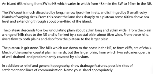
This MapCarte entry is a personal thank you to one of my former mentors, Roger Anson. Roger was Principal Lecturer in Cartography at Oxford Polytechnic. He was the boss and along with his colleagues in the late 1980s and early 90s they taught me all they knew about cartography (and a lot about beer as well – but that’s a different story). As students,one of the earliest practicals we were asked to complete involved the passage of text you see above. I’ve kept it and used it with my own students over the years. It’s a simple description of a place. The task involved drawing this place; building a mental image and then translating it to paper. It was a wonderful exercise in exploring the difficulties of imagining and describing places using words and the importance of maps as ways of seeing and representing space and place.

Unwittingly, we were being taught the importance of mental mapping and learning how to better create a spatial framework in our own minds. The development of our mental mapping capabilities was as important as our abilities to simply make maps using pens or computers. We first had to imagine them. The tools and the buttonology was secondary. They were merely the mechanisms by which we translated what we saw in our mind to a useful tangible product. It’s a principle that still serves well today.

So what of the map that the text describes? Can you imagine what the map looks like? Can you draw the map? Is it a real place or something abstract?

Well, below is my hand drawn effort from all those years ago (yes, I keep everything!).

Mapcarte365_field
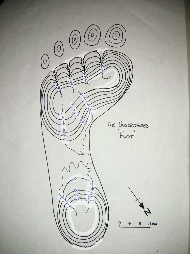
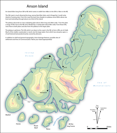
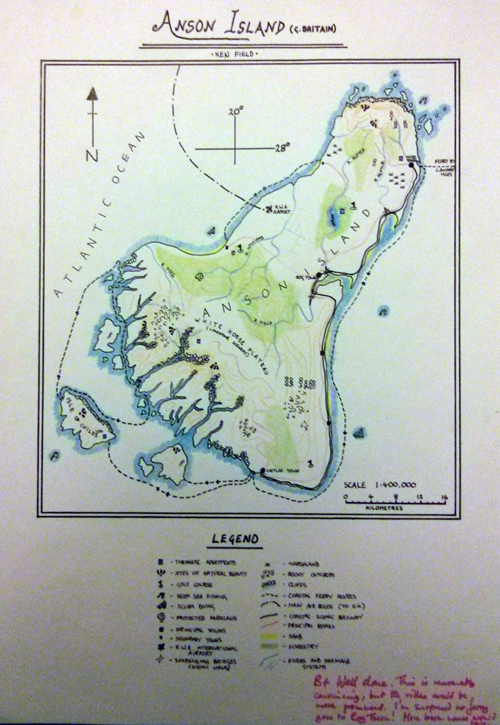
I called the place Anson Island. Can you tell what it is? As Roger said himself in the grading…it’s ‘reasonably convincing’ though when I quickly re-drew the map some years later to show my own students what they were ‘seeing’ (including copious Snowpake!) the map becomes somewhat more obvious in general structure:

Mapcarte365_fieldfoot
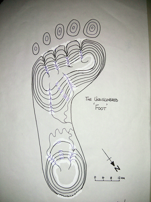
For some reason that I cannot recall I re-named the island ‘The Undiscovered Foot’. Reading the description back, the answer seems obvious and once seen it’s almost impossible not to ‘see’ the foot in the original passage. But it didn’t at first.

The beauty of mental mapping means it’s neither right nor wrong…it’s one interpretation. There are others! If you follow the basic structure of the description you’ll arrive at, well, a drawing of a footprint or something a little more fanciful like my original effort. Post-exercise we were told by Roger that he got out of the bath one day and stepped onto the bathroom floor whereupon his wet foot made an imprint. He imagined the wet puddle as a map and began describing the puddle as an imaginary island, or set of islands. Where there was more water, he imagined mountains.

It makes for a fantastic exercise to create a fictional topography that shares the same basic structure of a footprint. Of course, many of our maps didn’t look anything like footprints (mine only bears a passing resemblance)…because by the time you’d realized what it was you were drawing you’d already spent a considerable time and you weren’t allowed to start the exercise again. This also taught us the value of time in the cartographic design process…thinking is important. Our use of computers and reliance on defaults tends to bypass that thinking phase for many these days but thinking about your design and sketching it out remains important.

I thought I’d bring my effort up-to-date so here’s a 2014 version which I’ve reverted back to it’s rightful title of ‘Anson Island’. Perhaps interestingly the original version took me possibly a couple of days. This version took me about an hour.

MapCarte365_ansonWe are all mental mappers in the sense that we can all imagine geographies and we translate spatial understanding into pictures using mental cartographies. We design our own maps and they all look different. One other outcome of this exercise has led to a phrase I often come back to…apart from when one makes a constructional error, in map design there’s often no such thing as a correct map and an incorrect map; there’s simply better maps and poorer maps. Following the basic principles of cartographic design gets you some of the way to producing a well formed map. Beyond that, you need a little imagination, a little flair and an ability to bring something innovative and inspiring to your work.

You also need great tutors and Roger and his colleagues inspired me, taught me and nurtured me. This final MapCarte is a dedication to all those great cartography tutors out there who give us the basic cartographic design principles upon which we build our maps. Beyond that, we all bring our own design philosophy, style and influences to our work.

Maps exist in all of us. Some of them turn out to be great, some not so great; but they are all designed in some fashion and all add to the wonderful world of maps.

MapCarte 364/365: Detail of area around the Broad Street pump, by John Snow, 1854

MapCarte365_snowNo-one learns about cartography without studying the map of cholera around the Broad Street pump in Soho, London in the mid 1800s by John Snow. By any measure of importance, Snow’s map has become perhaps the standard-bearer for showing us how a map can say so much more than words alone.

Snow wasn’t a cartographer. In fact many of the maps showcased in MapCarte are by non-cartographers. He was an epidemiologist, a physician and the father of anaesthesia. He was also the personal physician to Queen Victoria. Snow also gave us a classic piece of cartography which resulted in his work in tackling the cholera epidemic of 1854. Knowledge of the disease transmission process was poorly understood. Snow set about trying to make sense of the disease and its spread by plotting all known deaths on a map. It was this instrument that led to his postulating that since most deaths seemed to occur in the vicinity of a water pump on Broad Street then cholera was likely a water borne disease.

“On proceeding to the spot, I found that nearly all the deaths had taken place within a short distance of the [Broad Street] pump. There were only ten deaths in houses situated decidedly nearer to another street-pump. In five of these cases the families of the deceased persons informed me that they always sent to the pump in Broad Street, as they preferred the water to that of the pumps which were nearer. In three other cases, the deceased were children who went to school near the pump in Broad Street…

With regard to the deaths occurring in the locality belonging to the pump, there were 61 instances in which I was informed that the deceased persons used to drink the pump water from Broad Street, either constantly or occasionally…

The result of the inquiry, then, is, that there has been no particular outbreak or prevalence of cholera in this part of London except among the persons who were in the habit of drinking the water of the above-mentioned pump well.

I had an interview with the Board of Guardians of St James’s parish, on the evening of the 7th inst [7 September], and represented the above circumstances to them. In consequence of what I said, the handle of the pump was removed on the following day.
—John Snow, letter to the editor of the Medical Times and Gazette

And so spatial epidemiology was born. Thematic cartography was also brought to the fore as Snow’s overplotting of a phenomena on a street map brought to light new information from the spatial pattern of data.

MapCarte365_snow_detailSnow’s map was ingenious and it’s remarkable that such a simple technique had not become more widely used prior to his efforts. It’s design is so utterly simple that we perhaps ignore its beauty. The simple black and white street network with road labels and the stacked approach to plotting deaths along the roads couldn’t be simpler if we tried to recreate it. The complexity of the study is brought to life through the simple graphical interface of the map. Snow didn’t need any more complex map to interpret his thesis and in so doing, he shows how maps can say so much with so little.

Of course, history tells us that by the time Snow had realized the mode of transmission, and action was taken to remove the handle from the pump, the disease was already abating. That shouldn’t reduce the importance of his work to epidemiology and public health or to his map in relation to cartography. It is rightly one of the most important maps ever made.

You can learn more of Snow’s map through the John Snow Society here or view a digital copy of the book he wrote (which contained the map) here.

MapCarte 363/365: Buyer Beware by National Post, 2012

MapCarte363_buyerThe rise of the infographic as a form of representation has brought with it some unwanted baggage. In trugh, information graphics have always been around but giving them a label has suddenly brought them into focus. What most people think of as an infographic might be summed up in this fantastic parody from web-comic XKCD…the list-like approach to representing a vaguely connected set of facts using seemingly random graphical approaches. Maps have always been information graphics. They are a specific form that deals with the spatial representation of data. We use design to encode meaning and to create visually interesting graphics that communicate to an audience. Perhaps where we’ve seen a development over recent years is in the use of maps as anchors for a story; where a different visual aesthetic is formed by bringing together maps, strong non-spatialised graphics and other components such as text. This example shows how a modern map-based infographic brings together the elements in a well-composed display.

In effect, the infographic approach to cartography emphasises the role of layout in design. The map is used as the core though in truth it’s really used simply as an image. There’s no information encoded into the map itself. It’s devoid of labels or any meaningful data. Instead, it plays the role of the mechanism that leads to other detail and allows us to use forms that might not be useful in other contexts. Here, two azimuthal projections of the globe are organised to support the use of leader lines to the information encoded using systematic, uniform pictorial graphics. Each is represented using the same general form and pictographs encoded with shape and colour give us the detail. The graphics are easily understood and overall, create an interesting pattern on the page, inviting the inquisitive reader.

MapCarte363_buyer_detailThe overall layout is augmented by panels of text that bring the story to the same page rather than an approach which might have seen the map embedded in a passage of text. This combination of the written passages and an interesting graphic gives us a form of graphical story-telling that integrates many different visual components, including maps into a coherent whole. It’s an infographic…but really, at it’s heart, it’s just well designed thematic cartography.

MapCarte 362/365: The United States of Bacon and Kale by Eric Chemi, 2013

MapCarte364_kaleThe rise of the ‘viral map’ has been something of an anathema to reasoned, considered and accepted principles of cartographic design. Much of what we see across social media and in popular media wouldn’t be considered as representing good design and in most instances there’s every reason to use such maps to highlight the limitations of the map. However, such maps are not all in bad taste and can bring us visually interesting examples of map-making that while not necessarily exhibiting classic cartographic design bring a new aesthetic to the body of cartographic work. This example by Eric Chemi accompanied a short news blog that looked at the spatial distribution of tweets that mentioned kale compared to mentions of bacon. Such subjects seem to be tailor made for the production of quick and dirty maps but this example proves that with a little care and thought, the map can actually become something visually interesting despite the whimsy. In fact, it’s entirely possible that such maps comprise a new form of ‘whimsical cartography’. Done well, like this example, shows us that design has no fixed boundaries and allows us to bring together a rich and varied palette of visual forms.

While a standard choropleth with diverging colour scheme would have been fine, the medium of publication possibly demands something more attention grabbing. Instead, the map-maker has transposed images of kale and bacon onto the palette and varied the opacity of the image to give a sense of magnitude. We can easily see the states with the highest ratio of kale or bacon tweets. We can see the states where there is a closer balance. It’s a simple approach but one which supports the congnitive process required. It’s also visually interesting. The addition of a few key textual components adds to the map by highlighting some useful nuggets of information. In this way, a rather bland choropleth map has been re-invented to give us a far more interesting visual feast…literally.

Done well, the simple map which accompanies relatively trivial media blog posts can bring us something unique and visually interesting. It exemplifies the fact that design is important in so many contexts to ensure that we don’t relegate the map to a pointless supporting role. Here, the map becomes one of the key take-aways, the key visual that people recall and a talking point in itself. That’s design.