Maps tend to be designed and produced for what might be termed normal circumstance viewing. By that, we mean that you’d expect the map to be viewed in reasonable light, in fairly benign circumstances and so on. Of course, that isn’t always the case but how many times do we see maps designed to deal specifically with unique viewing conditions?
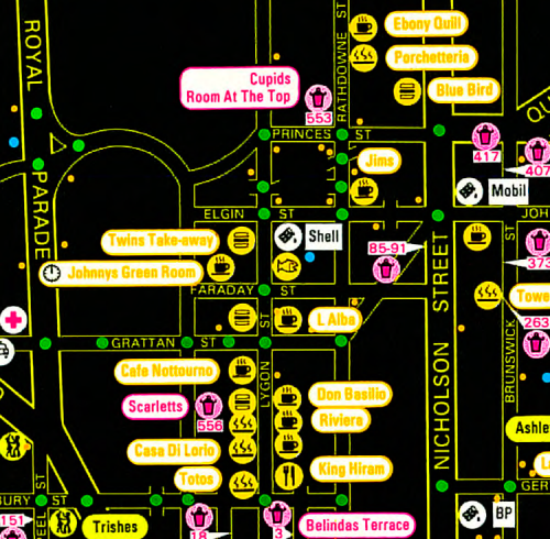
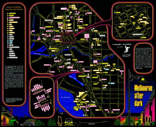
Cartographics International was established by Chris Crook, Maris Lakis and John Robertson. This map illustrates their unique take on cartographic design for viewing under street lighting. The colours are highly saturated and contain high contrast with surrounding detail. They are presented on a black background which minimises glare and the almost neon approach is highly effective.
 It’s not just the colour that is different – symbology and linework is quite sparse so as not to create a cluttered map difficult to disentangle visually. Bold lines are used throughout to help legibility. Many labels are printed against a white mask to give maximum contrast.
Maps do not have to look the same – we always consider our users but this map demonstrates how to really accommodate viewing conditions for those that would use the map.

