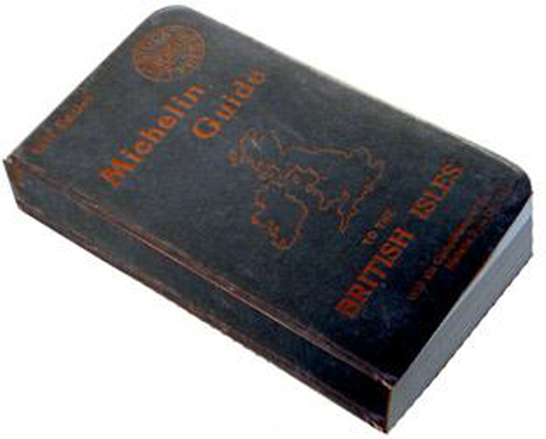
 Michelin, the French tyre manufacturer has long been known for more than just its tyres. It publishes guide books, maps, travel guides and is the organisation that bestows Michelin stars to restaurants in its red guide book for the quality of its cooking. Even the company mascot Bibendum, colloquially known as the Michelin Man, is one of the most iconic brand symbols.
Our interest in MapCarte is in the cartography of the Michelin Guides, a series of annual books first published in 1900 with the French guide for motorists. The guides were originally published with blue covers but these were changed to red in 1931 and they have been known as the red guides ever since.
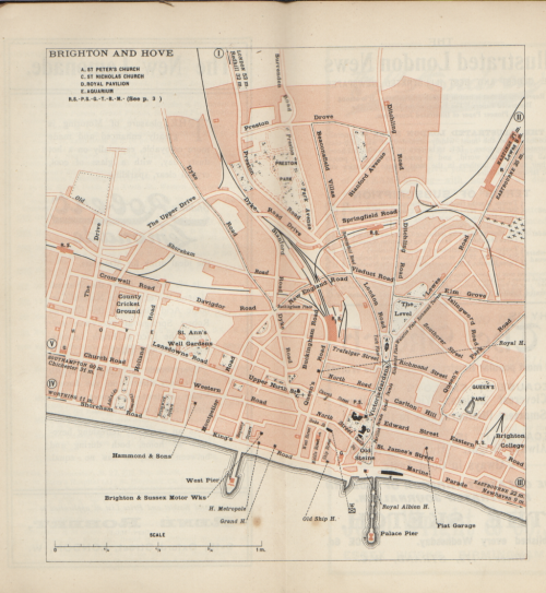
In particular, the more historic early editions which contained some beautiful cartography. Originally designed to boost demand for cars (and thus tyres, the first edition was given away free and contained information for motorists, maps, car mechanics, hotels and petrol stations. Other countries soon followed and the example here, from the 1911 British Isles version illustrates the cartography perfectly.  The guides continued to be given away free until 1920. The restaurant listings became hugely popular and this gave rise to anonymous restaurant inspections and in 1926 the award of stars for fine dining and eventually a category that informed the motorist of the value of the establishment in context to a journey as follows:
- one star: a very good restaurant in its category
- two stars: excellent cooking, worth a detour
- three stars: exceptional cuisine, worth a special journey
The maps are two colour and yet convey the essential information for a motorist perfectly. In urban areas, roads are not actually drawn but remain a focal point because of the depiction of built up areas which deliniates the road system perfectly. Roads are deliniated by linework only where buildings do not exist. It’s a very clever and efficient method of depicting the central component of a map for a motorist! Labels and other features are overprinted in black with small pictorial symbols where necessary. Patterned fills indicate parkland, Churches are also depicted in black and a waterlining technique marks out water bodies and the coastline. The only black linework indicates rail links and dashed lines are used well to link to places noted in the margins.
These large scale town plans are particularly detailed and accurate. So much so that while the guides’ publication was suspended during World War II, the Allied Forces requested a reprint of the 1939 guide because it contained the best and most up-to-date cartography to support military use.
Beautifully simple cartography but highly effective. The form and function are well suited and the maps have a delightful aesthetic appeal.
