MapCarte 118/365: Britannia by John Ogilby, 1675

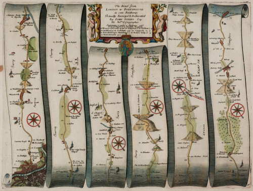
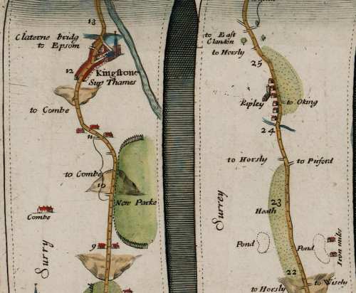
MapCarte118_ogilbyIn 1674 translator and publisher John Ogilby was appointed as His Majesty’s Cosmographer and Geographic Printer and published Britannia, a road atlas of Great Britain, in 1675 which set the standard for many years to come.

The atlas contained 100 strip maps accompanied by text at a scale of one inch to one mile.  The scale was innovative for the time and later adopted by Ordnance Survey in its first (one inch to one mile) map series. Ogilby’s maps are a linear cartogram and north varies between strips.

MapCarte118_ogilby_detail

People can orient themselves in the direction of travel regardless of the true direction.  The scroll effect suggests their use for navigation as if they were to be opened and used on the journey itself.  The lines have been necessarily straightened to fit into each strip but the essential details along the route are maintained. Features are artistically represented but all have a practical value and a great deal of extraneous detail is omitted.  Hills are included, oriented to depict whether you would be ascending or descending depending on the direction approached. Distances are included as well as place names, illustrations of villages, towns and forests. The maps, marginalia and cartouches are particularly ornate and typography also includes flowing ascenders and descenders.

Ingenious for its time and a style still used today to show the linearity of route networks (e.g. motorway networks) in many street atlases. Certainly, the use of straightened lines has become a very familiar cartographic approach for depicting transport networks with subway maps being perhaps the most abstract.

MapCarte 102/365: Egalitarian Mapping of People in Britain by Jo Wood, Jason Dykes and Aidan Slingsby, 2010

MapCarte102_woodSuccessful and elegant display of large multivariate data is rarely achieved because many attempt to fit their data into geographical space.  Of course, geographical space is often a most inconvenient container for the data because of the constraints of size and shape; and with the smallest areas containing the most diverse and important data.

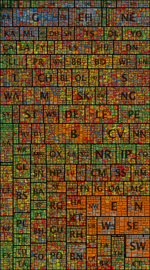
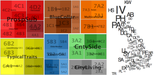
Cartograms have become a fairly typical way of taking the data outside traditional geography and ordering them in a different visual way to better display the relationships between areas. There are numerous examples but spatial treemaps not only allow you to show relationships across the data but detail within the data at different scales.  Here, Wood et al. show 1,526,404 postcode units in Great Britain, sized by population and arranged so that geographical relationships and postcode geography hierarchy are maintained.  The map is richly coloured according to a socio-economic classification comprising 7 super-groups split into 52 sub-groups that shows data concurrently.

MapCarte102_wood_legend

The map is beautifully arranged allowing patterns in the vast amount of information to become clear at local, regional and national scales.  In a single map, they have managed to effectively display detailed information about 60 million people recorded in 40 census variables in over 1 million places. The colour gives the appearance of a stain-glassed window inviting you to explore the information at different distances.  Sans serif type is a good choice to tie in with the clean regular lines of the map itself and transparency allows large labels to be placed unobtrusively.

Higher resolution versions and more explanation are available on the giCentre web site here.

MapCarte 96/365: OpenCorporates Maps by KILN, 2013

MapCarte96_kilnClick on the image to explore the web map

One of the biggest challenges in cartography is the design of a map that can succinctly illustrate the complex, intertwined nature of connections between similar phenomena. These are typically flow maps between one connected place and another and might show the movement of goods for instance. However, as globalisation continues apace they are increasingly about the interconnectivity of global entities – perhaps not along physical routes but in terms of their relationships to one another. Of course, the larger the geography, the more the content, the bigger the challenge.

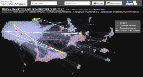
Here, KILN’s challenge was to design a map to illustrate the first global database of all the companies around the world. The data was supplied by OpenCorporates and contained all of the interlinkages from global organisations (which in truth are comprised of a multitude of subsidiaries) down to local businesses. The hierarchical nature of the data lends itself to a tree-like structure though with thousands of entries the design would soon have become too cumbersome both visually and in terms of performance through a web browser. Clustering would also be impractical due to one of the major design headaches for cartographers…detail is often most detailed in the smallest areas. Think urban vs rural differences or, in this case, huge numbers of businesses in relatively small locations like the United Kingdom.

The solution KILN settled on was a cartogram that gave each company a symbol of equal size which were then tesselated, grouped by country, into the shape of that country. The result is a map that clearly shows the relative importance of countries in terms of the quantity of companies they hold (the overall size of the country shape) as well as the density of interlinkages between companies. What works visually also works interactively as each company and country can be isolated to show the parent and children links.

It’s a combination of a cartogram and a schematic map. The shapes are abstract but as a design solution to mapping complexity, using as simple an approach as possible pays dividends.

KILN themselves describe more of the work behind their design on their web site.