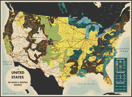
Colour can often be the defining element of a design and which gives the work as a whole a very particular aesthetic. This rather beautiful map is not much more than a fairly standard thematic map showing a range of natural resources for the United States as either shaded areas or through the use of mimetic point symbols. The use of different colours and pattern fills to illustrate the range of a particular land uses is not new. Neither are the way in which shape is used to create pictorial symbols representing certain resources…but the colours used make the map stand out.
The colours are not from a standard map-maker’s palette. They are fairly dark and although bright in hue are actually quite desaturated. This gives the map a retro feel, akin to the atlas printing of the 1950s when perhaps only a few solid colours were used. The dark background used for Canada and Mexico focuses our attention on the shape of the U.S. as the main map. The use of lightly coloured bathymetry also helps frame the main map and creates a sensible hierarchy.
Labels are bold but used sparingly. The use of yellow rectangular masks behind some of the key text gives them a strong highlight but because the whole map is bold in approach they fit right in. The title panel is strong and the use of a circular motif goes beyond the standard approach of just placing the title text on the map.
Overall, a bold and very purposeful use of colour and style that creates a strong visual with a unique aesthetic. Maps don’t have to follow convention and this breaks the mould in terms of it’s use of colour.
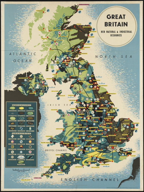
UPDATE: Despite the some 100 years+ of collective cartographic wisdom your ICA Map Design Commission team are deeply indebted to Marty Elmer for pointing out that the map featured above isn’t as original as we first presumed. While noting its retro appearance and style we were unaware of the existence of the following map produced by the British Information Services sometime between 1939-1945. The original can be seen at the Boston public library.
This proves a number of interesting points. First, even experienced cartographers are not aware of everything and we learn something new every day. It’s part of what makes cartography fascinating. Second, taking design cues from what has gone before is important because a lot of design is already out there somewhere and informs our work. There’s very little that is truly original and part of what this blog is attempting to do is point to great, properly ground-breaking examples of good design. Third, while the U.S. map we discussed IS a beautiful map it’s a copy. It’s an homage and while there’s nothing wrong with that, if you’re going to make something old, new again then it begets you to cite the work. Both maps are great examples of design. We’re not going to replace the U.S. one with the Great Britain one but had we known of the existence of the latter before the former then it would have been the MapCarte entry.


Am I missing something here? I do not see links to the original images or authors in these posts. In some cases maybe they don’t exist online but it would be nice to see higher res versions where the legends are readable. Also I wouldn’t mind posting some of these on my (mostly “empty calories” but always looking better content) site but don’t want to do so without proper attribution.
Attribution to original authors is always in the title. There are many and varied (often not online) sources and so we decided simply to offer a 500px and a 1024px version where possible, primarily so as not to contravene copyright by providing a full online version at high resolution; and a few detailed images if we were able. You’ll also find in many posts a link to further details or a higher-res version if we’re aware of its existence. Obviously the write-ups are original. Please feel free to share them.
Love it! Seems to be a modern homage to this retro map: https://www.flickr.com/photos/boston_public_library/3531527882/sizes/o/in/photostream/
Marty, Thanks for the heads up. We’ve amended the post accordingly. If only someone were doing an upcoming ‘what’s old is new again’ talk eh?