
Click the image to view the online web map
Web maps have become far more than static maps delivered online. They’ve become more than simply slippy maps that allow you to pan and zoom. Whilst it’s probably too far-fetched to think about cartography undergoing a paradigm shift, there’s no doubt that when done well, the modern web map offers an experience that maps have been unable to support until now. Technology has in many ways caught up with the imagination and enabled map-makers to use animation and interaction to create exploratory and immersive experiences.
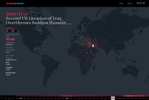
The Refugee Project is an excellent example of the genre. The map is simply a canvas upon which the story unfolds through sensible symbology and a simple, intuitive user experience. Maps tell stories and here, the narrative shows refugee migrations since 1975 with historical context and key events that help explain the patterns. The simplicity of the dark base map contrasts well with the blue and red proportional symbols…simple outlines with no fill that overlap but which can still be seen independently. There are buttons and sliders to modify the data being viewed as well as a time slider to cycle through the maps or to pause on a single year. Clicking countries brings that data into focus by muting the background and adding connectivity lines.
When done well, web maps have the opportunity to use technology to bring something new to the map consumer. Here is an example of the craft that hides the complexity of construction to give a clean user experience coupled with a strong visual design.
