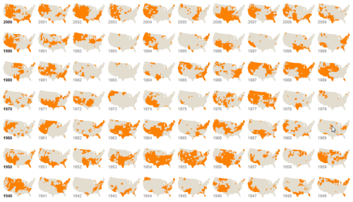
Mapping temporal data, particularly to show change, has always been a cartographic conundrum, made all the more difficult the more different time periods you want to show. Animation has often been the standard fallback and is increasingly used in web maps as the technology provides smoother transitions. Of course this approach has one major drawback – you can only see one point in time at any one point in the animation. How, then, do you present data at once to allow visual comparison?
Park and Quealy make excellent use of small multiples here to demonstrate those US Counties classified as under extreme drought conditions from 1896 – 2012. The map forsakes detail which would have demanded a much larger map. It’s not possible to use the maps as a way of looking at counties on an individual basis. The point here, though, is to give clarity and focus to the pattern of change as a general phenomenon and that is achieved to great effect.
While the maps are hosted on a web page, they are static. Adding the ability to mine the data would create a monstrous application that simply isn’t necessary. Each map is two colour; the binary approach is all that is needed so the symbology is stripped to the minimum. An equal area projection ensures areas can be visually compared accurately – important since the map is illustrating areal extent. Each row contains a decade of data, beginning with the start year shown in bold type just to add a little structure and guide the eye.
Small multiples are extremely useful in cartography. This example illustrates why. You can see the online version here.


