MapCarte 220/365: Iceland by Aitor García Rey, 2013

MapCarte220_iceland


Click on the image to view web map.

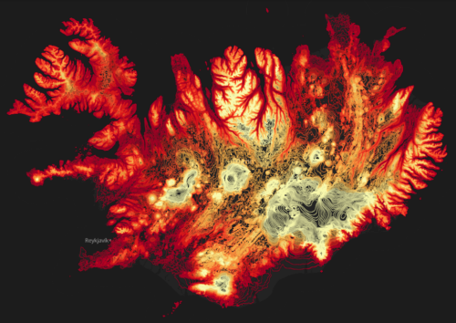
There are a multitude of different ways to represent terrain that might be derived from Digital Elevation Models including analytical hillshades, contours and hachures. All of these, of course, result in fairly traditional representations yet Aitor García Rey has taken the concept of contours (isolines of equal elevation) and created something remarkably different. The interesting thing is he actually hasn’t done anything remarkably different.

Rey’s approach is all down to the particular look and feel. There’s no additional topographic detail on his map other than the contours. He avoids traditional colours such as muted browns and goes, instead, for a palette that ranges from fiery reds in the lower elevations to almost white hot burning colours for the higher elevations. The land of fire and ice is represented with colours that provide the perfect metaphor. He uses a stark black background and nothing more…the contours do their job wonderfully at 20m intervals and which morph to suit each scale of the multiscale web map perfectly.

Quite simply, a beautifully alternative view of Iceland and a novel way of using and symbolising contours.

More details of the technique on Rey’s web site here.

MapCarte 182/365: Reliefkarte der Centralschweiz by Xaver Imfeld, 1887

MapCarte182_imfeld2

Throughout cartographic history there have been a number of eminent artists, map-makers and illustrators who have brought beauty and precision to the depiction of relief. We can trace relief depiction back to the very earliest maps when illustrations of mountains in aspect were etched into clay tablets. Since, many different techniques have been used including panoramas, oblique illustration, hachures and contours.

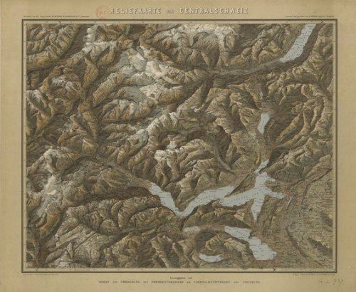
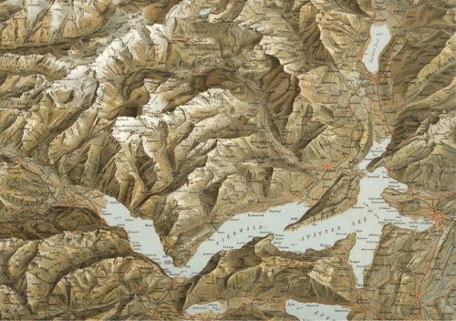
At first sight this beautifl map by Imfeld appears to be just another planimetric map with well executed hill shading but looking closer, it uses an intriguing additional approach. Rather than viewing mountains in an orthographic perspective, Imfeld has re-positioned the viewing angle to create a parallel orthographic view. This has the effect of showing the mountains partially in aspect which accentuates their form while not obscuring too much detail.

MapCarte182_imfeld

Imfeld, from Switzerland, became famous for his cliff drawings and especially for two masterpieces: The “Reliefkarte der Centralschweiz” shown here and his map of the Mont Blanc area. He’s less recognised as the first to use a parallel orthographic projection which has seen many reinventions yet here it is, drawn by hand to a high degree of precision. His mastery of colour, tone and shading is spectacular. Though containing many labels, they merge into the map without becoming dominant.

A superb topographic map, ahead of its time in many ways but giving modern map-makers a great example of relief depiction that improves on the standard orthographic approach.

MapCarte 68/365: Grand Canyon: Bright Angel by United States Geological Survey, 1903

MapCarte68_usgsRepresenting relief is always a challenge for cartographers and there are numerous alternatives. How, then, do you decide to represent the Grand Canyon which has one of the world’s greatest vertical difference across one of the shortest horizontal distance?

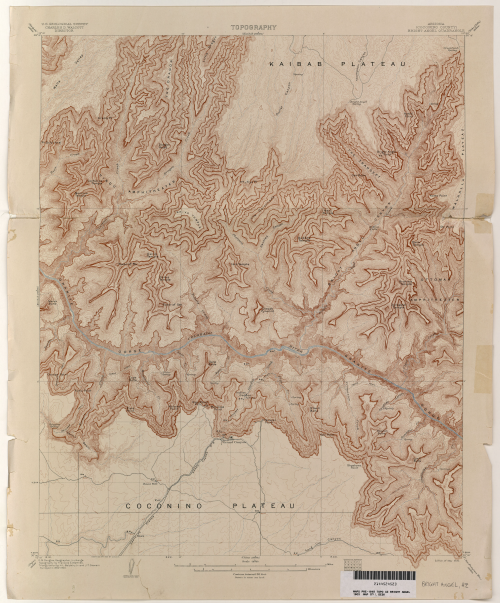
United States Geological Survey chose to simply use contours and their map of 1903 shows how simplifying the map by choosing only a single representation can bring increased clarity. More normally, you would see hill shading or hypsometric tinting used in conjunction with contours but in Grand Canyon the contours are packed so tightly together that they capture the topographic variation perfectly on their own.

MapCarte68_usgs_detail

The ochre colour of the contours adds to the effect since they reflect the reddish sandstones found in the canyon and the thickening of key contours gives a sense of the sandstone layers that in the canyon have a very distinctive pattern. There is very little additional detail other than the hydrology and labels. There doesn’t need to be any additional detail as the contours make this map what it is.