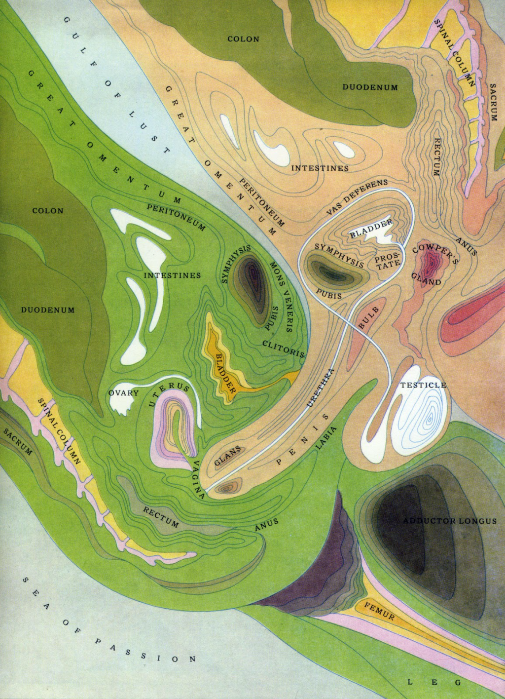
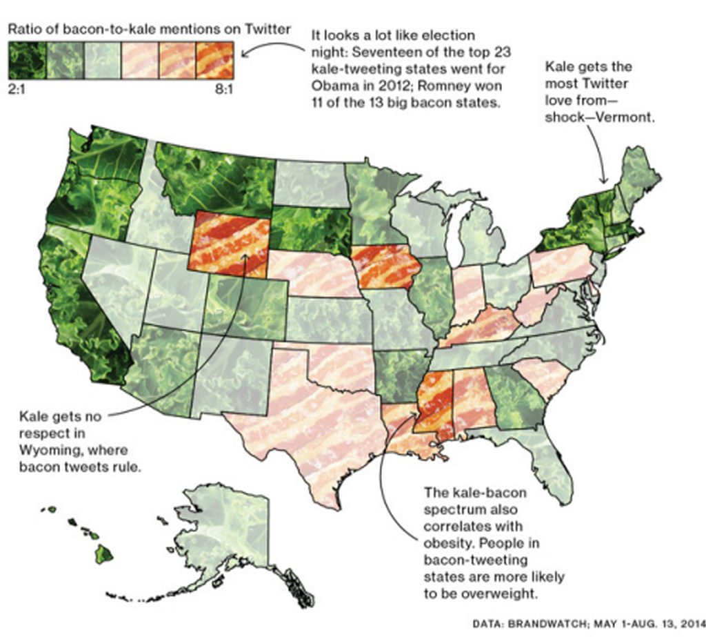
 The rise of the ‘viral map’ has been something of an anathema to reasoned, considered and accepted principles of cartographic design. Much of what we see across social media and in popular media wouldn’t be considered as representing good design and in most instances there’s every reason to use such maps to highlight the limitations of the map. However, such maps are not all in bad taste and can bring us visually interesting examples of map-making that while not necessarily exhibiting classic cartographic design bring a new aesthetic to the body of cartographic work. This example by Eric Chemi accompanied a short news blog that looked at the spatial distribution of tweets that mentioned kale compared to mentions of bacon. Such subjects seem to be tailor made for the production of quick and dirty maps but this example proves that with a little care and thought, the map can actually become something visually interesting despite the whimsy. In fact, it’s entirely possible that such maps comprise a new form of ‘whimsical cartography’. Done well, like this example, shows us that design has no fixed boundaries and allows us to bring together a rich and varied palette of visual forms.
While a standard choropleth with diverging colour scheme would have been fine, the medium of publication possibly demands something more attention grabbing. Instead, the map-maker has transposed images of kale and bacon onto the palette and varied the opacity of the image to give a sense of magnitude. We can easily see the states with the highest ratio of kale or bacon tweets. We can see the states where there is a closer balance. It’s a simple approach but one which supports the congnitive process required. It’s also visually interesting. The addition of a few key textual components adds to the map by highlighting some useful nuggets of information. In this way, a rather bland choropleth map has been re-invented to give us a far more interesting visual feast…literally.
Done well, the simple map which accompanies relatively trivial media blog posts can bring us something unique and visually interesting. It exemplifies the fact that design is important in so many contexts to ensure that we don’t relegate the map to a pointless supporting role. Here, the map becomes one of the key take-aways, the key visual that people recall and a talking point in itself. That’s design.