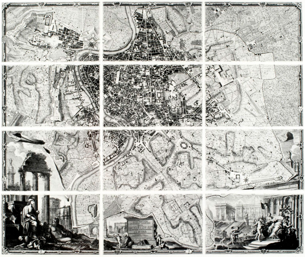
 The Italian architect and surveyor Giambattista Nolli is perhaps best known for his epic ichnographic plan of Rome, known as the Nolli map. He began his exhaustive survey in 1736 and eventually engraved and published the map in 1748 across twelve sheets measuring 176cm by 208cm when pieced together. The map was effectively commissioned by Pope Benedict XIV as a way to map and subsequently demarcate Rome into 14 districts. The detail of the map reflected the architectural achievements of Rome and of the Papacy itself of the time.
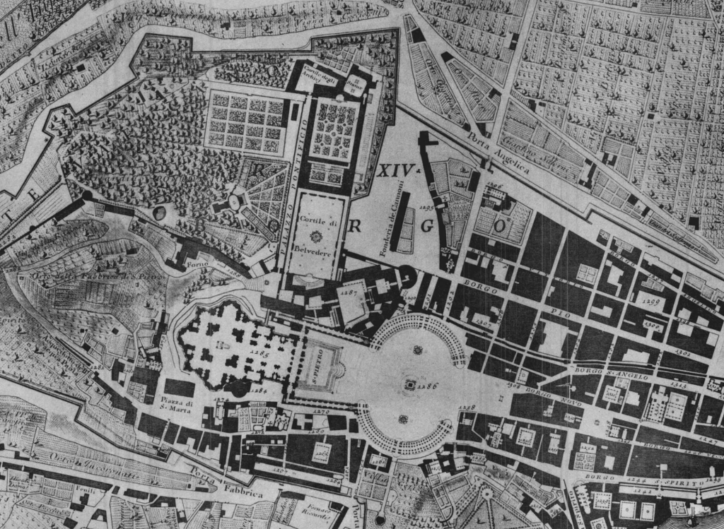 The map is a phenomenal achievement of technical work and of detail and precision. It also incorporates some interesting design choices, not least the orientation of east to magnetic north to reflect the use of the compass to determine bearings in relation to the city’s layout. In terms of depiction, the map illustrates the importance of figure-ground in cartographic design. Nolli followed a previous work, the Bufalini map of 1551, which shaded buildings and other features in dark while ensuring open spaces were white. Additionally, he maps the various colonnades of important public spaces such as St. Peter’s Square in black, almost in the style of an architectural blueprint.
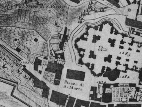 While the map undoubtedly has historical significance both in the mapping of Rome and also as a scientific and technical achievement, the contribution to cartography is also hugely important. The dark grey hachuring for the buildings highlighted the importance of colour, depth, contrast and texture in defining visual contrast. Nolli used black to indicate monuments and white outlines to show the locations of ancient monuments that no longer exist. S-shaped curves were used to denote contours and slopes which was before contours were used more commonly to illustrate elevation. A waterlining effect was used as a vignette for the river and various symbols used to show locations of other features with qualitative differences indicated through design (e.g. open and closed drains). The use of precise illustrative symbols was rare in maps of the time.
You can read more about the Nolli map, and view an online archived version, at the Interactive Nolli Map website here.